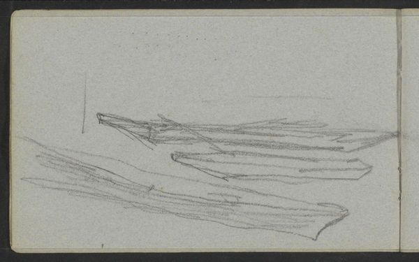
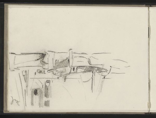
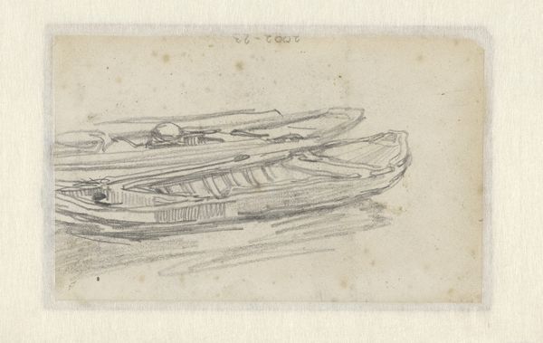
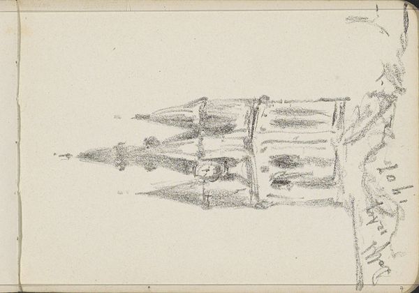
drawing, paper, pencil
#
portrait
#
drawing
#
aged paper
#
toned paper
#
light pencil work
#
quirky sketch
#
sketch book
#
figuration
#
paper
#
personal sketchbook
#
sketchwork
#
pencil
#
sketchbook drawing
#
storyboard and sketchbook work
#
academic-art
#
sketchbook art
Copyright: Rijks Museum: Open Domain
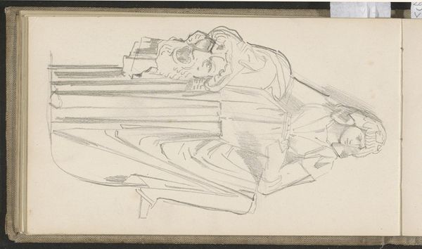
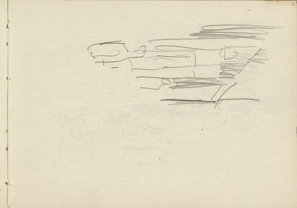
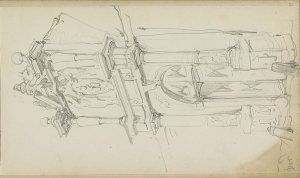
Curator: Here we have Antoon Derkinderen's pencil drawing, "Twee nonnen van de orde van de Clarissen," placing it somewhere between 1892 and 1901. What's your initial read? Editor: My first thought is constraint. The grayscale tones, the light pencil work; it feels muted and reserved, almost fragile in its execution. The composition leads the eye to read each stroke methodically to discover any hidden emotion. Curator: Absolutely. The choice to portray Clarissan nuns is significant. The Clarisses, the "Poor Ladies," are devoted to poverty and contemplation. Consider the visual austerity—the pencil medium, the seeming simplicity—mirrors the values of the order itself. The work captures the idea of dedicating a whole life of devotion to the order. Editor: But simplicity isn't empty; there's a latent geometry. The repetition of the robes, the implied lines of their forms—it's an arrangement, a constructed visual order that supports the subjects. Notice how even within such defined borders, some edges bleed out a bit into nothingness, thus creating a strong yet gentle contrast. Curator: And consider the symbolic weight. These habits aren't mere garments, but uniforms signaling identity, piety, and separation from the temporal world. The rosaries around their necks and small crucifix are potent symbols, anchoring the drawing within a rich historical and spiritual framework. It is as though Derkinderen wanted to create an archetype. Editor: The medium matters, too. Pencil on paper offers an immediacy, a directness absent in, say, oil painting. There’s an undeniable honesty in the marks left by the artist’s hand. We are catching a moment, a passing idea. I admire the almost mechanical aesthetic brought by an experienced hand. Curator: I think you’re spot on. The sketchlike quality adds a layer of intimacy, as if we’re glimpsing a private moment, a personal meditation. There is also this raw beauty as he strips the figure down to its basics. We witness a quiet encounter. Editor: Precisely. For me, the brilliance lies in its refined compositional elements and understated qualities that give us just enough visual data, which allows a powerful presence to form. Curator: A beautiful study in symbolism and restraint. It compels us to reflect on devotion, identity, and the quiet power of simple representation. Editor: Agreed, an expertly crafted composition. Its power comes not just from *what* it depicts, but *how*—its understated simplicity unlocking volumes of potential interpretations and contemplation.
Comments
No comments
Be the first to comment and join the conversation on the ultimate creative platform.
More like this