Curatorial notes
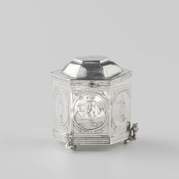
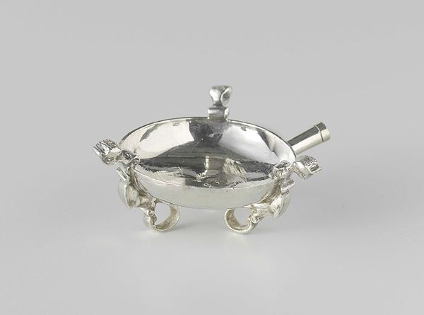
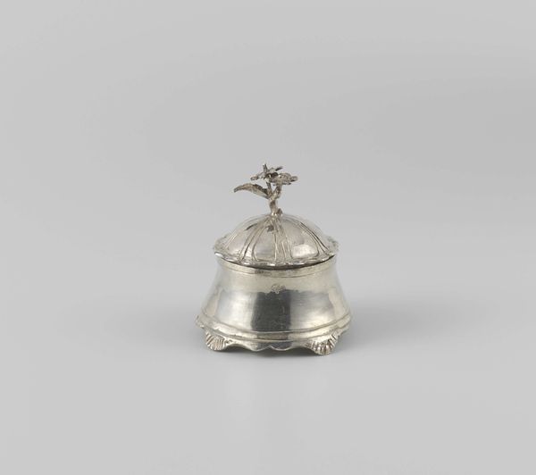
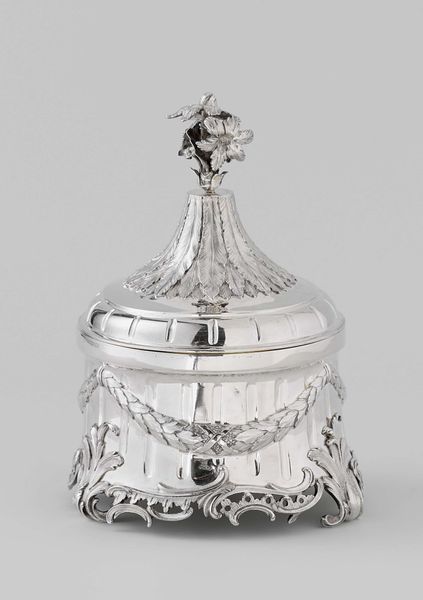
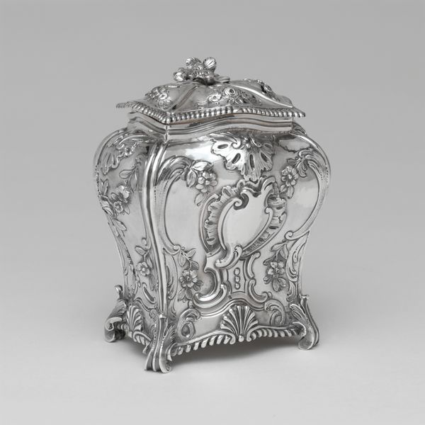
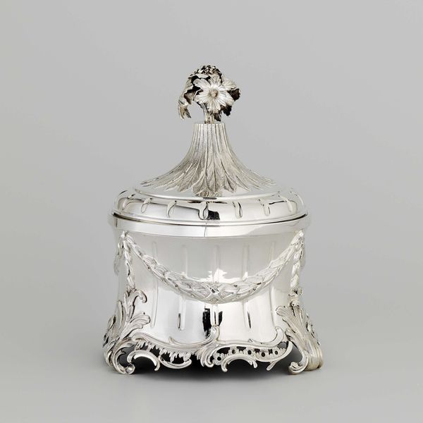
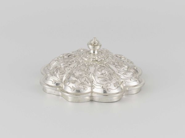
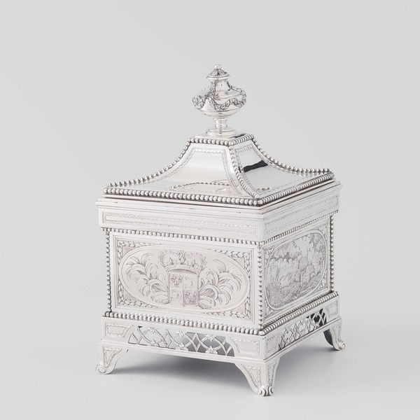
Curator: The piece before us, dating back to 1755, is a Tabakspot fashioned by Jan Borduur. Crafted from silver, it embodies the decorative sensibilities of the Baroque era. What strikes you initially about it? Editor: Tiny treasure! It's got such presence, you know? Like a miniature palace or something. The shininess is outrageous! Curator: The high polish is indeed a characteristic feature, accentuating the play of light and shadow across its form. Notice how the overall structure adheres to classical geometric principles, while the ornate legs introduce a contrasting element of curvilinear movement. Editor: Those little feet are the business. Kind of plant-like, growing, wriggling, supporting this gleaming edifice on what look like silvery vines. Is this typical, botanic silverwork, like, a trope of its day? Curator: Botanical motifs were, in fact, prevalent, but consider how these stylized legs also act as load-bearing structures. The quadrupedal design raises the vessel, which is essentially a container for ground tobacco. Editor: It feels precious now, you know? Like, a sacred holding vessel. Something to open carefully in the boudoir for only your most intimate encounters. And I bet it smelled AMAZING! All musty and floral. Did they lace tobacco then? Curator: Contemporary tobacco blends could certainly have included various aromatic additives. It is pertinent to regard this Tabakspot within the framework of elite society; the act of tobacco consumption became almost ritualized in upper echelons, facilitated by beautiful items such as these. Editor: Luxury, beauty, smoke… what could possibly go wrong?! But seriously, as an object, as silver-work, what *exactly* am I beholding? The lines, the forms... talk to me. Curator: Observe how the sharp edges and defined planes contrast against the organic curves of the feet, resolving asymmetrically as naturalistic elements. Borduur is employing baroque formalism but it appears restrained by today's standard: the structure emphasizes clarity and legibility. Editor: Right! Clarity. It’s trying to be bold without *actually* doing too much. And its small size... this isn’t screaming for attention! Well, still a delightful peek into another time. It just makes me wonder, you know, what was Jan Borduur like? Did he laugh? Did he partake? Curator: Perhaps, although our immediate purview as art observers resides not in speculative biographical tangents, but rather, in rigorous, intrinsic aesthetic readings of artifacts such as these. Editor: Okay, okay, Formalist! But me? I’ll always wander back into Jan Borduur's silversmithy in my mind palace, breathing in the aroma of possibilities... Curator: A worthy endeavor. Such reflections provide us with new points of entry through which art history becomes tangible, immediate.