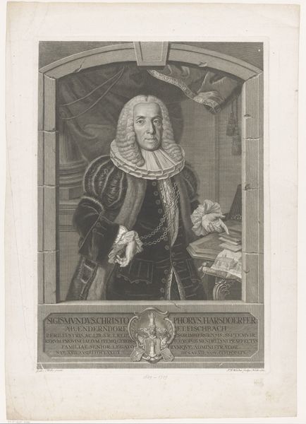
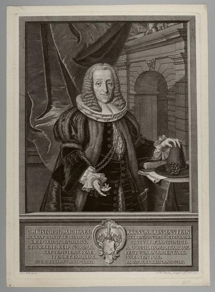
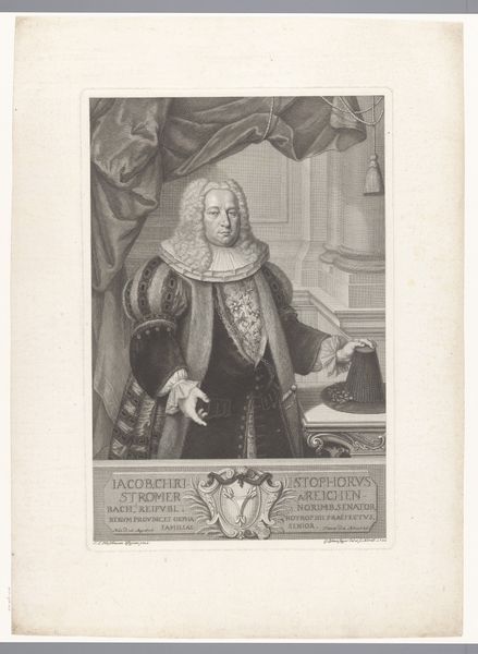
engraving
#
portrait
#
baroque
#
caricature
#
line
#
portrait drawing
#
engraving
Dimensions: height 472 mm, width 330 mm
Copyright: Rijks Museum: Open Domain
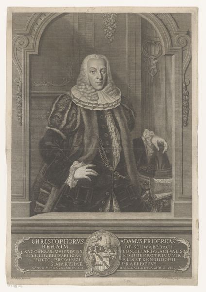
Curator: I am immediately drawn to the meticulous detail of this engraving. The subject, Christoph Michael Kress von Kressenstein, almost seems to be staring right through me. Editor: There's a starkness to it, even a kind of world-weariness, wouldn't you agree? He's practically swimming in fabric. And what about that exaggerated collar? A rigid barrier to the world perhaps? Curator: Quite possibly! What we're seeing here is Johann Wilhelm Windter's "Portret van Christoph Michael Kress von Kressenstein", created in 1753. Windter captured not just a likeness, but an entire era. Think of the rigid social hierarchies of the Baroque period. The symbols are meant to demonstrate power and authority. Editor: I do agree about the demonstration of authority but consider who gets represented and how. This feels like a calculated display, very controlled, yet in some ways unintentionally revealing. All of those symbols become a costume that almost weighs the subject down. What societal pressures was he subject to as part of the aristocracy of the day, to require such formalised representation? Curator: He seems like such a serious individual! Though Windter's style definitely adds a satirical undertone. Those lines and the stark contrast almost veer into caricature, despite its being an official portrait. I find the architectural detail in the background intriguing; what do you read from that? Editor: To me it reinforces a kind of isolation and, although surrounded by symbolic indicators of influence, almost creates a claustrophobic atmosphere for Christoph, not aided by his physical positioning on the artwork so enclosed within a rectangular frame within the image itself, but the heavy drapery behind the pillars of the structure don’t suggest openness. Curator: Looking closely at the engraving, the quality of line is exceptional, with hatching and cross-hatching bringing considerable tonal depth to what would otherwise be a very flat medium. You can feel the weight of history within these lines. It connects us to that time. Editor: In his attempt to project timelessness, perhaps Windter inadvertently laid bare some very timely truths. I’m thinking about art’s purpose, the way it simultaneously immortalises and reveals us – that tension makes the engraving endlessly fascinating. Curator: I feel as if I know him a bit. The power of art to speak across centuries continues to astound! Editor: A vital, visceral conversation through time – captured in ink.
Comments
No comments
Be the first to comment and join the conversation on the ultimate creative platform.
More like this