drawing, paper, ink
#
drawing
#
asian-art
#
paper
#
ink
#
abstraction
#
line
#
calligraphy
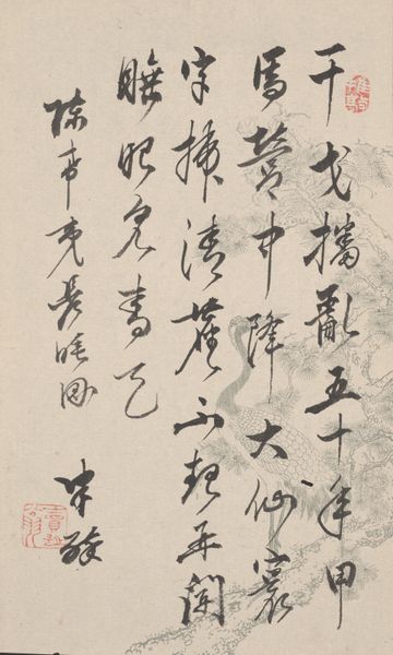
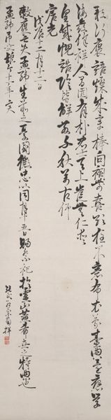
Copyright: Ding Yanyong,Fair Use
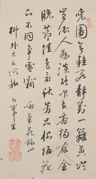
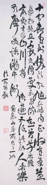
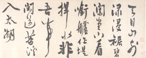
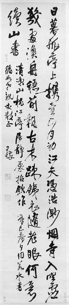
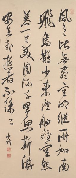
Ding Yanyong made this calligraphy with ink on paper; the exact date is unknown. The creation of this work feels like a dance of process. The ink varies in tone, and the brushstrokes are at times dry and scratchy, and at others, fluid and smooth, creating a push-pull effect. Look at how the characters swell and taper, with the ink pooling in certain areas, giving a sense of depth and dimension. This piece reminds me of Cy Twombly, with its calligraphic gestures, but there's a control here that's very much Ding's own. The characters in the third line are especially striking, with the curves and angles creating a visual rhythm, like a musical score. It’s as if each stroke is a note, and together they form a harmonious composition. I love how he embraces ambiguity; the marks aren’t always legible, but the feeling is clear.
Comments
No comments
Be the first to comment and join the conversation on the ultimate creative platform.
More like this