acrylic-paint
#
abstract expressionism
#
acrylic-paint
#
geometric-abstraction
#
abstraction
#
line
#
modernism
Copyright: Constantin Flondor,Fair Use
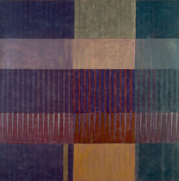
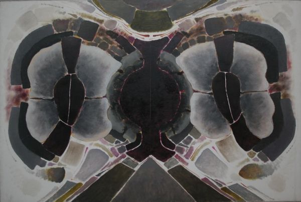
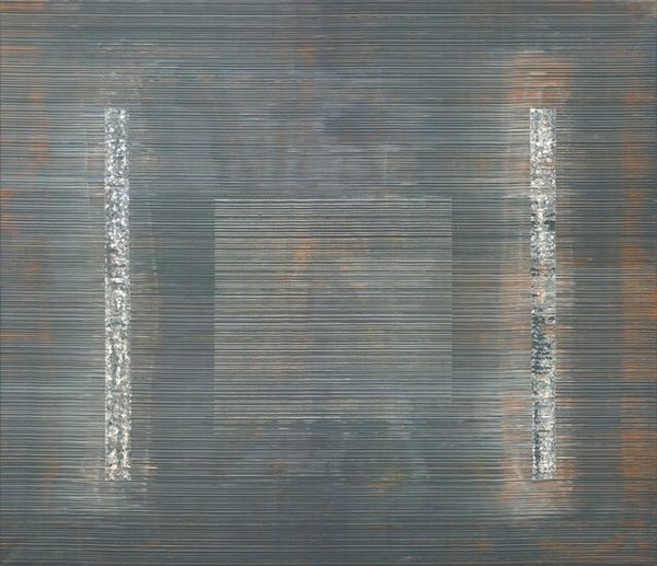
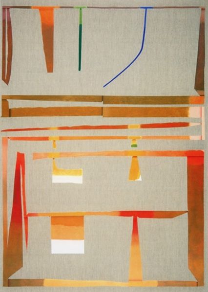
Editor: We are looking at Constantin Flondor’s "Luminous Reflections I" from 1967, made with acrylic paint. It gives me a feeling of controlled tension; it's abstract but almost architectural. How would you interpret the visual elements in this piece? Curator: This artwork presents a compelling study in form and color. Notice how Flondor employs geometric abstraction—the superimposed rectangles, the elliptical shapes, and the subtle gradations of color—to create a sense of depth and rhythm. What is the effect of using parallel lines throughout the composition? Editor: They do bring a sense of order to the abstraction, acting almost as visual anchors within the free-floating geometric forms. But the pastel hues soften that rigid geometry somehow. Curator: Precisely. Observe how the chromatic scale, dominated by earth tones punctuated with cooler blues and mauves, works to modulate the inherent starkness of geometric forms. The horizontal banding further segments the visual field. Is there anything else about the composition that captures your attention? Editor: Yes, actually. It's how the composition feels split horizontally but the mirroring helps retain some visual symmetry overall. It really makes my eyes dart around the work. Curator: That visual dynamic, in fact, speaks to the painting's successful manipulation of compositional tension and harmony. What new perspectives on Flondor’s work are you taking away after our discussion? Editor: I am definitely going to look for underlying structures within seemingly abstract works from now on. It's less about *what* it represents and more about *how* it’s constructed!
Comments
No comments
Be the first to comment and join the conversation on the ultimate creative platform.
More like this