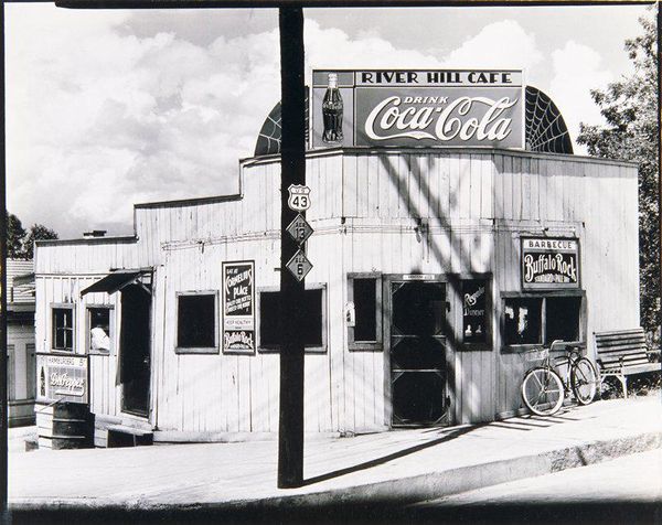
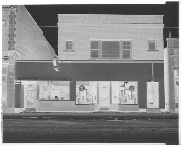
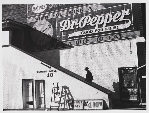
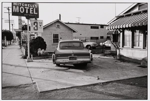
gelatin-silver-print, photography, gelatin-silver-print
#
still-life-photography
#
gelatin-silver-print
#
landscape
#
street-photography
#
photography
#
gelatin-silver-print
#
street photography
#
united-states
#
monochrome
#
realism
#
monochrome
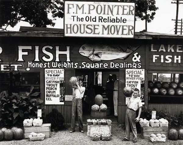
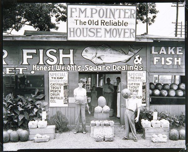
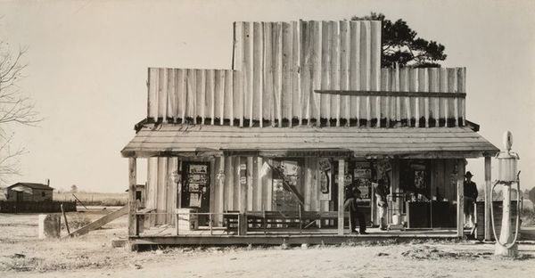
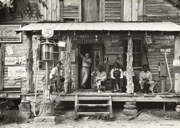
Dimensions: 7 1/2 x 9 7/16 in. (19.05 x 23.97 cm) (image, sheet)18 x 14 3/4 in. (45.72 x 37.47 cm) (mount)
Copyright: No Copyright - United States
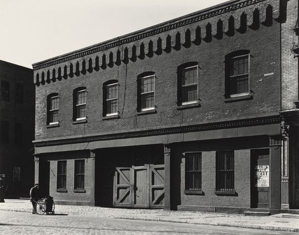
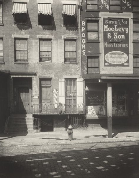
Curator: Walker Evans's gelatin silver print, possibly titled "Fish Market near Birmingham", with a tentative creation date sometime between 1936 and 1971, now resides here at the Minneapolis Institute of Art. Editor: Stark and arresting. The textures, particularly the wood grain and hand-painted signage, create a powerfully stark visual rhythm. I also notice it uses monochrome which has an aesthetic that provides a timeless, and contemplative feel, doesn’t it? Curator: It's not merely an aesthetic choice, though; the gelatin silver print, with its specific chemical processes, allowed Evans to capture the nuances of light and shadow. The contrast isn't just visually striking, but essential to how the materiality of the print conveys the scene's mood and underscores the economic realities of the subject matter. Look at the upper sign and phone number...this hints to when, where, and the context surrounding the community. Editor: True, but the composition directs the eye, too. The stacked signs, the repetition of the list, all frame the figures visible through the door, suggesting a specific hierarchy and spatial depth. The artist places a very specific focal point on "honest weights, square dealing" -- the most prominent sign! The black and white amplifies the linear, almost severe structuring of elements, which strikes me as formal, controlled...almost staged? Curator: Not "staged", but meticulously considered, definitely! Evans's work at this time sought to document the vernacular. His focus on commercial signage and the architecture of everyday life—these fish prices posted, those bushel baskets there, the layered messages painted on that building's facade!— speaks to his broader investigation into American social and economic landscapes during this era. He documented how these factors intersected within working communities like that represented here. The text really stands out! Editor: I concede that Evans captured that era's specific architectural language very succinctly here. What a juxtaposition with a sign above touting the reliable house mover; there is a sense of instability despite the business slogan for reliability. The picture certainly is very thought-provoking, Curator: I'm glad you noticed those connections between vernacular design, economics, and societal conditions captured here, Editor! By exploring his meticulous methodology to document material realities through such precision techniques inherent within gelatin silver prints, that’s where, together, our dialogue provides such richness to understanding his legacy’s contributions to our art history.
Comments
No comments
Be the first to comment and join the conversation on the ultimate creative platform.
More like this