print, typography
# print
#
11_renaissance
#
typography
Copyright: Rijks Museum: Open Domain
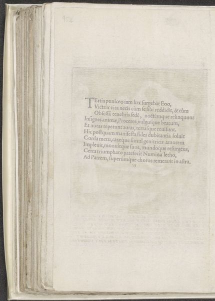
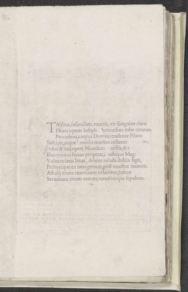
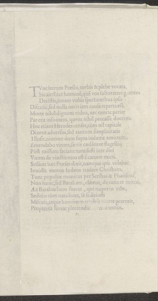
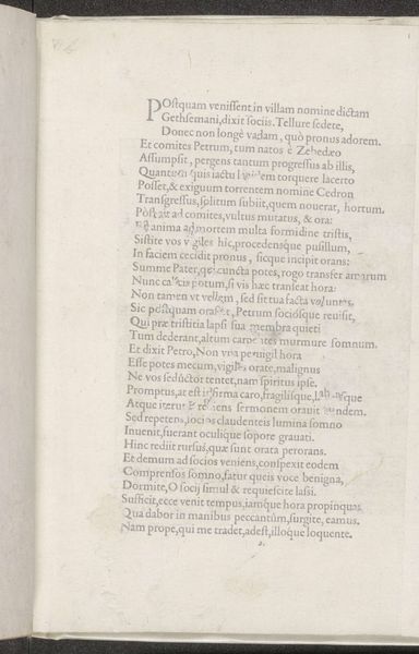
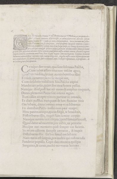
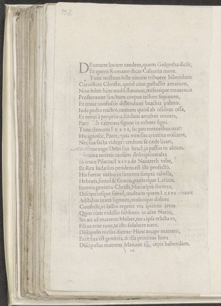
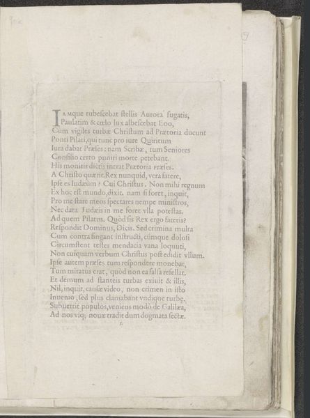
This page of text about the Carrying of the Cross was made by Domenico Mancini around 1500 using ink on paper. Initially, we observe a structured arrangement: lines of text form a unified block, creating a dense, yet balanced composition on the page. The poem itself employs the Latin alphabet, a symbolic system that transcends its immediate aesthetic function. The words narrate Christ's journey, but the formal presentation—the disciplined lines and justified margins—imparts a sense of order and control. The poem is set in a classical structure that is both contained and balanced. The text could be said to subvert the traditional representation of religious suffering. The poem's formal structure contrasts with the chaotic and painful subject matter. It is an attempt to contain and rationalize the emotional and spiritual content. The poem invites us to consider how language and form mediate experiences of faith, suffering, and representation.
Comments
No comments
Be the first to comment and join the conversation on the ultimate creative platform.
More like this