Dimensions: height 59 mm, width 142 mm
Copyright: Rijks Museum: Open Domain
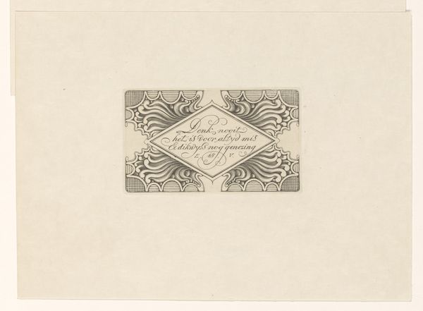
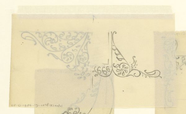
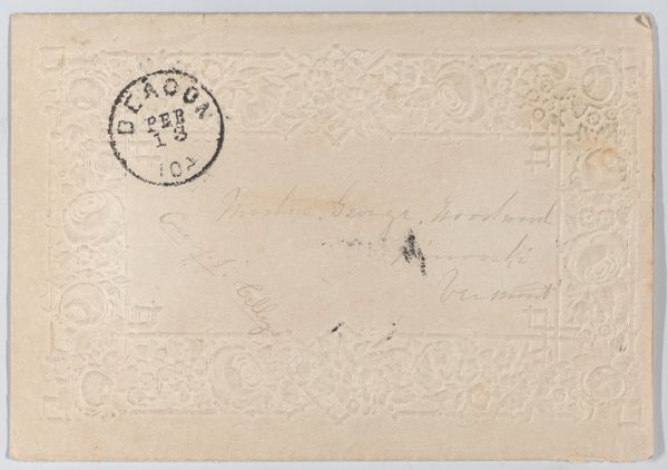
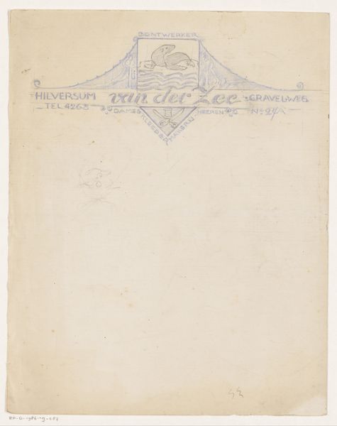
Curator: We’re looking at "Address vignette Otto's Laan 20 in Hilversum," a piece that spans 1884 to 1952, crafted by Reinier Willem Petrus de Vries. Editor: My immediate thought is restraint; it’s monochromatic with simple, angular forms. A curious blend of utility and quiet artistry. Curator: It's fascinating to think about how such a small piece intersects with broader social themes. Address labels represented not only place, but also identity, connection, and a sense of belonging. Consider the class implications: whose addresses were adorned like this? What communities did Otto’s Laan 20 connect with? Editor: From a formalist lens, the brown lettering set against the neutral paper presents a subtle study in contrast and texture. The typography, flanked by stylized flourishes, is balanced yet unconventional. Its function becomes aesthetic, elevated by attention to shape and placement. Curator: And what did it mean to fix your place and identity on a page this way? How does a postal address tie into societal concepts of home and locality? Especially during such turbulent periods in history? Think about this home address as representative of the history and evolution of social demographics. Editor: I’m drawn to the delicate balance of the letterforms with those symmetrical swirls. How the curves work with and against the geometry of the overall composition. Even the raw edges of the paper contribute a rough texture that interacts dynamically with the controlled print at the center. Curator: The act of addressing something signifies a personal transaction, yet becomes profoundly altered as we consider who does, and crucially does not, have fixed representation. It opens discussions around power dynamics and unequal access. Editor: It is easy to read at first sight, but invites slow inspection of the finer choices which the artist made: a subtle lesson in finding form inside of what is perceived as mundane. Curator: Precisely! Thinking of it as a subtle social document reframes our understanding, placing importance on visibility and fixed identity. Editor: Absolutely, a deceptively small image brimming with subtleties of construction, making it deeply interesting.
Comments
No comments
Be the first to comment and join the conversation on the ultimate creative platform.
