About this artwork
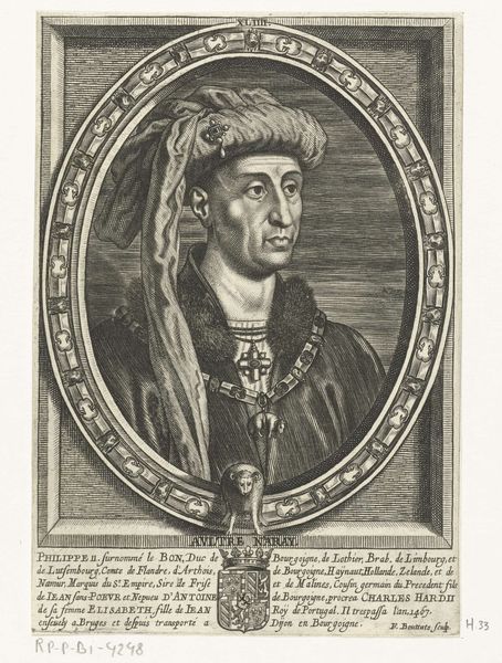
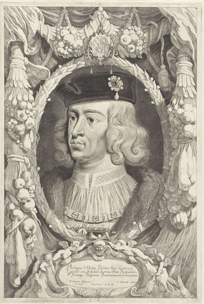
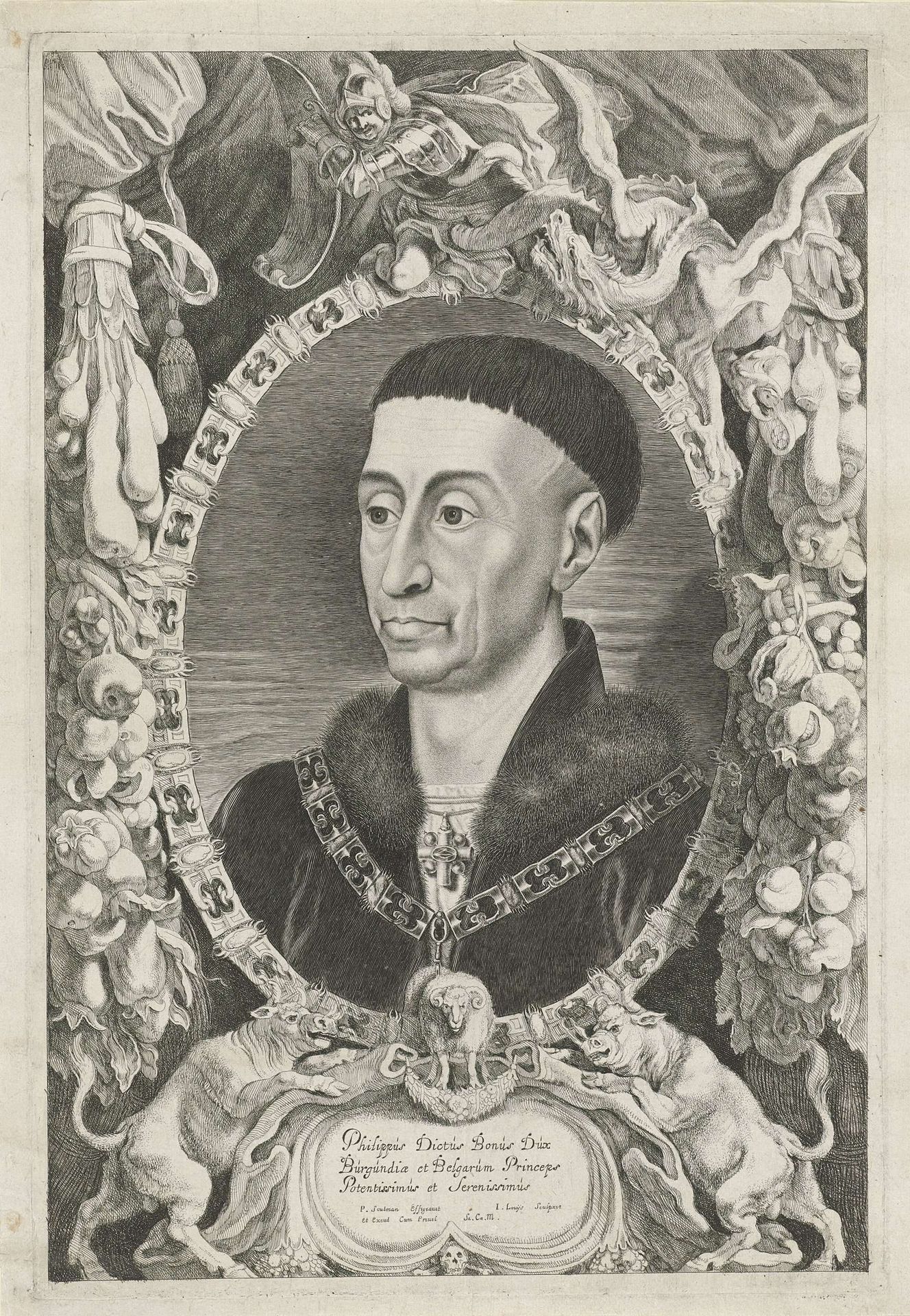
Curator: Here we have Jacob Louys’s "Portret van Filips de Goede," dating approximately from 1644 to 1650. It's an engraving, demonstrating impressive detail. Editor: It strikes me immediately with its rather severe mood. The subject's gaze is direct, unflinching, framed by such a formal and elaborate oval surround. Curator: Yes, the composition is meticulously crafted. Notice the precise lines defining Philip the Good's features and attire. The artist is clearly concerned with verisimilitude. Look at the chain. Editor: Absolutely, but let's consider the physical act, the labour involved in such minute detail. Engraving, especially at this scale, required enormous skill, and not to forget access to high quality copper plates to start with. There's something so laborious about capturing power this way. Curator: Material conditions aside, the overall visual effect, achieved through precise arrangement and juxtaposition of elements, signifies the subject’s noble status, an effect produced through careful rendering of textures. Think of the contrast between the soft fur trim and metallic chain, not to mention his fashionable bowl haircut, very distinctive and somewhat anachronistic. Editor: Indeed. What about the labour involved to reproduce the original and distribute the prints throughout his dukedom, spreading and performing the status it depicts! The value isn't intrinsic; it arises from the production processes embedded in the printmaking. How accessible was this portrait really? How would those involved in the process have related to it? Curator: The semiotic layering is interesting: from the Latin inscription, proclaiming his noble titles to the ram emblems below it. Editor: Right, I was struck by those strange demonic, goat-like figures at the bottom flanking that ram emblem. This challenges traditional binaries—the rational versus the decorative. I appreciate that the material handling and engraving methods, despite the portrait's rigidity, present an image intended for much wider consumption. Curator: The stark lines and high contrast create an almost regal feel in the portrayal. It's really through the controlled application of visual syntax and codes, after all, that one could communicate and ensure someone’s importance beyond just material display of power. Editor: Fair enough, however, this close engagement has prompted me to rethink our tendency to devalue the labor-intensive practices integral to what we classify now as early mass media production. Curator: A pertinent and very interesting reflection that expands beyond conventional appreciation!
Artwork details
- Medium
- print, engraving
- Dimensions
- height 414 mm, width 280 mm
- Copyright
- Rijks Museum: Open Domain
Tags
Comments
Share your thoughts
About this artwork
Curator: Here we have Jacob Louys’s "Portret van Filips de Goede," dating approximately from 1644 to 1650. It's an engraving, demonstrating impressive detail. Editor: It strikes me immediately with its rather severe mood. The subject's gaze is direct, unflinching, framed by such a formal and elaborate oval surround. Curator: Yes, the composition is meticulously crafted. Notice the precise lines defining Philip the Good's features and attire. The artist is clearly concerned with verisimilitude. Look at the chain. Editor: Absolutely, but let's consider the physical act, the labour involved in such minute detail. Engraving, especially at this scale, required enormous skill, and not to forget access to high quality copper plates to start with. There's something so laborious about capturing power this way. Curator: Material conditions aside, the overall visual effect, achieved through precise arrangement and juxtaposition of elements, signifies the subject’s noble status, an effect produced through careful rendering of textures. Think of the contrast between the soft fur trim and metallic chain, not to mention his fashionable bowl haircut, very distinctive and somewhat anachronistic. Editor: Indeed. What about the labour involved to reproduce the original and distribute the prints throughout his dukedom, spreading and performing the status it depicts! The value isn't intrinsic; it arises from the production processes embedded in the printmaking. How accessible was this portrait really? How would those involved in the process have related to it? Curator: The semiotic layering is interesting: from the Latin inscription, proclaiming his noble titles to the ram emblems below it. Editor: Right, I was struck by those strange demonic, goat-like figures at the bottom flanking that ram emblem. This challenges traditional binaries—the rational versus the decorative. I appreciate that the material handling and engraving methods, despite the portrait's rigidity, present an image intended for much wider consumption. Curator: The stark lines and high contrast create an almost regal feel in the portrayal. It's really through the controlled application of visual syntax and codes, after all, that one could communicate and ensure someone’s importance beyond just material display of power. Editor: Fair enough, however, this close engagement has prompted me to rethink our tendency to devalue the labor-intensive practices integral to what we classify now as early mass media production. Curator: A pertinent and very interesting reflection that expands beyond conventional appreciation!
Comments
Share your thoughts
