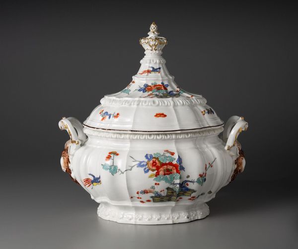
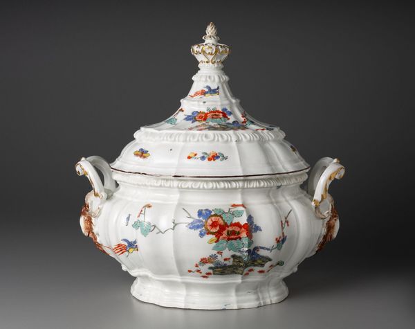
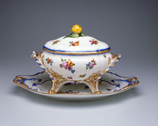
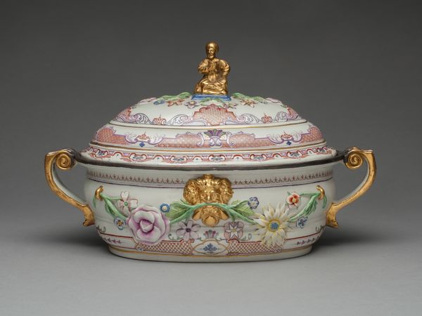
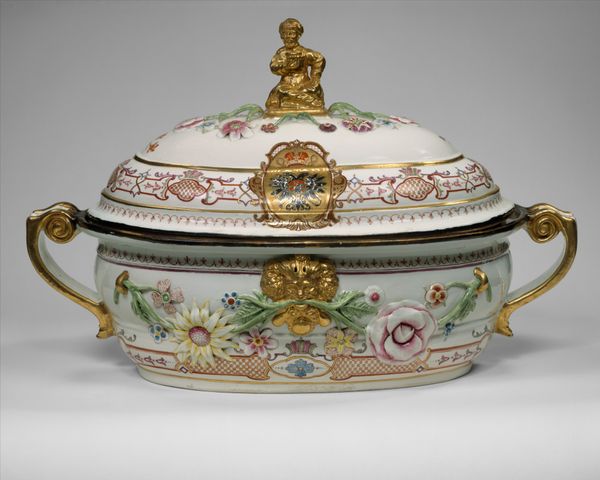
Covered Tureen and Stand (One of a Pair) c. 1740
0:00
0:00
ceramic, porcelain, earthenware
#
germany
#
ceramic
#
porcelain
#
earthenware
#
decorative-art
#
rococo
Dimensions: Stand: 39.9 × 29.6 × 7.9 cm (15 11/16 × 11 5/8 × 3 1/8 in.) Tureen body: 37 × 21.2 × 16.6 cm (14 9/16 × 8 3/8 × 6 ½ in.) Lid: 26.8 × 22.1 × 19.1 cm (10 9/16 × 8 11/16 × 7 ½ in.) Tureen and lid height together: 33.0 cm (13 in.)
Copyright: Public Domain
Curator: Let's discuss this Covered Tureen and Stand made around 1740 by the Meissen Porcelain Manufactory. The porcelain piece, hailing from Germany, strikes me as overwhelmingly ornate. What do you notice first? Editor: Absolutely, it is ornate. I immediately noticed the asymmetrical balance, the delicate brushstrokes forming both scenes and decorations, and all that shimmering gold leaf, particularly around the handles and edges! There’s a lot happening… how do you even begin to interpret a work like this? Curator: Begin by deconstructing its structure. Note the whiteness of the porcelain which serves as a canvas. See how it is punctuated by the placement of scenes contained within gold cartouches, each bordered by flowers. Consider how this controlled ornamentation contrasts with the fluidity of the Rococo style it evokes. Notice the miniature paintings... What semiotic readings can we draw? Editor: That's a lot to take in, but looking closer I can see how the miniature paintings break the smooth white surface to prevent it from feeling monotonous, like windows into another world, reinforcing its role as a status symbol and luxury item rather than just a utilitarian piece. How intentional is this elaborate, but subtle storytelling? Curator: Precisely. Observe that each carefully applied stroke constructs a world that whispers luxury. The medium becomes the message. But is there anything about the structure that detracts from its appeal? Editor: Hmmm, possibly. If the cartouches, frames, and flowers had a little more empty space between them, would it allow the details to really shine? Maybe, just maybe, a bit less *is* more. Curator: An astute observation. Form and function vie for attention, mirroring the social tensions of the era. It seems that exploring art through its structure reveals narratives beyond aesthetics. Editor: It does. Paying closer attention to details has provided unexpected avenues of interpretation and illuminated how technique can shape perception.
Comments
No comments
Be the first to comment and join the conversation on the ultimate creative platform.
More like this