#
aged paper
#
homemade paper
#
paperlike
#
typeface
#
stylized text
#
thick font
#
handwritten font
#
thin font
#
historical font
#
small font
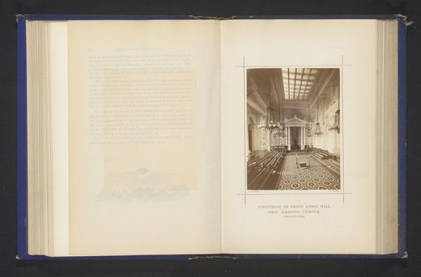
Dimensions: height 120 mm, width 93 mm
Copyright: Rijks Museum: Open Domain
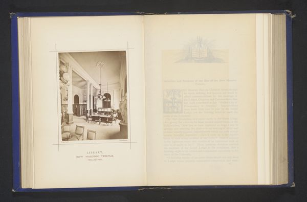
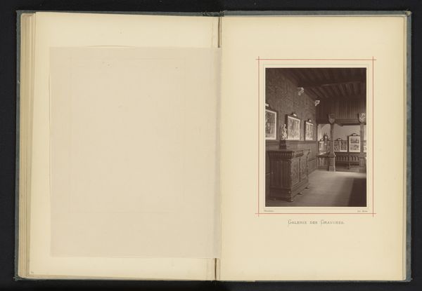
Editor: So, we have a photographic print called "Interieur van de tempel van de vrijmetselarij te Philadelphia," that’s “Interior of the Freemason Temple in Philadelphia” by Frederick Gutekunst, predating 1874. It seems to be part of a book or album. What I find immediately striking is the contrast between the highly detailed photograph and the ornate but mass-produced typography on the facing page. What’s your take? Curator: Consider the photographic print itself – albumen, likely. Think of the labor involved in its production. The glass plate negative, the chemicals, the time, and the skilled technician required for each print. Compare this to the readily available printed text – likely typeset – which suggests a different kind of labor and access to means of reproduction. How does the juxtaposition of these two processes impact your understanding of the subject matter - the Freemason temple? Editor: That's interesting. I hadn’t really considered that, focusing more on just the image itself. The photo feels very intentional, almost staged, versus the quite formal but less engaging script on the opposite page. Could this say something about the Freemason's value of both craftsmanship and widespread communication of their values? Curator: Precisely. The Freemasons, with their own systems of labor and initiation, were consciously choosing how to present themselves. Think about the cost of a photographic print versus mass-produced text. Who would be the consumers of this book? What message does the combination of these very different methods of production convey about Freemasonry’s social positioning at the time? It wasn’t about mere access. Editor: I suppose they're demonstrating exclusivity while also signalling an intent to educate. That is something I have never thought of looking for in a piece like this, production context, what do you think our visitors should take away? Curator: That even seemingly straightforward historical documents can be read for their complex material choices and the social messaging embedded within their production processes. Consider how materiality shaped consumption, perception, and social relations in the late 19th century. Editor: I'll definitely keep that in mind going forward! It really does add another layer to understanding the artwork.
Comments
No comments
Be the first to comment and join the conversation on the ultimate creative platform.
More like this