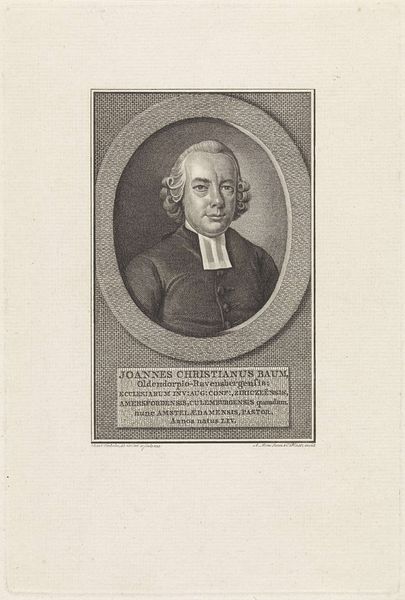
print, engraving
#
portrait
#
neoclacissism
# print
#
engraving
Dimensions: height 246 mm, width 200 mm
Copyright: Rijks Museum: Open Domain
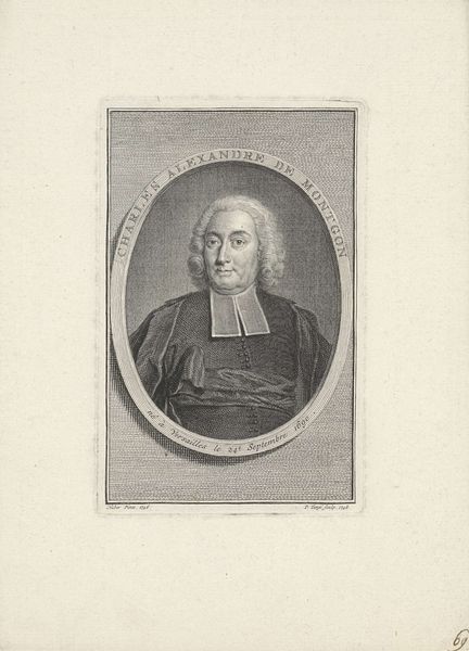
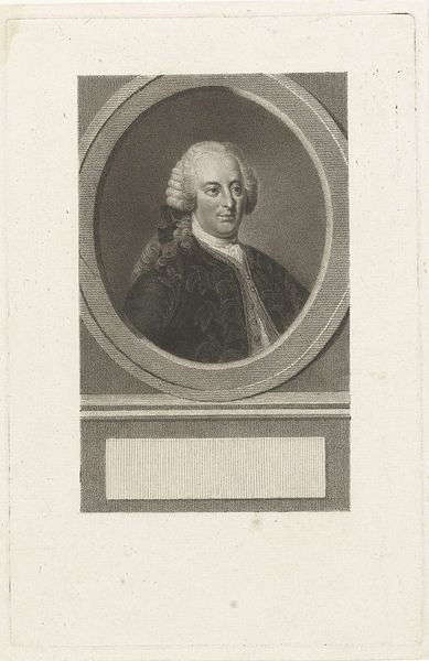
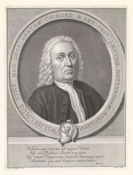
Editor: Here we have "Portret van Reinier Pieter van de Kasteele," an engraving dating from 1803. The meticulous lines create a somber mood. The tight oval framing the subject draws my eye right in. What do you see in the piece, beyond its obvious function as a portrait? Curator: Consider the deliberate use of line and texture. Note the subtle gradations that define the planes of his face, contrasting with the relatively flat, unmodulated surface of his coat. This strategic differentiation is key. The engraver manipulates light through density of line, creating form where none exists materially. Editor: So, you're focusing on how the print medium itself shapes our perception? Curator: Precisely. The oval frame functions as more than mere decoration. Observe how it contains the figure, drawing attention to the head and shoulders as the primary compositional elements. Further, this concentrated framing accentuates the lines around the eyes and mouth which create an internal intensity. Do you see how the inscription mirrors the oval with its rectangular form, acting as a visual anchor? Editor: I hadn't noticed that! The balance between the portrait and text creates a sort of formal harmony, doesn’t it? Almost like the inscription is grounding the portrait. Curator: Yes, and considering the principles of neoclassicism, a period that often prized order and balance, one could see that this artwork exemplifies those ideas through restrained and structured composition. Editor: I learned that focusing on these formal elements illuminates so much more about the piece! Curator: Indeed. Through analysis of form, we begin to grasp the intentions and effects of the artist.
Comments
No comments
Be the first to comment and join the conversation on the ultimate creative platform.
More like this