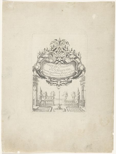
Titelprent voor een serie van studiebladen met figuren en paarden 1675 - 1711
0:00
0:00
anonymous
Rijksmuseum
print, engraving
#
allegory
#
baroque
# print
#
old engraving style
#
geometric
#
line
#
engraving
#
calligraphy
Dimensions: height 98 mm, width 167 mm
Copyright: Rijks Museum: Open Domain
Curator: Here we have an engraving from the late 17th or early 18th century, "Titelprent voor een serie van studiebladen met figuren en paarden"—"Title print for a series of study sheets with figures and horses." It resides in the Rijksmuseum collection, attributed to an anonymous artist. Editor: It strikes me as a meticulously rendered composition, full of classical motifs. The line work is incredibly detailed, evoking a sense of ornate elegance despite its modest scale and materiality. Curator: Indeed. The balance achieved through symmetry and the geometric arrangements are key. Note the allegorical figures with trumpets and flags, flanking what appears to be a coat of arms, all beneath a radiant sunburst. These elements create a visually complex hierarchy within the print's design. Editor: Speaking of design, let’s consider the material process of creating this engraving. The artist’s labor is palpable. The controlled hand needed to carve those precise lines into a copper plate, the physical exertion and the knowledge of applying ink, pressing the paper—there's a history embedded in that act. What was the function of these prints and their accessibility within Baroque society? Curator: Functionally, it was meant as a frontispiece to a series of drawing studies. The text below the cartouche dedication indicates its purpose—serving as a guide for artists learning to draw figures and horses. Its symbolism reflects the baroque fascination with grandeur and skill, but more abstractly speaks to visual representation through complex organization of line. Editor: I wonder about the paper itself. What quality was it? Was it locally sourced or imported? Who were the patrons demanding such intricate works, and what was their relationship to the engraver, Petrus Schenkium, mentioned within the inscription? Those socioeconomic connections inform the visual object on display. Curator: These are insightful questions, directing our thoughts towards material accessibility and the economies of artistic production. The print successfully embodies the visual conventions of the period, prioritizing structured line, detail, and balanced arrangements that give form to the overall work. Editor: Seeing the print through this lens highlights its intrinsic link to social history. The material processes involved reveal much more than aesthetic value alone; they speak to societal structures as a whole. Curator: It brings new perspectives for analysis, where careful observation of lines, forms and space become a journey through production of an era, so to speak.
Comments
No comments
Be the first to comment and join the conversation on the ultimate creative platform.
More like this