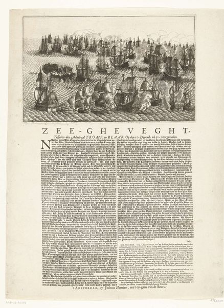
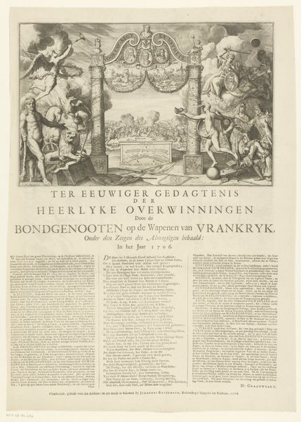
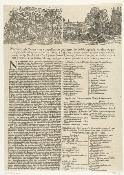
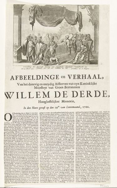
print, engraving
#
portrait
#
baroque
#
dutch-golden-age
# print
#
old engraving style
#
pen work
#
cityscape
#
engraving
Dimensions: height 480 mm, width 317 mm
Copyright: Rijks Museum: Open Domain
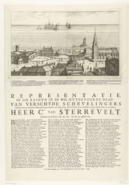
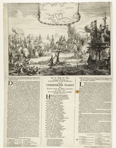
Editor: This is "Spotprent op admiraal Sterrevelt", a print from 1703 by an anonymous artist. It’s quite detailed for an engraving. What strikes me is the way the artist has juxtaposed the Admiral with the cityscape. What do you see in this piece, from a formal perspective? Curator: Indeed, the compositional structure immediately arrests my attention. Observe how the picture plane is distinctly divided. Above, the intricate cityscape is teeming with activity, a dynamism echoed in the flurry of ships. Below, however, the text provides an anchor, lending stability to the print. What is the effect of such a bifurcation? Editor: It almost feels like two separate artworks combined… a portrait with a naval scene. The text at the bottom feels a bit disconnected from the visuals. Curator: Precisely! Consider the figure of the Admiral himself. He stands stiffly, almost superimposed against the lively background. Notice his rigid pose, the meticulous rendering of his garments. It stands in marked contrast to the fluid lines depicting the ships and city. Is he part of that scene, or distinct from it? How do the various scales of objects and figures relate to each other, in terms of emphasis? Editor: That's interesting. He looks like he’s presenting that scene, almost like a stage. But you're right, he does seem somewhat separate from it too. I guess it highlights his authority, by showing him removed from the action, even if it might flatten the depth in the work overall? Curator: Exactly. By isolating and enlarging the Admiral in this way, it brings his position as orchestrator into focus. Note also that the engraver opted to flatten or shrink elements within the busy harbour background in relation to those foregrounded elephants. It offers interesting visual clues, even if distorting our sense of natural proportion or perspective! Editor: This formal analysis makes the image seem even more interesting than before! I am curious now to read the words, since you make me question everything I thought before about this piece.
Comments
No comments
Be the first to comment and join the conversation on the ultimate creative platform.
More like this