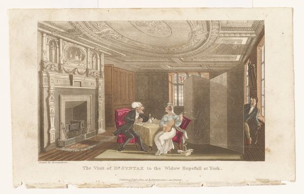
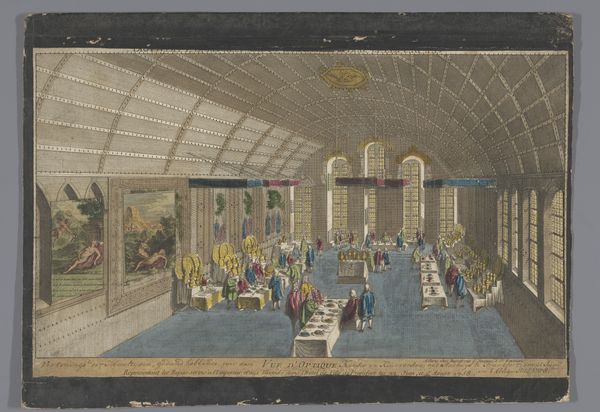
The Repository of Arts, Literature, Commerce, Manufactures, Fashions, and Politics 1809 - 1828
0:00
0:00
drawing, print, watercolor
#
drawing
#
neoclassicism
# print
#
watercolor
#
coloured pencil
#
watercolour illustration
#
genre-painting
Dimensions: each vol. approx.: 9 7/16 × 6 × 1 3/4 in. (24 × 15.3 × 4.5 cm)
Copyright: Public Domain
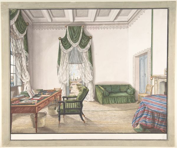
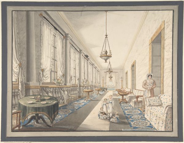
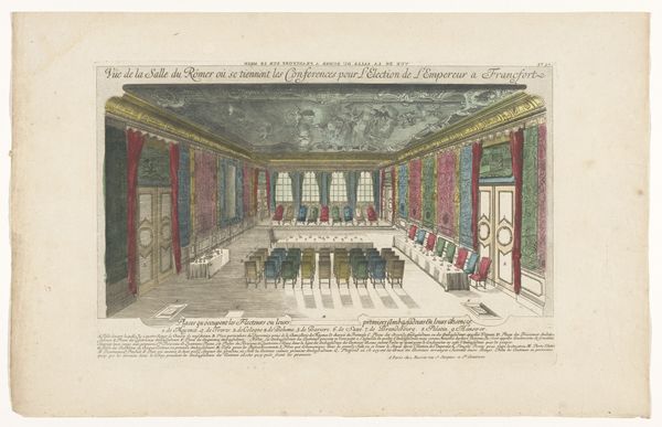
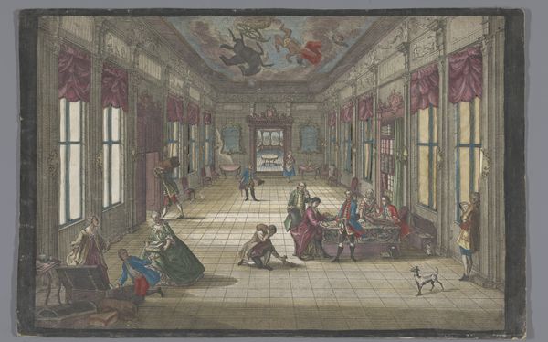
Editor: Right now, we're looking at "The Repository of Arts, Literature, Commerce, Manufactures, Fashions, and Politics," a print made between 1809 and 1828 by Rudolph Ackermann in London. It’s crafted from drawing, print, and watercolor. The detail is remarkable. What really strikes me is how the composition creates this almost stage-like space. How do you interpret the visual elements at play? Art Historian: Indeed. Focusing on the formal qualities, one notices the emphasis on line and the interplay between vertical and horizontal elements. The strong horizontality of the floorboards and display tables is offset by the imposing verticality of the windows, columns, and towering furniture pieces. The print’s geometry creates a structured, ordered space. Editor: So, it's not just about what's being depicted but how it's structured visually. The repetition, particularly, with the furniture and window panes – does that contribute to a particular effect? Art Historian: Precisely. The repetition engenders a sense of rhythm and visual harmony. Note the considered distribution of light and shadow. How does the natural illumination streaming through the glazed roof and windows, for instance, affect your reading of the image’s depth and volume? Observe the colour palette used to create these gradations of light, what would you say about them? Editor: I’d describe it as subdued, there are few strong contrasts, yet this muted range actually lends the image an inviting warm glow. I suppose if the palette was more garish, or contained dramatic contrasts it could result in a visually conflicting picture, and distract from its balance and composition, right? Art Historian: An insightful point. Color saturation affects mood, a vital design choice in all artworks. Thinking critically about visual order, what do you find most intriguing about its aesthetic impact now? Editor: Paying attention to these formal devices – I noticed elements in the room have distinct angular lines and hard corners, whereas softer materials in this image tend to drape in waves, and create more curvature. By paying attention to these patterns of forms and techniques in art I suppose we develop visual literacy over time? Art Historian: An exemplary conclusion, the cultivation of analytical discernment in observing structural properties constitutes visual literacy.
Comments
No comments
Be the first to comment and join the conversation on the ultimate creative platform.
More like this