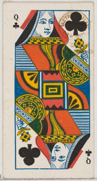
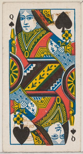
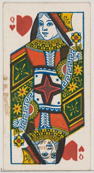
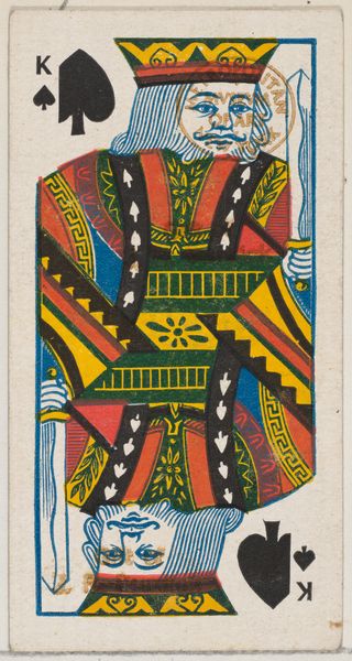
Queen of Diamonds (red), from the Playing Cards series (N84) for Duke brand cigarettes 1888
0:00
0:00
Dimensions: Sheet: 2 3/4 x 1 1/2 in. (7 x 3.8 cm)
Copyright: Public Domain
Curator: Good morning. Today, we’re looking at “Queen of Diamonds (red)”, a piece from the Playing Cards series designed around 1888 for Duke brand cigarettes. Editor: First impression? Stark, oddly mesmerizing...like an icon designed by someone who's only heard about royalty. It’s so flat and boldly graphic. It demands attention but offers very little in the way of personality. Curator: Exactly! It’s less about capturing individual essence and more about symbolic representation. These cards, essentially trade cards inserted into cigarette packs, were promotional items. What symbols do you see at play? Editor: Well, diamonds for a start—associated with material wealth, confidence, and boldness, of course. The Queen holds a flower, a common enough symbol of beauty and ephemerality. Her mirror image—duplicated both upright and upside down— suggests perhaps the dual nature of power or fortune, its ability to bless or to curse. Curator: Nicely observed. This “double portrait" mirrors the traditional layout for face cards to make them easily identifiable when held. It served a functional purpose as much as a symbolic one, no? Editor: Sure, and the choice of a queen! Often seen as representative of nurturing but potentially of deviousness, reflecting the complexity and intrigue surrounding status and influence at the time. Let’s remember, though, this image also reflects the ideals (or projected fantasies) associated with smoking: luxury, sophistication. Curator: That's interesting. This feels a bit more ironic or perhaps satirical considering its origin as tobacco advertising? Like putting high art and aspirations into everyday consumer objects? Editor: That collision, though, creates something unique. A commentary on consumer culture, packaged as…well, more consumer culture. You know? And a glimpse of where mass marketing and art blur into pop art in the coming decades. Curator: It leaves me wondering if the woman it represents felt seen. Editor: Maybe "seen" isn’t the right word here; it captured. Like pinning down an archetype and, at the same time, underscoring its fragility, since its mass-produced throwaway reality. I guess it is pretty cool for a cigarette card.
Comments
No comments
Be the first to comment and join the conversation on the ultimate creative platform.
More like this