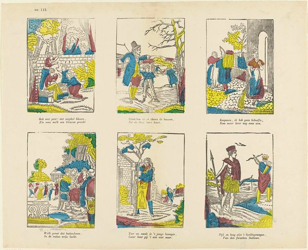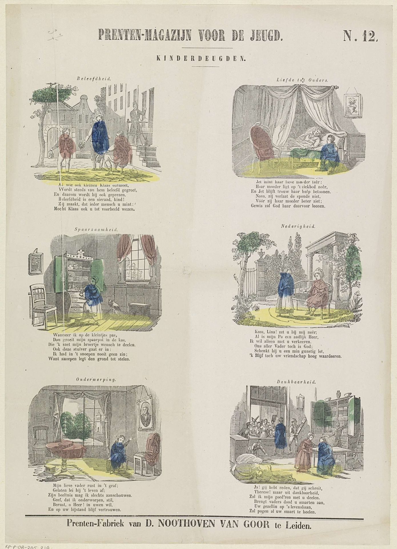
1850 - 1881
Kinderdeugden
Listen to curator's interpretation
Curatorial notes
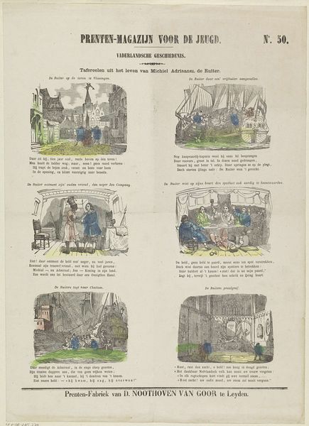
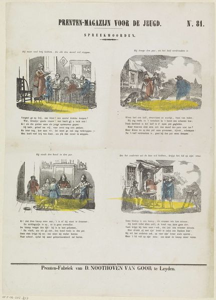
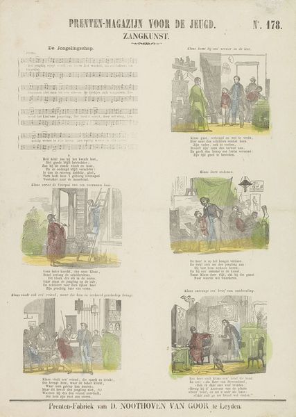
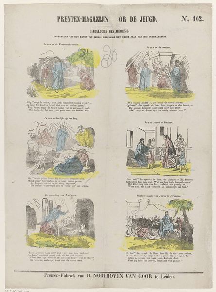
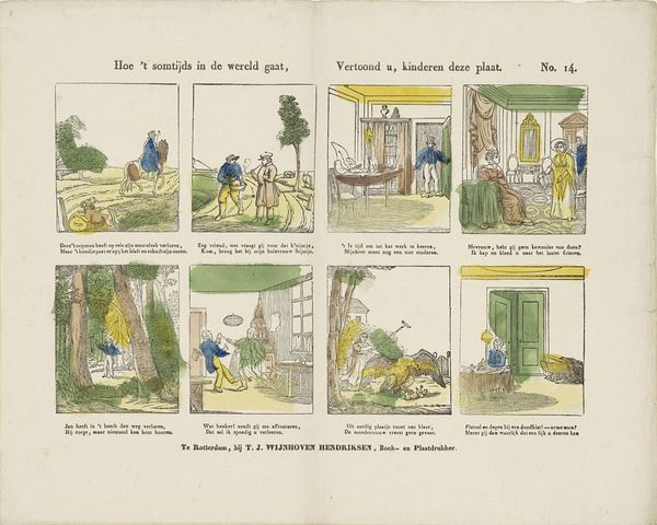
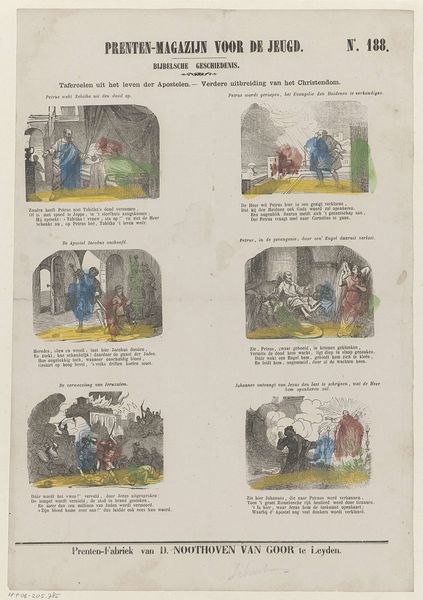
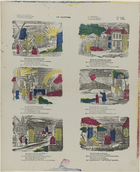
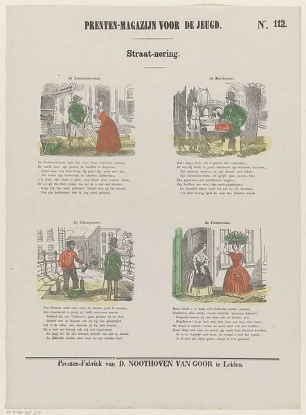
Curator: Here we have “Kinderdeugden,” which translates to “Children’s Virtues,” a lithograph and engraving created between 1850 and 1881 by Dirk Noothoven van Goor. It's an example of narrative and genre art that seeks to teach a moral lesson. Editor: My first thought is how much this speaks to the rigid moral frameworks of the 19th century. Look at the materiality here. A lithograph and engraving! Think of the sheer labor involved in producing this image for mass consumption. What virtues are being materially produced and consumed here? Curator: Yes, the piece is a part of a series called "Prenten-Magazijn voor de Jeugd" or "Print Magazine for the Youth," designed to be both educational and entertaining. Each scene illustrates a particular virtue such as obedience, diligence, thankfulness, and displays behaviors that are rewarded by their surroundings, suggesting an almost transactional virtue. Editor: Absolutely, the transactional element is interesting. Virtue as a kind of labor is certainly a theme that comes through here, not only as represented but actually performed in the means of production for such magazines as well! One can almost smell the ink! What materials were used? How did that inform access? Curator: Van Goor employs a very accessible visual language; even though there’s text, the symbolism in each little scene would be rather straightforward, creating strong cultural codes of conduct. The style, very typical of Academic Art, relies on universal themes readily understandable to his intended audience. It feels almost didactic! Editor: Right, “accessible,” but whose access? Where were these printed? Who distributed them, and to what social classes? To me, it's fascinating to think of the materiality of this “virtue-production.” Where are the print blocks now, I wonder? Are the inks stable, after all this time? The yellow especially looks fugitive. Curator: Examining those details adds depth and richness to our understanding of the piece’s impact, going beyond merely the intended message to explore the historical forces in play. This definitely prompts me to reconsider what ‘virtue’ means across different temporal landscapes. Editor: Indeed! The materials whisper their own stories and materializing children's virtues into paper and ink brings a unique clarity about those intentions for virtue in Dutch history! Thank you.