About this artwork
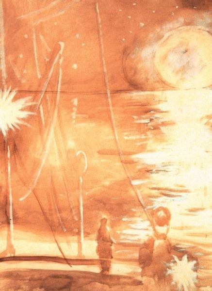
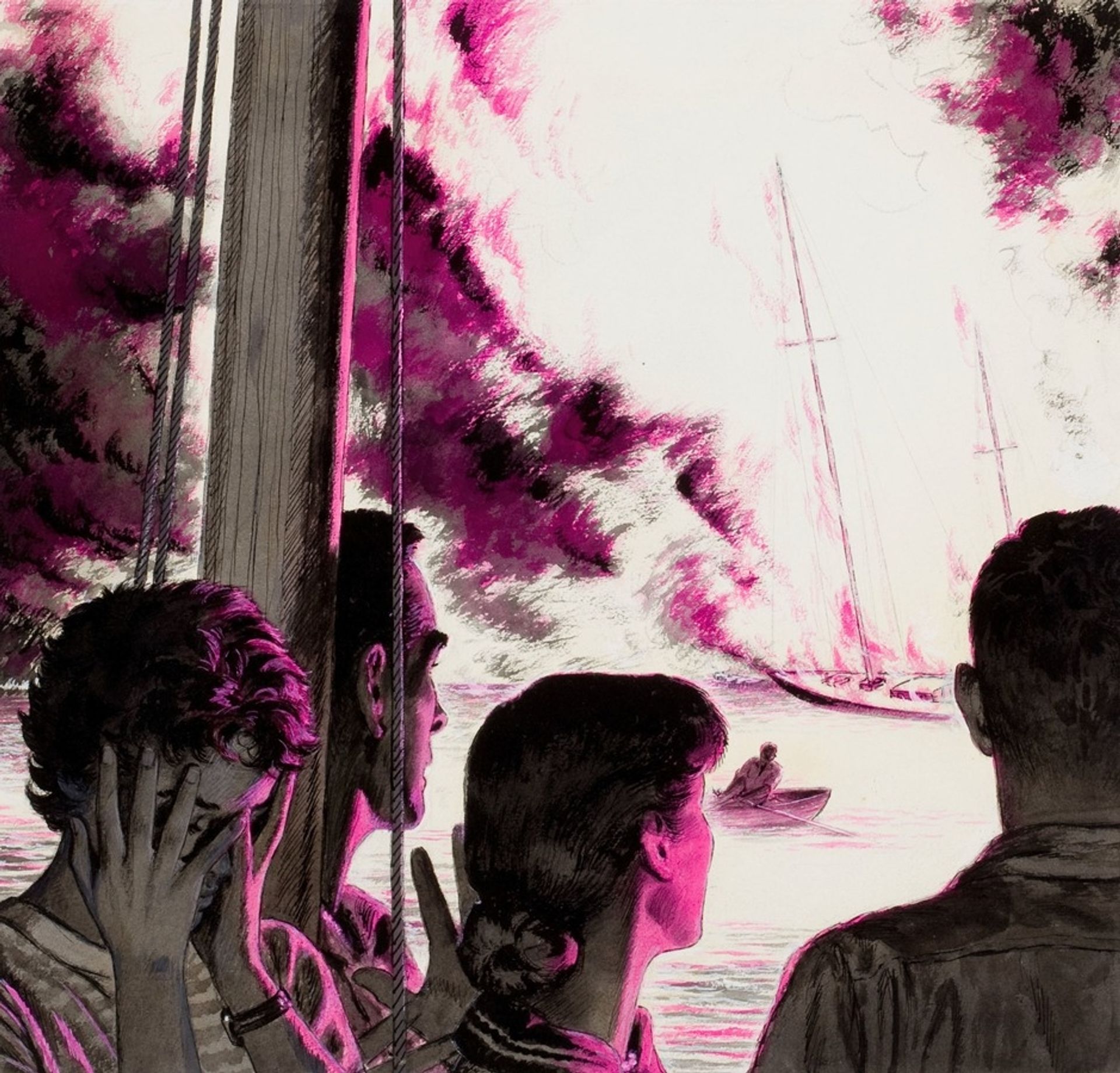
Edwin Georgi made this picture, Trouble at Sea, and it looks like it was made with ink and maybe some kind of gouache or watercolor. The limited palette is really striking, mostly monochrome with this pop of pink that feels both dramatic and kind of unsettling. I find myself drawn to the way Georgi uses these colors to build the scene, the sea looks pretty rough! Look how the pink kinda bleeds into the dark ink of the sky, it gives everything this turbulent feeling, like the whole world is shifting. Then you've got the boat itself, it's like this little fragile thing against all that wildness. And the figures reacting to the boat on fire are like us, standing in front of the artwork! Georgi's style reminds me a bit of Edward Hopper, especially in the way he captures these quiet, tense moments, though Hopper usually sticks to more muted tones. But like Hopper, Georgi seems to be saying something about how we experience the world, how beauty and danger can exist side by side, and how we're all just trying to make sense of it all.
Artwork details
- Copyright
- Modern Artists: Artvee
Comments
Share your thoughts
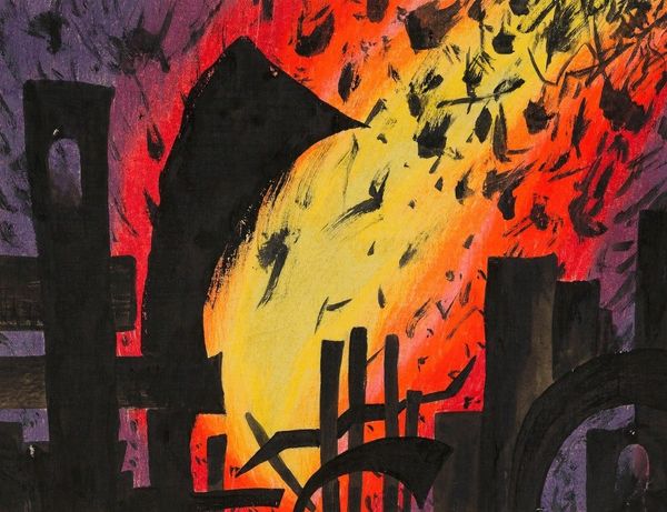
About this artwork
Edwin Georgi made this picture, Trouble at Sea, and it looks like it was made with ink and maybe some kind of gouache or watercolor. The limited palette is really striking, mostly monochrome with this pop of pink that feels both dramatic and kind of unsettling. I find myself drawn to the way Georgi uses these colors to build the scene, the sea looks pretty rough! Look how the pink kinda bleeds into the dark ink of the sky, it gives everything this turbulent feeling, like the whole world is shifting. Then you've got the boat itself, it's like this little fragile thing against all that wildness. And the figures reacting to the boat on fire are like us, standing in front of the artwork! Georgi's style reminds me a bit of Edward Hopper, especially in the way he captures these quiet, tense moments, though Hopper usually sticks to more muted tones. But like Hopper, Georgi seems to be saying something about how we experience the world, how beauty and danger can exist side by side, and how we're all just trying to make sense of it all.
Comments
Share your thoughts