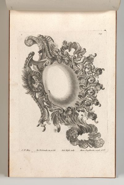
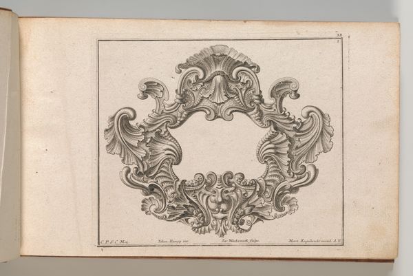
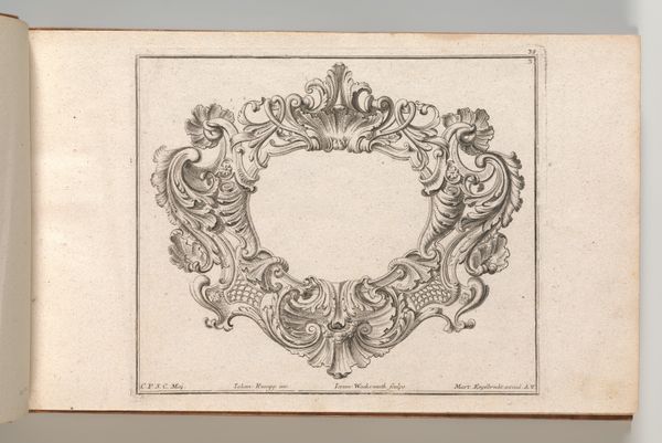
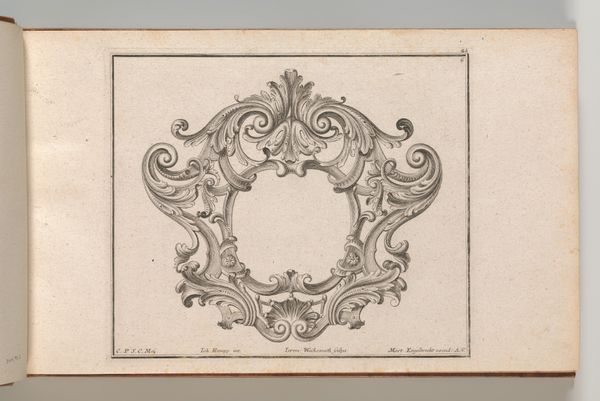
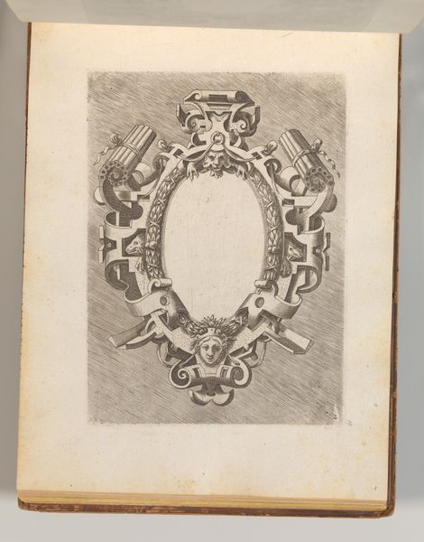
Design for a Cartouche, Plate 2 from 'Allerneueste Façon einiger Schild oder Cartouches' 1745 - 1755
0:00
0:00
drawing, print, engraving
#
drawing
# print
#
decorative-art
#
engraving
#
rococo
Dimensions: Overall: 8 7/16 × 13 3/4 in. (21.5 × 35 cm)
Copyright: Public Domain
Curator: Before us, we have "Design for a Cartouche, Plate 2 from 'Allerneueste Façon einiger Schild oder Cartouches'" by Andreas Hofer, created sometime between 1745 and 1755. It's an engraving, part of a larger set, at The Met. My initial thought is just how intensely decorative it is. Editor: Intensely decorative is an understatement! It screams opulence, almost aggressively so. I feel like I’ve stepped into a palace reflecting the unbridled excesses of a ruling elite completely divorced from the realities of everyday life. Curator: The rococo style practically demands that feeling. Notice the shells, the curling acanthus leaves—they speak to a visual language deeply embedded in classical and natural symbolism. Consider how the cartouche itself, traditionally a blank space for a coat of arms or inscription, becomes an opportunity for pure ornamentation. Editor: Yes, and that emptiness in the middle... it almost mocks the idea of substantial content. It’s a frame without a picture, a signifier without a signified, really highlighting the artifice and theatricality of power during that era. The intricate detail feels almost performative, meant to overwhelm and impress. Curator: Indeed, and the engraving medium itself adds another layer. Think about how this design, intended to be reproduced and disseminated, influences other artisans. The flowing lines become a sort of design vocabulary for expressing status and belonging to a certain group, almost a shared cultural language. Editor: That proliferation speaks to power too. By embedding these symbols in architecture, furniture, even smaller decorative objects, the elite visually reinforced its dominance. I'm struck by how these designs helped shape the very environment—and thereby the worldview—of anyone moving through those spaces. It is an expression of visual colonization. Curator: Well put! The enduring appeal of this, I think, lies in the emotional pull of the forms, in how the swirling, asymmetrical designs seem to promise fluidity and dynamism. There's a real invitation to escape, even within that highly codified language. Editor: An invitation for a very select group of people, perhaps. Still, looking at it now, centuries later, the empty center makes you wonder: what are the cartouches of our time and what ideologies do we unknowingly embellish in our own lives? Curator: Fascinating thought. I am left wondering at the interplay of image and social structure. It reflects our relationship with visual languages through the ages. Editor: I’m left thinking about accessibility to this piece – it makes me think and analyse its impact. Both experiences enrich how we receive historical work, offering valuable historical insight.
Comments
No comments
Be the first to comment and join the conversation on the ultimate creative platform.
More like this