drawing, paper, ink, pen
drawing
hand-lettering
hand drawn type
hand lettering
paper
personal sketchbook
ink
hand-drawn typeface
pen-ink sketch
ink colored
pen work
sketchbook drawing
pen
sketchbook art
calligraphy
Copyright: Rijks Museum: Open Domain
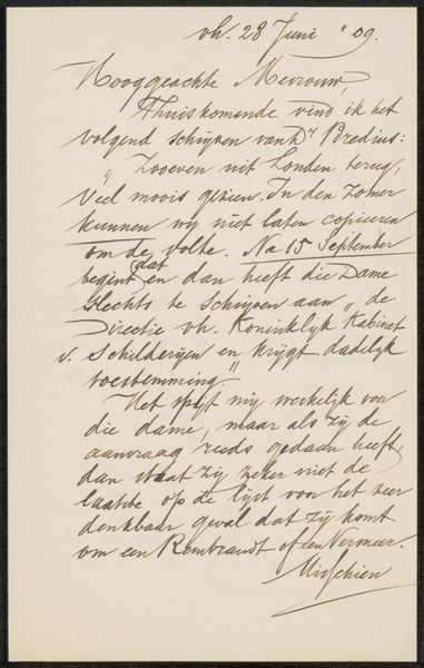
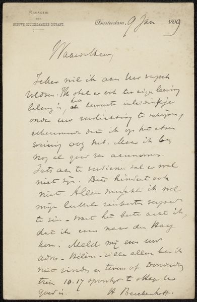
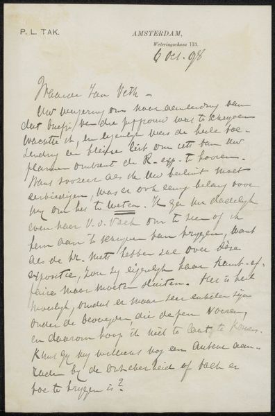
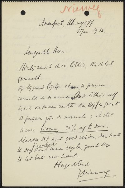
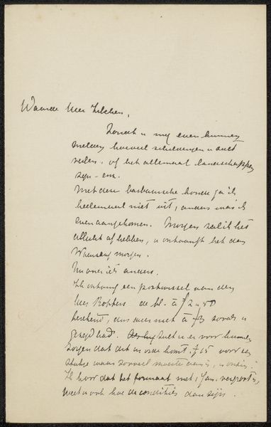
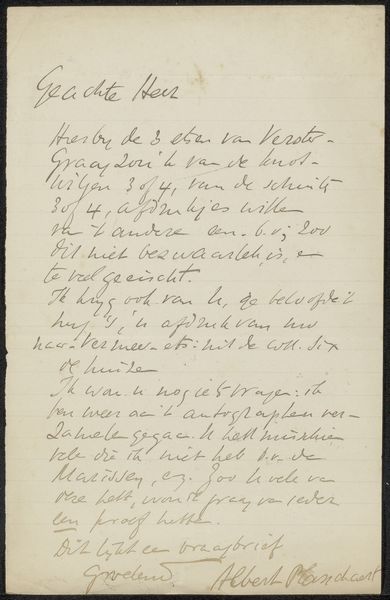
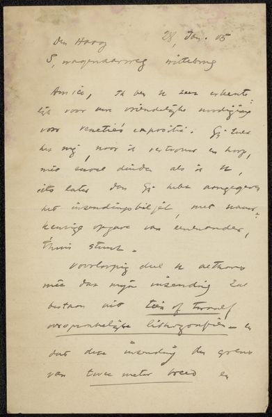
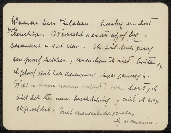
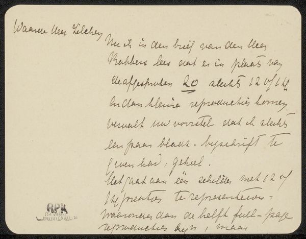
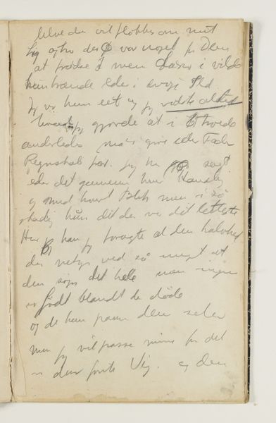
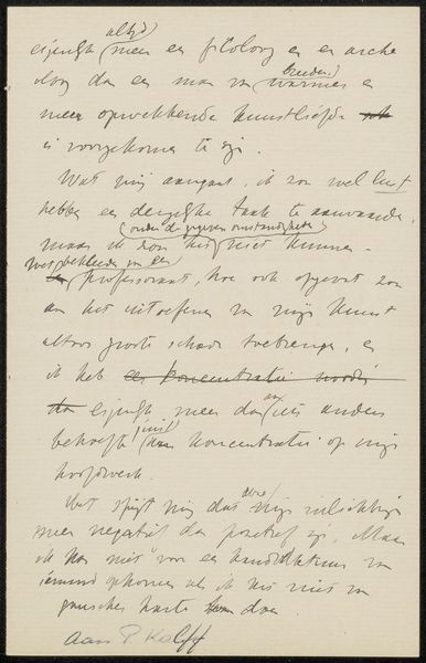
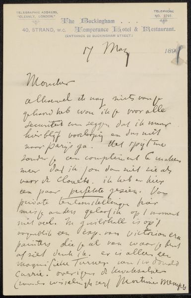
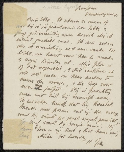
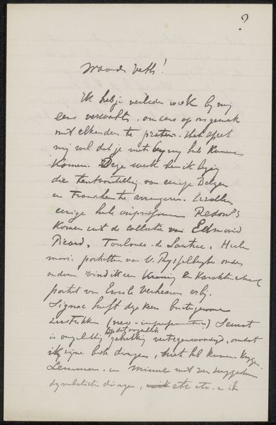
Curator: Here we have a glimpse into the correspondence of Grada Hermina Marius, with her piece "Brief aan Philip Zilcken," dating from before 1902. It appears to be executed in pen and ink on paper. It immediately strikes me as intimate. The handwriting gives it such a personal feel. Editor: Absolutely. There's a rawness here, an unfiltered quality to the hand-lettering that I find compelling. It feels like peeking into a private moment. Do you find that intimacy translates to insight on the role of artists in Dutch society at the time, given it's a letter? Curator: Yes, this letter could shed light on artistic networks and communication channels of the time, which definitely could provide more cultural and social context. Editor: Beyond the content of the letter, I am quite fascinated by the symbolic choice to present words themselves as art, isn’t that intriguing? Curator: Indeed. Marius consciously elevates a casual form of communication to art. What is equally remarkable is that her calligraphic style reinforces the content of the letter: it's not only what she says, but how she says it, which evokes feelings of reflection, nostalgia and even a certain moodiness characteristic of the fin de siècle. The words become an echo of her state of mind. Editor: I see that the choice to work with her own script might have functioned as a tool of self-expression but at the same time a tool of promotion since correspondence among artists, critics, and dealers certainly facilitated the development of art careers and trends at the time. It provides unique insights into social interactions, perhaps artistic collaborations and intellectual exchanges. Curator: Agreed. And if we knew more about Zilcken’s role in her life, it could offer greater context around her position and perhaps a way to consider the gendered aspects of the Dutch art scene in the late 19th century. What do you make of the density of text, its spatial relationship with the void space? Editor: The handwritten aspect lends it such an aura of the immediate—a connection to the individual which you don't get with typography. To me, the density creates an intense focus on her intent, though much is lost in translation without an accurate reading of the language she uses. Still, there’s something very affecting here. Curator: Precisely. "Brief aan Philip Zilcken" reveals the beauty of communication itself. Through handwritten correspondence she makes what might be seen as trivial, sublime.
Comments
No comments
Be the first to comment and join the conversation on the ultimate creative platform.
More like this