Copyright: Public domain US
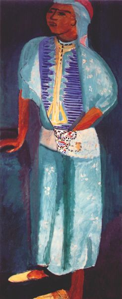
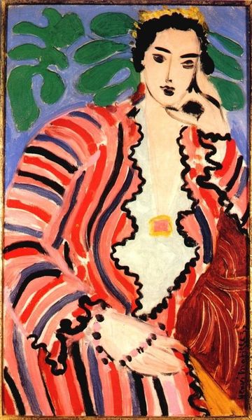
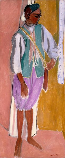
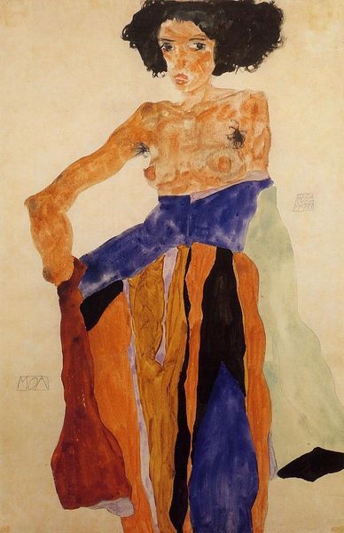
Editor: Here we have Henri Matisse’s “Zorah Standing,” painted in 1912 using oil and gouache. It’s a rather striking portrait. The use of color is so bold and the figure is so stylized. What do you see in this piece? Curator: Formally, I am struck by Matisse’s use of simplification. Notice how he reduces the figure to essential lines and planes. The tension between the flatness of the picture plane and the illusion of three-dimensionality is also quite compelling. What do you make of the relationship between the figure and the ground? Editor: I notice that the red background really makes the blue of the robe pop. It seems like he's flattened the space, pushing the figure forward. Do you think that emphasis on color and flatness is typical of his work from this period? Curator: Indeed. During this period, Matisse was heavily engaged with the Fauvist principles of using arbitrary color to express emotion and structure form. Consider the brushstrokes themselves; they’re quite visible, aren’t they? They serve to remind us of the materiality of the paint and the act of creation. Do you see any areas where the application of paint seems particularly expressive? Editor: The yellow around the waist is interesting – it’s almost carelessly applied. Is it common to see that kind of seemingly unfinished quality in Matisse’s portraits? Curator: In some of his works, yes. It highlights a focus on the process rather than a pursuit of photorealistic representation. It encourages a focus on purely visual qualities rather than narrative. How do you feel about the balance of these visual choices? Editor: I find it refreshing, actually! It's less about capturing likeness and more about experimenting with form and color. I’m seeing more in his paintings every time I revisit them. Curator: Indeed, and I too find myself continuing to explore its intriguing arrangement of line, color, and form.
Comments
No comments
Be the first to comment and join the conversation on the ultimate creative platform.