Copyright: Peter Max,Fair Use
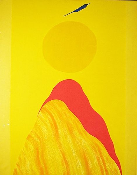
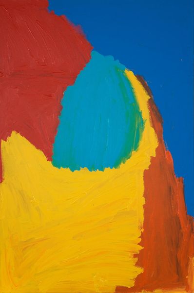
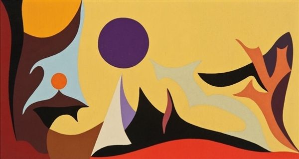
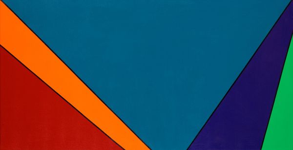
This is ‘Closer to God’ by Peter Max. What I really get from this piece is the process of it. The way the colors are so vibrant and flat, it gives the impression of something almost printed, like it was made mechanically. But then, looking closer, you see that this isn’t a print, it’s a painting! The yellow is thickly applied, a kind of viscous material. It’s amazing, the way he lays down these big blocks of color. He must’ve used some seriously wide brushes to keep it so flat. I love how it becomes about the physicality of laying down the paint itself. That mountain is so smooth, but the little mark at the top of the mountain is so suggestive. It could be a person. That single mark opens up the whole thing, making me think about scale and being in nature. Max makes me think of Alex Katz, another artist using flat expanses of colour and bold graphic forms. You can get lost in all that colour; it’s a real trip.
Comments
No comments
Be the first to comment and join the conversation on the ultimate creative platform.
More like this