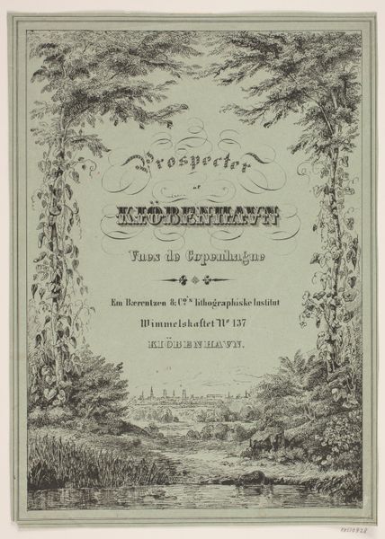
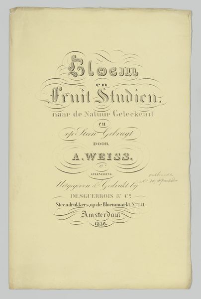
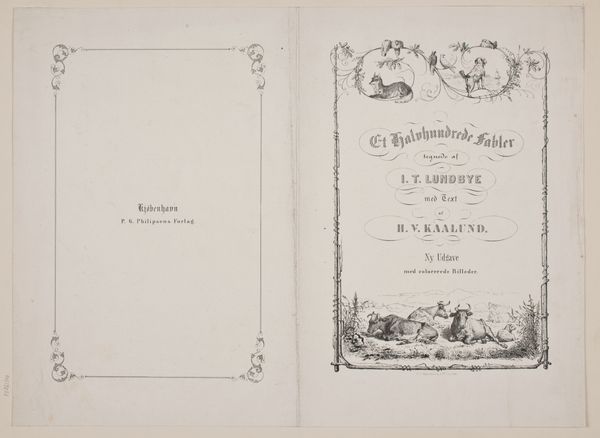
graphic-art, print, paper, typography, engraving
#
graphic-art
#
neoclacissism
#
aged paper
#
parchment
#
branded good
# print
#
old engraving style
#
hand drawn type
#
paper
#
typography
#
yellow element
#
warm-toned
#
handwritten font
#
golden font
#
word imagery
#
engraving
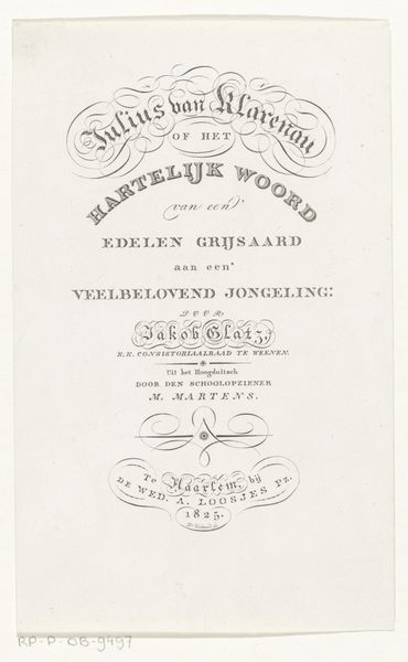
Dimensions: height 237 mm, width 142 mm
Copyright: Rijks Museum: Open Domain
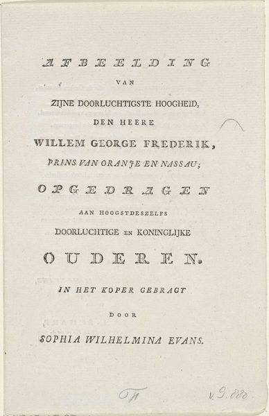
This is the title page for Jakob Glatz’s "Godsdienstig Handboek", created in 1816 by an anonymous artist. The visual experience is dominated by elegant typography meticulously arranged on the page. The use of script and serif fonts evokes a sense of formality and tradition, yet the composition also emphasizes a clear structural organization. Notice how the artist uses font size and style to create a visual hierarchy. The title is grand and ornate, drawing the eye, while subsequent lines are more subdued, guiding us through the text. The delicate embellishments and flourishes around key phrases create a sense of visual rhythm, balancing the rigidity of the letterforms. The very structure of the page becomes a semiotic device, communicating order and authority, reflecting the book's purpose as a religious guide. This title page is not merely a label; it is a carefully constructed visual argument, inviting the reader into a world of established meanings and values.
Comments
No comments
Be the first to comment and join the conversation on the ultimate creative platform.
More like this