print, engraving
#
baroque
# print
#
cityscape
#
history-painting
#
engraving
Dimensions: height 174 mm, width 284 mm
Copyright: Rijks Museum: Open Domain
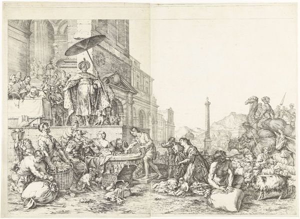
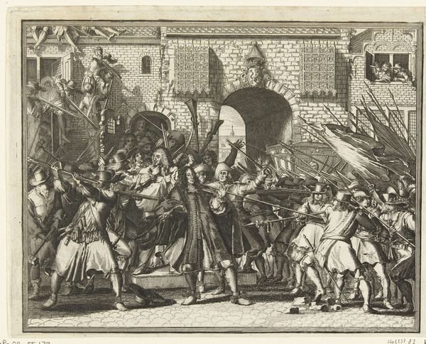
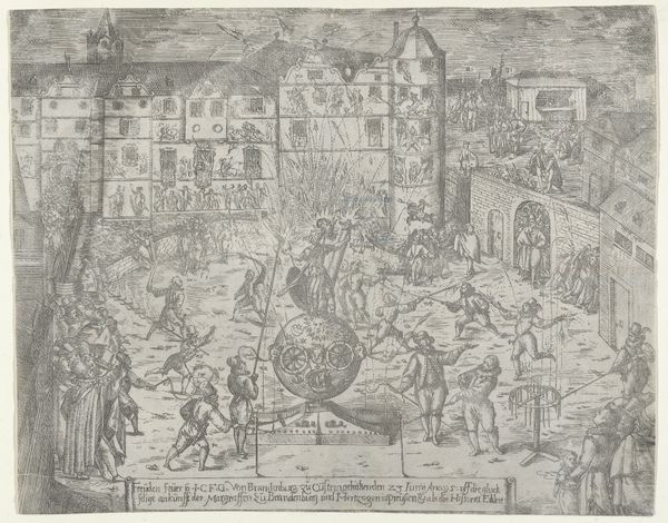
Curator: So, what catches your eye first about this piece? It's called "Allegory on the Admiralties" and it was etched by Romeyn de Hooghe sometime between 1705 and 1707. Quite a mouthful, right? It's here at the Rijksmuseum. Editor: I am immediately struck by its controlled chaos. A whirlwind frozen in ink. A whole city, a whole narrative contained in these precise lines. Almost like a perfectly organized fever dream! Curator: Yes, "organized fever dream" sums up De Hooghe perfectly! Look at how he uses the architecture. Those almost severe, regimented lines and angles contrast beautifully with the frenzy of activity unfolding below. There’s this tension between order and…well, delicious disorder. Editor: The foreground buzzes with bodies—figures hauling, gesturing, practically vibrating off the print. The semiotics of labor—sweat and effort. Are we meant to focus on this, or are we supposed to see a portrait of the idealized virtues that upheld Dutch maritime power at the time? Curator: It’s doing a bit of both, isn't it? It serves as a visual reminder of what went into their naval prowess, but it's also laying it on thick with symbolism, meant to impress. This piece depicts more than the fleet; De Hooghe's included symbols to show strength, vigilance, prosperity... that kind of thing. You have the cannons, of course, but also this grand, embellished structure behind all the people – it says “Pugno Pro Patria” – “I Fight for the Fatherland”. Editor: That emblem practically screams Baroque exuberance. But the real magic for me resides in that contrast again. Between the solid declaration above and the roiling dynamism below. The interplay between that which claims to embody stability and those bodies in relentless action makes you ask: where does the power really lie? Curator: And the etching technique emphasizes it further. Each line feels deliberate and calculated and yet the final image exudes a vibrancy that feels spontaneous and almost reckless. A narrative captured not in broad strokes, but a million tiny calculated movements. Editor: So much to take in with this artwork; such a testament to this historical moment. You start to think about the role of printmaking at the time. Curator: Right? Think of how widely distributed this would have been and how easily it visually communicated the aspirations and anxieties of an entire society through allegories! That’s powerful. Editor: Powerful indeed. Every detail contributing to the grand statement, and still prompting these questions. It’s art that demands, and rewards, close looking.
Comments
No comments
Be the first to comment and join the conversation on the ultimate creative platform.
More like this