painting, oil-paint
#
painting
#
street view
#
oil-paint
#
oil painting
#
cityscape
#
genre-painting
#
regionalism
#
realism
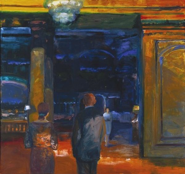
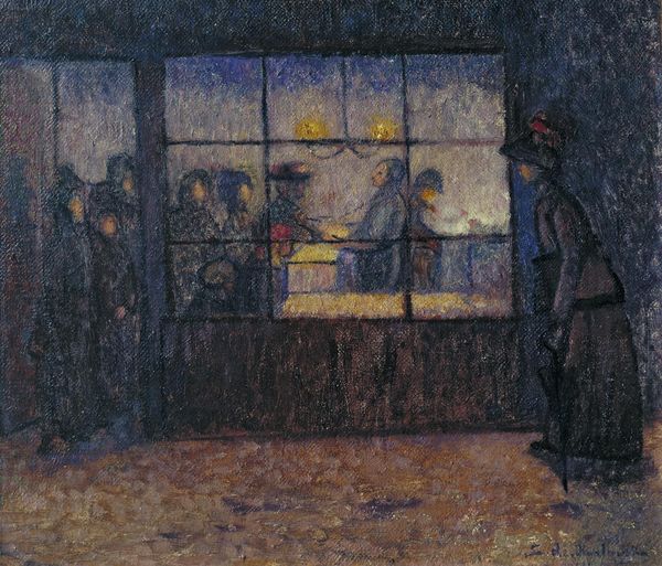
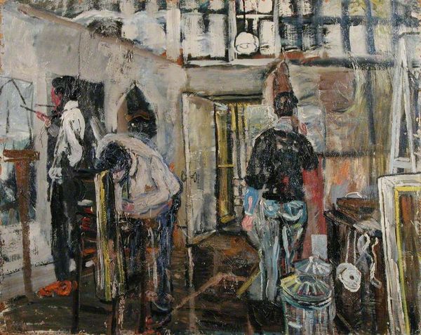
Copyright: Mark Rothko,Fair Use
Editor: So, here we have Mark Rothko's "Entrance to Subway" from 1938, done in oil paint. There's something incredibly stark about the geometry of the scene, those cold blues, and how the figures almost blend into the architectural structure. What strikes you most when you look at it? Curator: The initial impact arises from Rothko's handling of form and color. Note the pronounced verticals—columns and railings—which divide the pictorial space, creating a grid-like composition. The limited palette— primarily blues, yellows, and purples—serves not to mimic reality but to construct a chromatic architecture. Consider the reciprocity between the vertical and horizontal elements: does this framework amplify the figures' alienation? Editor: That’s a good question. It's interesting how you focus on the visual structure. I hadn’t really thought about the interplay of verticals and horizontals so deliberately, but it is such a dominating component. Curator: Indeed. Consider the function of the painted surface itself. The visible brushstrokes, the subtle layering of color: these are not mere descriptive tools but essential components of the artwork's formal language. How does the materiality of the paint contribute to the overall effect? Editor: I see how the application of paint, almost blurring the edges, contributes to that feeling of anonymity... almost like they're becoming part of the subway itself. This has given me a lot to think about, especially about the expressive power of something as basic as verticals and horizontals. Curator: Precisely. It reveals how seemingly simple elements, when carefully orchestrated, can articulate profound statements. Analyzing it solely as visual components highlights a controlled aesthetic.
Comments
No comments
Be the first to comment and join the conversation on the ultimate creative platform.
More like this