Dimensions: image: 4 7/8 x 9 7/16 in. (12.4 x 23.9 cm)
Copyright: Public Domain
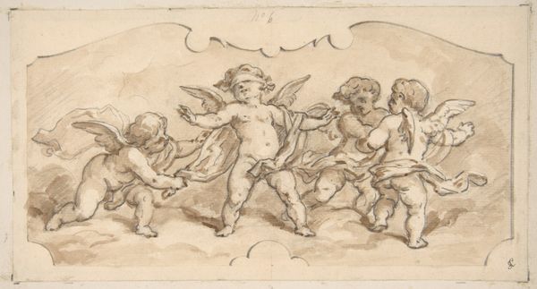
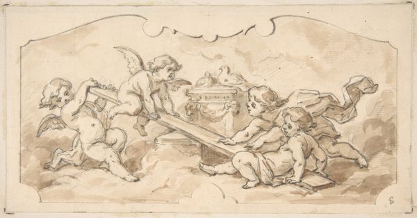
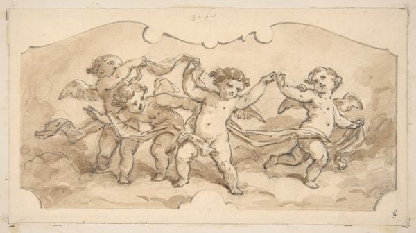
Editor: So this drawing, "Design of putti at play" by Jules-Edmond-Charles Lachaise, made with ink on paper sometime between 1850 and 1900, depicts these playful cherubs. I’m really drawn to the dynamic composition – it's quite charming, almost like a snapshot of a fleeting moment. What stands out to you? Curator: The composition is indeed noteworthy. Note the careful arrangement of the putti – how their forms, and the objects they interact with, create vectors within the frame. The eye is led from the cupid drawing on the left, across to the figure shooting an arrow. Consider also the tonal range, masterfully manipulated to create depth and volume with limited washes of ink. Editor: You're right; the depth is impressive given the limited palette. I also noticed the variety of poses – some are active, others more contemplative. Curator: Precisely. Lachaise demonstrates considerable skill in rendering the human form, imbuing each figure with its distinct character and role within the overall design. This exemplifies the Rococo aesthetic – ornamental but also grounded in acute observation. Do you see any further contrasts in the piece? Editor: Well, there’s the contrast between the sharp lines of the bows and arrows and the soft, almost blurry edges of the figures. It gives it a sense of movement, right? Curator: Yes, the tension between precise line work and diffused areas heightens the sense of dynamism and spontaneity characteristic of the Rococo. These features serve to guide our viewing and underscore the aesthetic priorities of that historical moment. Editor: That makes me appreciate how much detail is actually conveyed through so few lines and washes. Curator: It highlights the essence of drawing as a medium – the ability to capture form, space, and movement with incredible economy of means. I am reminded again of the efficiency and compositional strategy informing the artist’s hand in its arrangement of these allegorical forms. Editor: I'll definitely look more closely at the artist's choice of line and tone in other Rococo pieces we discuss!
Comments
No comments
Be the first to comment and join the conversation on the ultimate creative platform.
More like this