Copyright: Robert Indiana,Fair Use
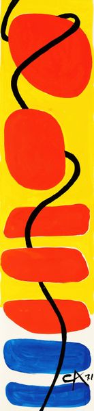
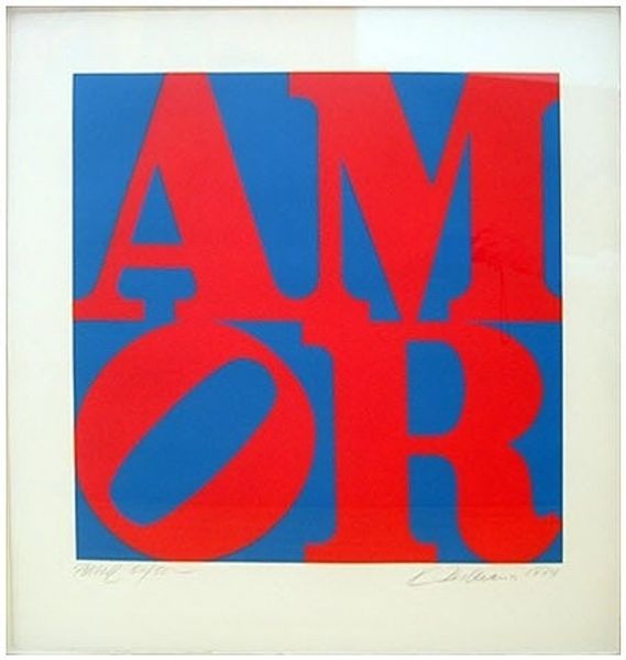
Robert Indiana made this ‘German Love’ print, featuring the word LOVE stacked with a tilted ‘O’, sometime during his career. It’s all about flat planes of color, bold shapes bumping up against each other to create a strong visual punch. There's a real sense of graphic clarity here, almost like a sign. The colors—red, yellow, and black—are so direct, no messing around with blending or shading. Notice how the black sits right next to the yellow, creating this visual vibration. That tilted ‘O’ is like a little hiccup in an otherwise very rigid structure, and it’s this that gives the piece its unique personality. Indiana often used words as images, turning language into something you can see and feel. Think about other artists who played with text, like Ed Ruscha, but there’s something so uniquely Indiana about this crisp and economical approach. It makes you wonder: what does "love" look like, and how can we make it visible?
Comments
No comments
Be the first to comment and join the conversation on the ultimate creative platform.
More like this