graphic-art, print, textile, typography
#
graphic-art
#
baroque
# print
#
textile
#
typography
Dimensions: height 219 mm, width 310 mm
Copyright: Rijks Museum: Open Domain
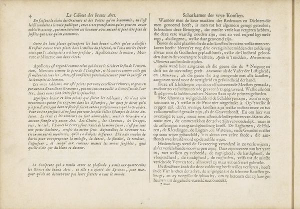
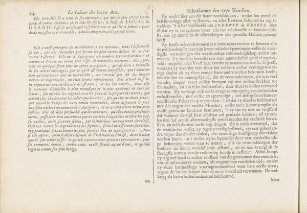
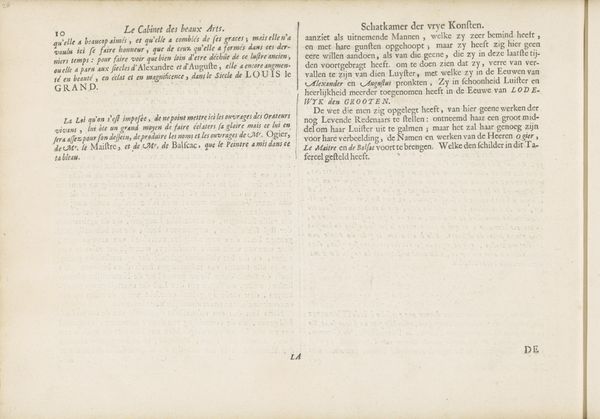
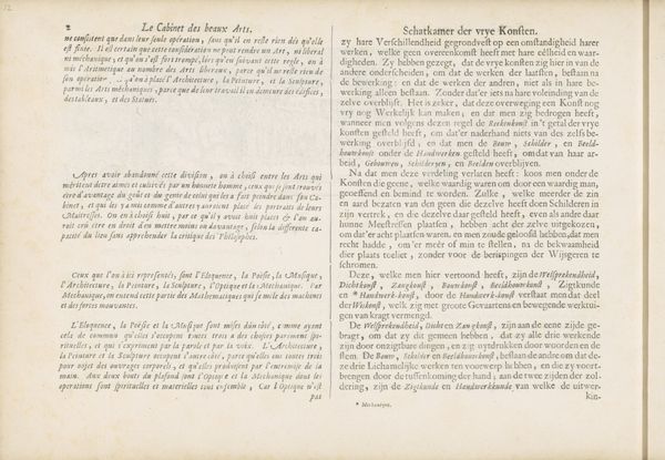
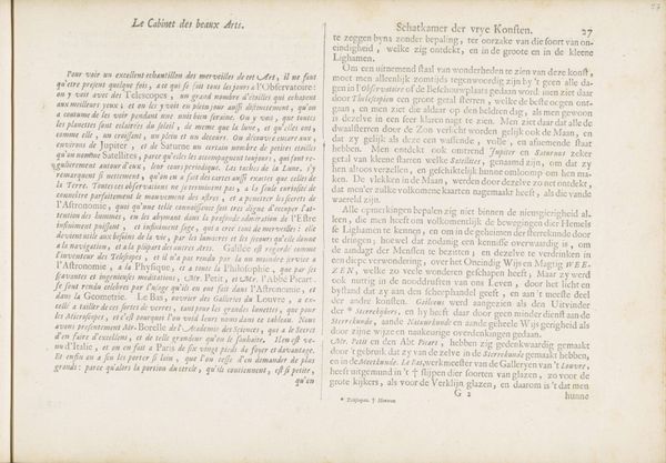
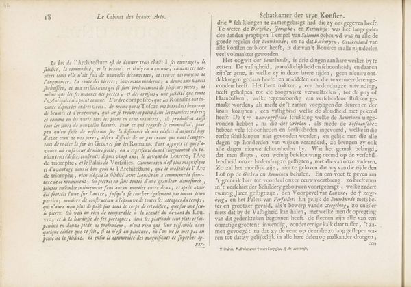
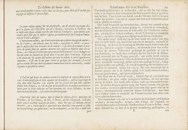
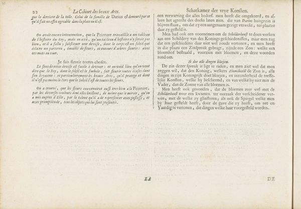
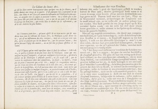
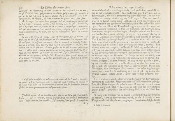
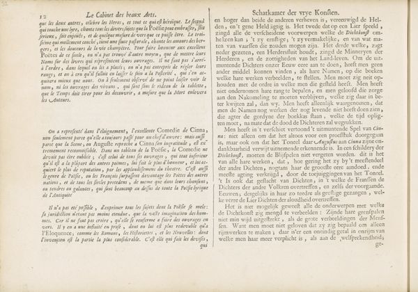
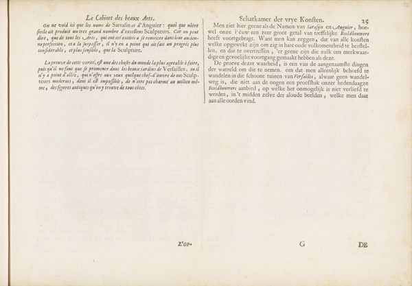
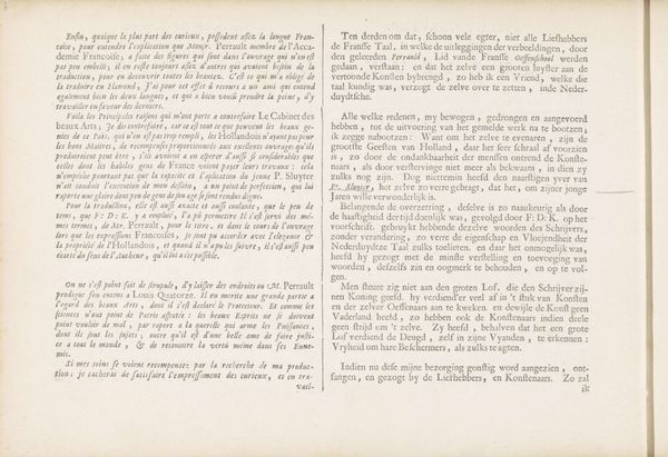
Curator: Formal qualities are primary here, the layout, the arrangement of the text blocks… these all create a distinct experience for the viewer. Editor: This is an engraved page from Charles Perrault's "Verklaring van de prenten" dating back to 1693, showcasing both Baroque style and textile elements through typography. The density of the text is initially intimidating. I find the sheer volume of words and the contrast between the columns kind of stark. What can we decode from this arrangement? Curator: Consider the balance. The artist divided the page into two textual columns. Each one mirroring the other. Observe how each column uses ornate language and complex sentence structures. Can you identify any specific Baroque conventions in play here? Editor: I see that the text is very dense. But it is organized; there are distinct paragraphs with clear topic sentences, right? This control imposed upon such a volume of information reminds me of Baroque's blend of ornamentation and rational structure. Curator: Precisely. It shows an interesting synthesis, that blending, one of elaborate display and intellectual ambition. The textile elements through typography serve as both a canvas for information and a visually stimulating medium. Do you feel the arrangement supports this tension, creating a framework or emphasizing disarray? Editor: I'd argue both. There's an ordered, symmetrical frame, and yet, within it, such complex layering of words generates movement and prevents the format from turning monotonous. It makes you want to linger longer, to sort of tease out particular passages and ponder upon the meanings underlying the artwork. Curator: Absolutely, I am glad that this approach allowed you to explore deeper levels of appreciation for this seemingly uninteresting engraving, that you connected with the Baroque in its fusion of detail and intellect. Editor: Me too, looking at it with just its elements gives a solid idea of the complexity in the simplest piece.
Comments
No comments
Be the first to comment and join the conversation on the ultimate creative platform.
