acrylic-paint
abstract painting
colour-field-painting
acrylic-paint
fluid art
acrylic on canvas
abstraction
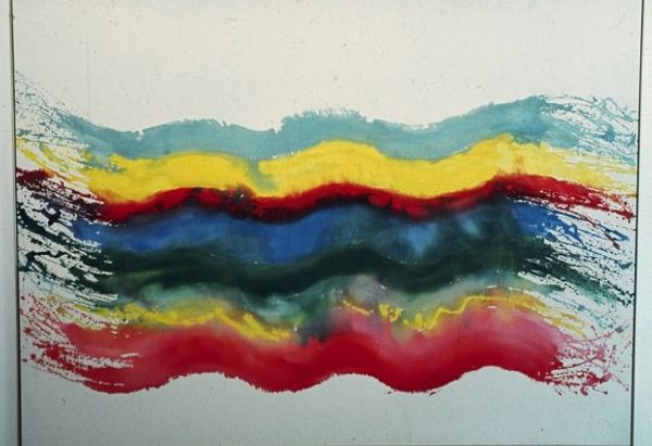
Copyright: Pat Lipsky,Fair Use
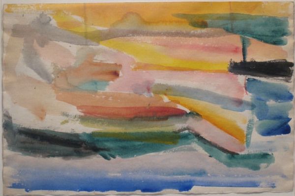
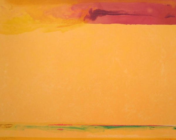
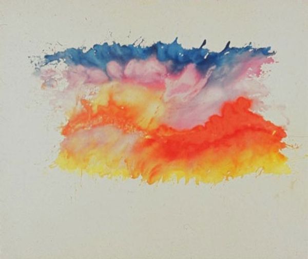
Editor: This is "White Space," painted by Pat Lipsky in 1969, using acrylic on canvas. I am struck by how the colours, while vibrant, also create a sense of depth. The layered application almost feels like geological strata. What stands out to you in terms of composition? Curator: The formal qualities are indeed quite striking. Consider the interplay of those vibrant hues you mentioned. Lipsky seems to be orchestrating a visual experience, almost a dialogue, between the saturated blocks of colour and the untouched canvas. Notice the horizontal arrangement – how does it affect your perception of the piece? Editor: It makes me think about landscapes, maybe even a horizon line, although it is not realistic at all. Does the title "White Space" refer to that blank space on the canvas? Curator: Precisely. That white space is not merely the absence of paint but an active element. Think of it as a negative space, a visual counterpoint to the density of the colours. The juxtaposition heightens the viewer's awareness of the painted surface itself. Note that the fluidity and the texture invite close scrutiny of the material properties of the paint and canvas. Editor: That's really interesting. So it is not just about the colours, but about the surface and materials? Curator: Absolutely. It encourages a formalist reading: investigating how the artwork constitutes its own reality. By focusing on shape, colour, texture and medium, Lipsky's "White Space" explores its unique pictorial structure. How has our conversation changed your initial understanding? Editor: It makes me appreciate that every choice, including leaving the canvas bare, is significant and contributes to the meaning of the piece. Curator: Indeed. Understanding the formal elements can deepen our engagement with art.
Comments
No comments
Be the first to comment and join the conversation on the ultimate creative platform.