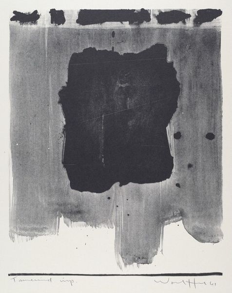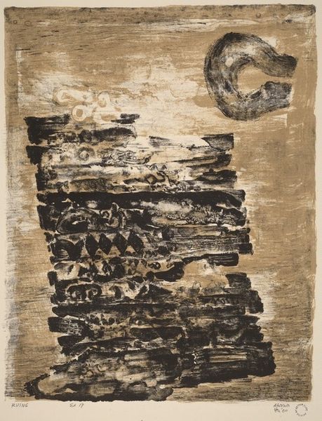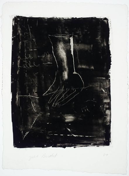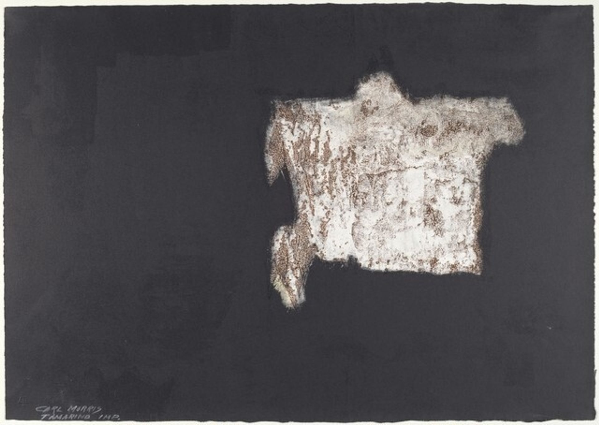
1962
Flight
Listen to curator's interpretation
Curatorial notes
Carl Morris made 'Flight' as a lithograph print, which means he was probably getting pretty physical with a stone, some grease, and acid! The stark contrast of the dark ink against the raw paper pulls me right in. I see that central form—is it a figure, a cloud, some kind of strange, hovering architecture? The texture is incredible; layers and layers of mark-making build a solid, almost crumbling presence. Look at the way the white ink seems to both sit on top and be embedded in the black, creating a surface that feels rough and tender at the same time. I'm reminded of the prints of someone like Robert Motherwell, or even some of the later Guston’s—that same sense of grappling with form, using the materials to carve out a space for feeling. 'Flight' isn't just about what we see, but how we feel the weight and lightness of the world.