graphic-art, print, typography, poster
#
graphic-art
#
aged paper
#
neoclassicism
# print
#
typeface
#
typography
#
fading type
#
stylized text
#
thick font
#
white font
#
handwritten font
#
classical type
#
poster
#
historical font
#
columned text
Dimensions: width 247 mm, height 192 mm
Copyright: Rijks Museum: Open Domain
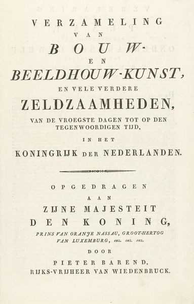
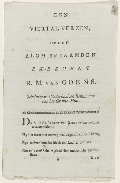
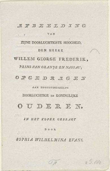
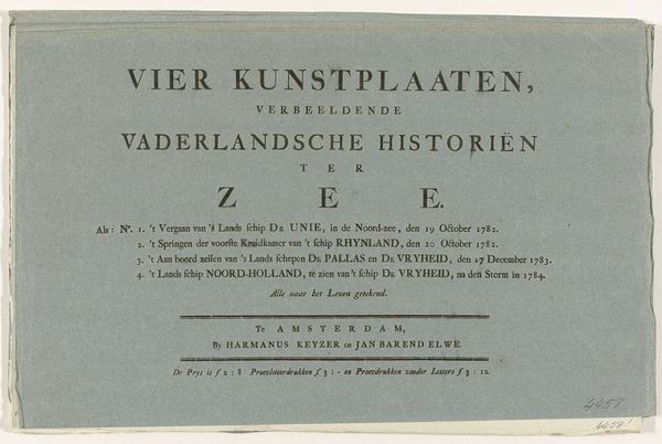
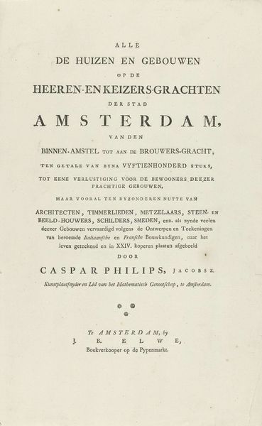
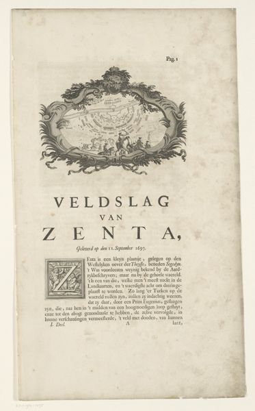
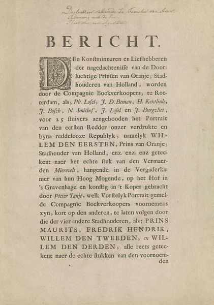
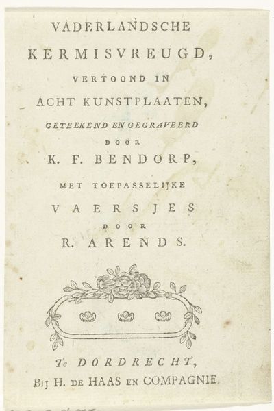
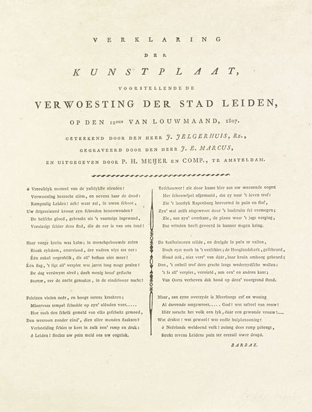
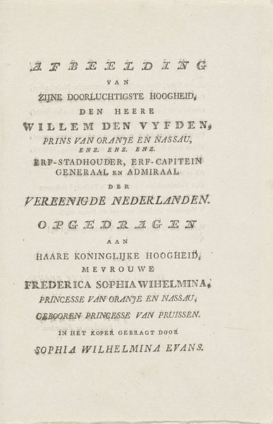
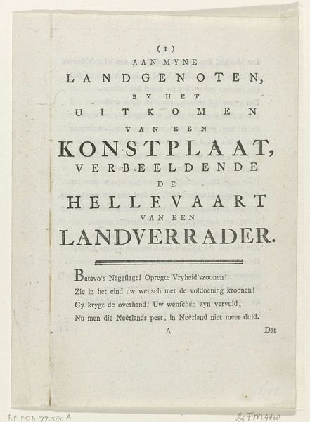
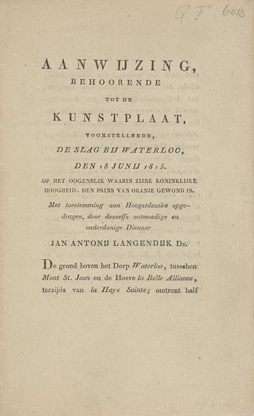
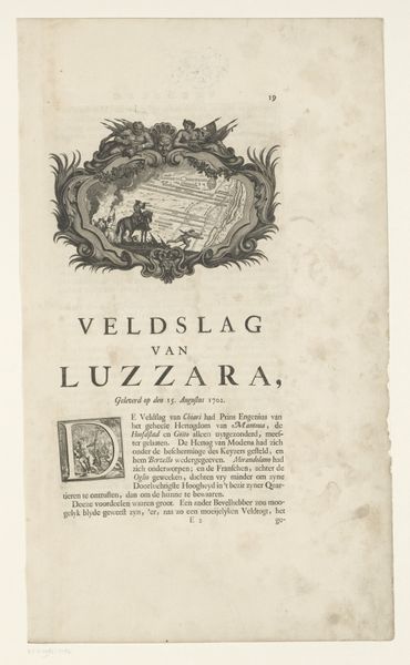
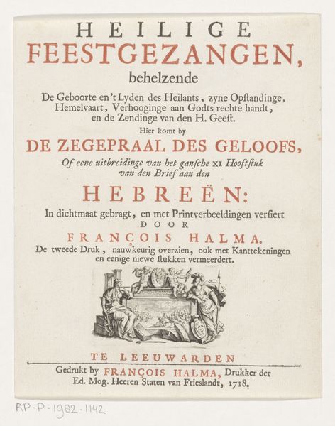
This is the title page for J.H. Campe's "De kleine zielkunde voor Kinderen," made in 1806. The design is dominated by a typographic structure, a grid-like arrangement of text that immediately establishes a sense of order and didactic intent. The choice of typeface and its spatial distribution on the page create a visual hierarchy. The title is broken into segments, each word isolated, almost atomized, across the space. The lack of conventional flow disrupts habitual reading patterns. The texture of the paper and the muted ink give the piece a tactile quality, grounding its intellectual content in a physical reality. This interplay between the abstract idea of 'soul-knowledge' and the material presence of the page underscores a semiotic function: the design doesn't just present information, it performs a process of instruction, of visually breaking down knowledge for a young audience. The formal constraints imposed by the layout challenge our perception of textual space. Text isn't just a carrier of meaning but an active participant in the construction of knowledge.
Comments
No comments
Be the first to comment and join the conversation on the ultimate creative platform.
