painting, acrylic-paint
#
painting
#
pattern
#
op art
#
pop art
#
colour-field-painting
#
acrylic-paint
#
geometric
#
abstraction
#
pop-art
#
line
#
hard-edge-painting
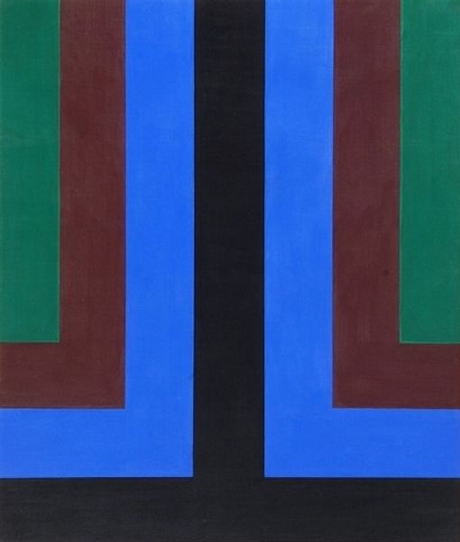
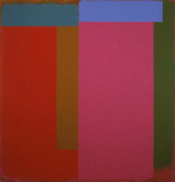
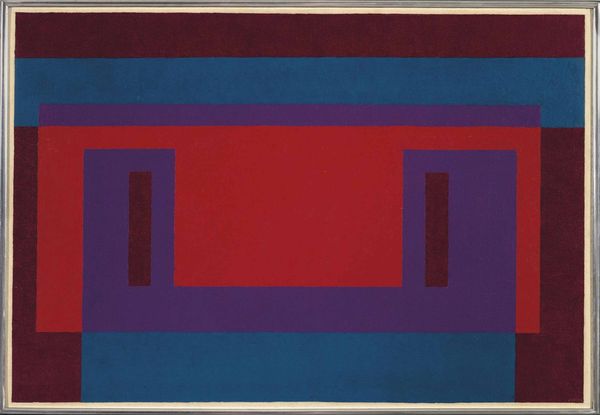
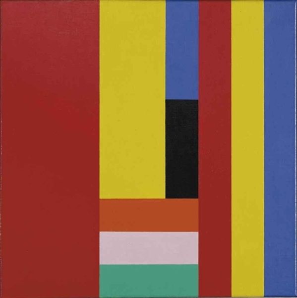
Dimensions: 201 x 172.6 cm
Copyright: Howard Mehring,Fair Use
Curator: This is "Triple Double" painted in 1964 by Howard Mehring, a significant piece of hard-edge painting rendered with acrylic on canvas, now residing at the Smithsonian American Art Museum. Editor: My initial impression is a fascinating push-and-pull. The bright, bold colours lock together like perfectly fitted building blocks, and I'm getting a very strong sense of clean, unwavering lines defining each colour plane. Curator: Precisely. Note the interplay of these hard-edged geometric shapes—how red frames green, which in turn frames a central core of pink and blue. The painting engages with notions of space and perspective by suggesting the Russian Matryoshka doll with lines creating a feeling of containment. Does it evoke anything to you? Editor: I see it in terms of visual balance and counterpoint. The hard edges and saturated colour palette contribute to this quality. And with colour field painting, there’s definitely an aspect of paring down the essence of painting. Curator: Yet, this is so different from, say, Rothko’s colour fields which, in comparison, look infinite! In Mehring's painting, I wonder, are those colours purely arbitrary, or does their interplay speak to some emotional or cultural memory? Is this choice related to colour use within mid-century advertisements? Editor: I think Mehring really invites us to concentrate on those relationships as purely visual phenomena, and what's so amazing is how the spatial depth arises purely from colour contrast and not with brushwork! The smooth finish encourages this perceptual focus. Curator: Perhaps the pop art associations, particularly, indicate an intent on the artist’s part to connect to accessible motifs! Consider its connection to Op Art trends— the potential for optical illusions is latent, yet the visual structure thwarts complete sensory immersion. Editor: Agreed, it certainly treads the line! What is ultimately so satisfying is how those nested geometric configurations result in dynamic tensions, holding our attention within a tight composition. Curator: For me, its graphic language speaks powerfully. Its bright color harmonies take me back to the color sense and design principles of 1960s textile design. Editor: In short, a vibrant piece worthy of slow consideration given its seeming simplicity!
Comments
No comments
Be the first to comment and join the conversation on the ultimate creative platform.
More like this