drawing, print, paper, ink, engraving
drawing
rippled sketch texture
medieval
pen drawing
old engraving style
paper
ink line art
ink
geometric
pen-ink sketch
intricate pattern
line
pen work
coloring book page
engraving
doodle art
intricate and detailed
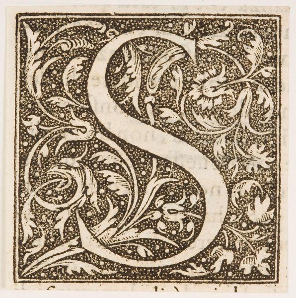
Dimensions: height 54 mm, width 54 mm
Copyright: Rijks Museum: Open Domain
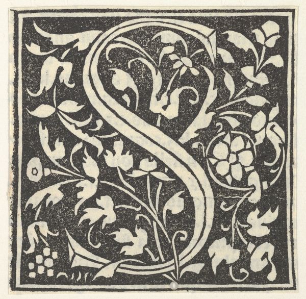
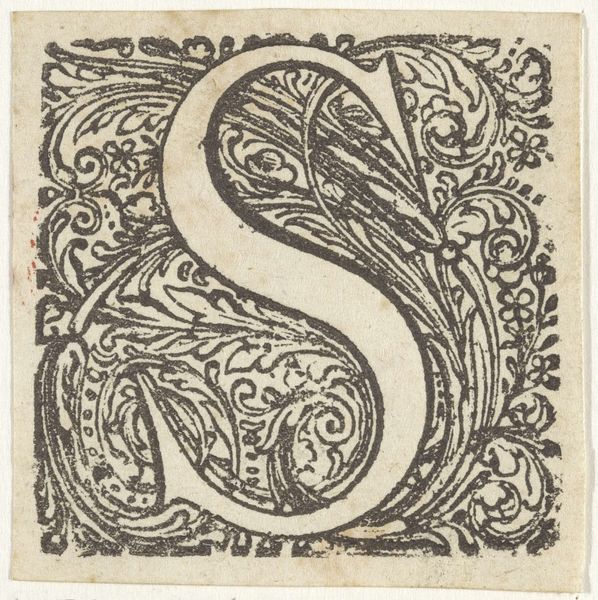
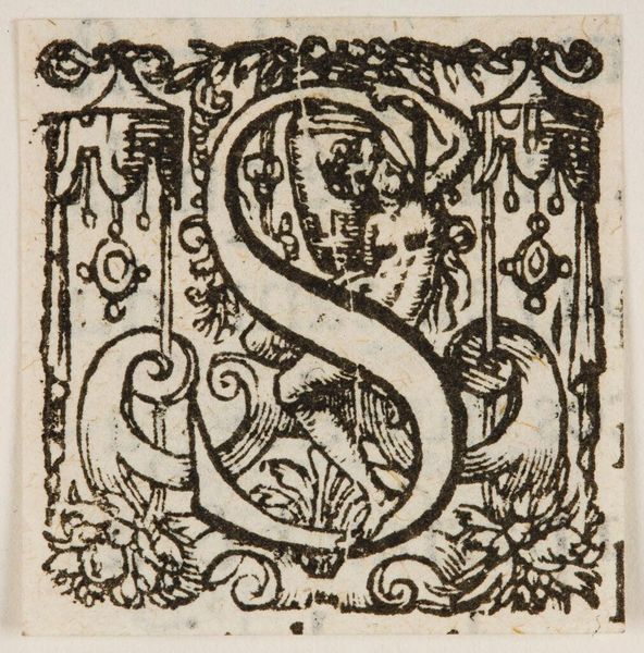
Curator: Here we have an engraving from the 17th century, an ornate rendering of the letter "S". It's titled "Letter S in een geornamenteerde omlijsting" and the artist is, alas, anonymous. Editor: It feels… contained. The embellishments are exquisite, but the rigid frame around them gives it this sense of visual constraint, a tension between freedom of expression and societal expectation. Curator: Interesting observation. Consider that the letter itself is a symbol, carrying meaning both literal and perhaps spiritual. Throughout history, illuminated letters, like this 'S', weren't merely decorative. They marked important passages, acting as gateways into sacred texts or significant documents. They are like decorated entryways into meaningful text. Editor: And who held the keys to those gateways? Often, religious or political elites. So while the intricacy is beautiful, I wonder about accessibility. Did this beautification serve to elevate the text or obscure it for the masses, reserving its understanding for a select few? The curves and frills, they create a certain sense of gatekeeping, even. Curator: That’s a provocative thought. Perhaps the artist was playing with those very ideas—hiding knowledge within plain sight through complexity. The letter is central and clear, while the frame offers the depth to inspire thought and curiosity about context. Editor: Precisely! What does that ‘S’ stand for? Who commissioned this piece and for what purpose? The anonymity, it just amplifies these questions. It is important to remind ourselves to look beyond pure aesthetics. Who held the quill or printing press creating this piece? Who would have had the capacity to possess or share this type of ornamentation? These patterns were only for a limited population during this time. Curator: The symbolism feels intentionally veiled, sparking contemplation rather than offering easy answers. It seems that whoever designed the piece created a rich narrative, even in just a single letter. Editor: Absolutely, it forces us to consider the broader cultural and political contexts within which such art was produced.
Comments
No comments
Be the first to comment and join the conversation on the ultimate creative platform.