Copyright: Banksy,Fair Use
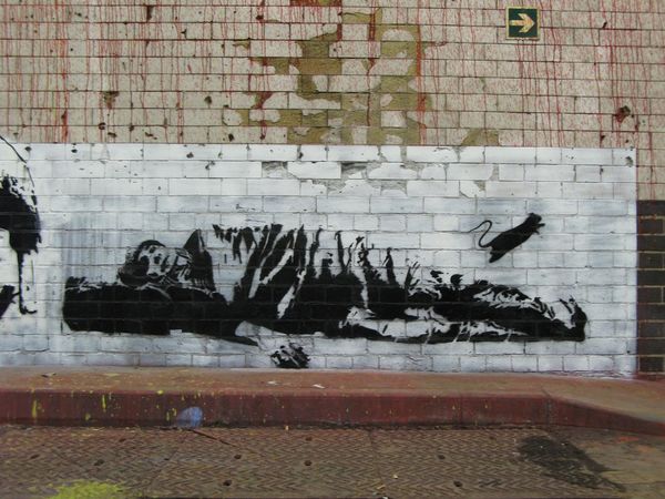
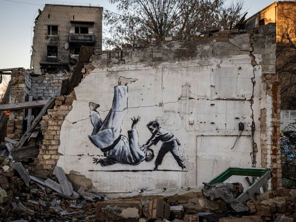
Editor: Here we have Banksy's "Bethlehem," created in 2005 using acrylic paint in the public sphere. It's arresting. The stark contrast between the playful beach scene and the imposing concrete wall really stands out. How do you interpret this work? Curator: Formally, the work utilizes a striking juxtaposition of representational styles. Below the trompe l'oeil "breach" revealing a tropical paradise, we find stencil-like figures. This contrast creates a visual tension. What effect do you think that dissonance is intended to create? Editor: It feels like an impossible choice. The idyllic scene is literally out of reach. The kids below look trapped or confined, longing to participate in this playful scene on the other side. Curator: Precisely. Banksy is creating a deliberate fracture in our perception. He forces us to confront the visual elements: the cool blues and greens of the beach versus the drab greys of the wall, the fluidity of the painted sky against the rigid geometry of the crack itself. Observe how that tension enhances the overall impact. Editor: I see it. The structural opposition emphasizes the symbolic meaning! What appears to be a simple image becomes so much more complex through formal construction. Curator: Indeed. Through this strategic deployment of contrasts in texture, color, and form, Banksy generates a compelling statement. Do you now see the relevance of applying formal analysis to deepen our insight? Editor: Absolutely. Looking beyond the immediate imagery reveals a sophisticated framework that amplifies the message. I had not previously considered those formal relationships. Thanks for shedding some light on that!
Comments
No comments
Be the first to comment and join the conversation on the ultimate creative platform.
More like this