Dimensions: height 116 mm, width 162 mm
Copyright: Rijks Museum: Open Domain
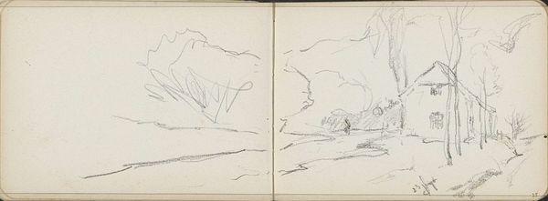
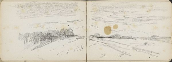
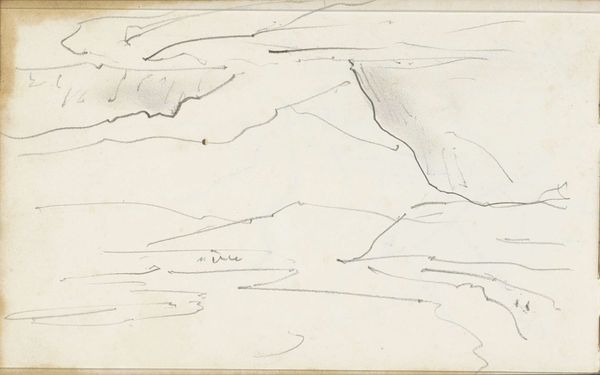
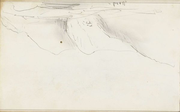
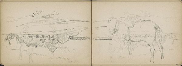
Editor: This is Willem Cornelis Rip's "Landschap" from 1905, created using pencil. It's a rather subtle sketch. I’m curious about the use of space and how the contrast between the densely filled area on the left and the sparser landscape on the right creates an interesting balance. What catches your eye in this work? Curator: The stark contrast certainly commands attention. Consider the economy of line; Rip masterfully suggests form with minimal strokes. Note how the hatching on the left establishes volume, contrasting with the planar treatment of the landscape on the right. Is it purely representational? Editor: I think so, maybe he was trying to capture a landscape. Curator: Perhaps, but observe the ambiguous nature of the forms. They verge on abstraction, disrupting a straightforward reading. Could the densely hatched area be read as a psychological weight, counterpoised against the relative lightness of the rendered "landscape?" Does the relationship change when seen through the formal language alone, of shape and contrast? Editor: Hmm, that’s an interesting way to put it, more as emotional forms. So, focusing on form over literal content kind of frees the piece up to be about other things? Curator: Precisely. The work prompts us to analyze its intrinsic elements. Are the lines merely descriptive or are they also expressive, operating almost independently? Editor: I see what you mean. I was so caught up in seeing it as just a simple landscape that I missed that! I think I have a better understanding of the abstraction element now and of the freedom you get through analysing these qualities. Curator: And I, from our brief dialogue, am once more aware of the compelling interplay between observation and conceptualisation in experiencing any art piece.
Comments
No comments
Be the first to comment and join the conversation on the ultimate creative platform.
More like this