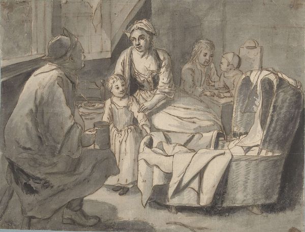
drawing, print, ink, pen
#
drawing
#
narrative-art
#
baroque
# print
#
pencil sketch
#
figuration
#
ink
#
pen
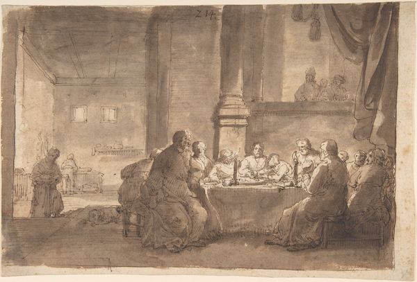
Dimensions: 7 11/16 x 11 1/2 in. (19.5 x 29.2 cm)
Copyright: Public Domain
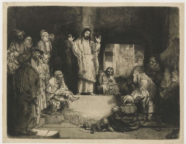
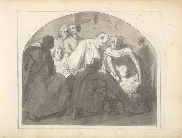
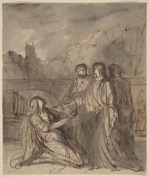
Curator: Philips Koninck gives us a scene from the Bible with his pen, ink, and pencil drawing "Last Supper," placing us right in the heart of the Metropolitan Museum of Art, dating it roughly to 1655 to 1660. It has such stark contrasts! What's your immediate take on it? Editor: Stark is the word! It’s raw, like a study almost. All this expressive mark-making creates this ghostly scene where the material really emphasizes that kind of spectral, liminal space. I immediately clock the economic investment--or rather, the lack thereof--that the piece calls forth. It begs the question, "Why commit a scene as culturally weighted as the Last Supper to such rudimentary tools? Is Konick being ironic?" Curator: Or maybe brutally honest? Koninck seems less interested in Baroque extravagance and more concerned with capturing the sheer, unsettling humanity of that moment. The way he uses the ink washes, it almost feels like we're seeing it through tears. Each stroke captures such anguish and raw emotional truth. I'm struck by that slumped figure. Editor: He really throws off the balance! And you're right; look at the labor it takes to translate this dramatic narrative moment to paper, how reliant it is on this quick yet considered technique, the build-up of layered applications. The dramatic spotlight that's put on Jesus… is that to indicate his inherent superiority, a divergence from his compatriots? Is he trying to make some kind of claim of production value, to create almost like a "rough draft" with the understanding it still carries merit? Curator: Maybe. Or maybe it's Koninck pointing to that moment of transformation—the calm before the storm, both literally and metaphorically. He isolates Jesus as if to suggest the disciples were simply not quite seeing the full picture. What stands out to me is the lack of… fanfare, I suppose? Editor: But it has to be intentional; all that stark materiality emphasizes class in a subtle, cunning way. The sketch almost feels as if it is incomplete or rough by design; and like Christ’s “humble” origins, it is elevated by its themes of sacrifice and piety to that upper echelon. But with less effort on Konick's behalf. And there are several iterations. You know, the gall! Curator: Ha! Well, whichever motivation was paramount for the artist, for me, the drawing captures a powerful narrative using surprisingly minimal means. Its sketch-like quality offers a rare glimpse into that moment. Editor: Agreed. This really makes one ponder labor, worth, intention and social messaging in art production.
Comments
No comments
Be the first to comment and join the conversation on the ultimate creative platform.
More like this