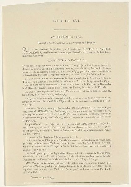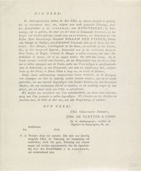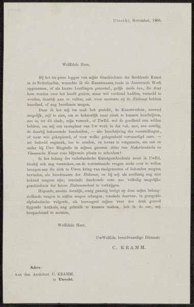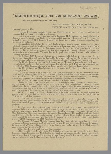
graphic-art, print, textile, paper, typography, poster
#
graphic-art
#
text not image
#
white text
# print
#
textile
#
paper
#
typography
#
sans-serif
#
poster
Dimensions: height 235 mm, width 150 mm
Copyright: Rijks Museum: Open Domain
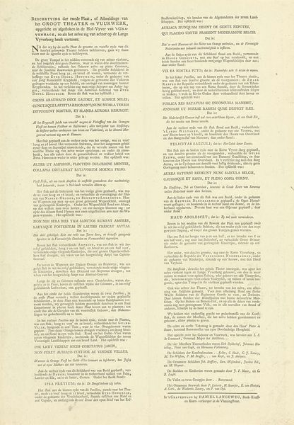
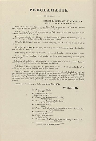
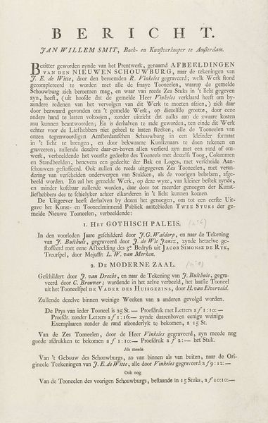
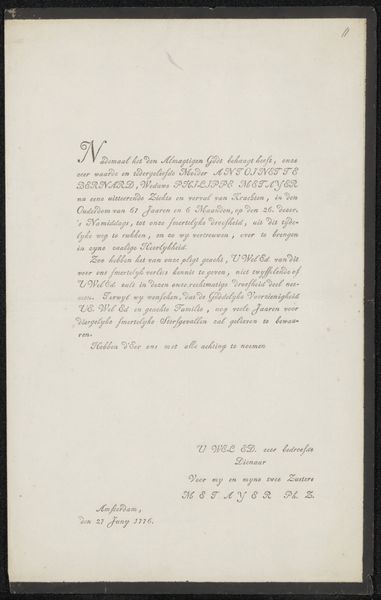
Editor: So, this poster, "Prospectus voor 'Twee uitgaven over het exlibris'" from 1954 by Wereldbibliotheek NV...it’s essentially an advertisement for two books on ex-libris, or bookplates. What strikes me is how much text there is, prioritizing information and order over a strong visual hook. It's like a classified ad, really. How do you interpret the purpose of this kind of poster in its historical context? Curator: Exactly! Think about the role of printed matter in the mid-20th century. This isn’t just advertising, it's a cultural announcement. Books, especially niche topics like ex-libris, relied on direct engagement with a specialized audience. Wereldbibliotheek N.V., the publisher, positions itself not just as a seller but as a facilitator of a certain kind of cultural capital. Editor: Cultural capital… can you expand on that? Curator: Absolutely. Collecting ex-libris signifies a certain level of taste, education, and social standing. By advertising these books, the publisher caters to and reinforces that demographic. The text listing international artists highlights a cosmopolitan, intellectual sphere. This poster acts as a social marker as much as an advertisement. Where would someone see this type of poster? Editor: Probably in bookstores or libraries? Somewhere accessible to readers of a certain type... Curator: Precisely! It's carefully placed to reach its intended audience, subtly reinforcing the link between book ownership, intellectual pursuits, and belonging to a specific cultural group. What else jumps out at you? Editor: Now that I'm thinking of it that way, I am noticing that even the sans-serif typography communicates modernity and efficiency, which are perhaps traits the publisher want to associate with their brand and readers. Curator: Well observed! Considering its social and historical context shifts how we understand such promotional art. Editor: I learned how to interpret an image based on who its consumers are. Thanks!
Comments
No comments
Be the first to comment and join the conversation on the ultimate creative platform.
