graphic-art, print, paper, typography, pencil
#
graphic-art
#
art-nouveau
#
narrative-art
#
ink painting
# print
#
figuration
#
paper
#
typography
#
folk-art
#
pencil
#
symbolism
Copyright: Public domain
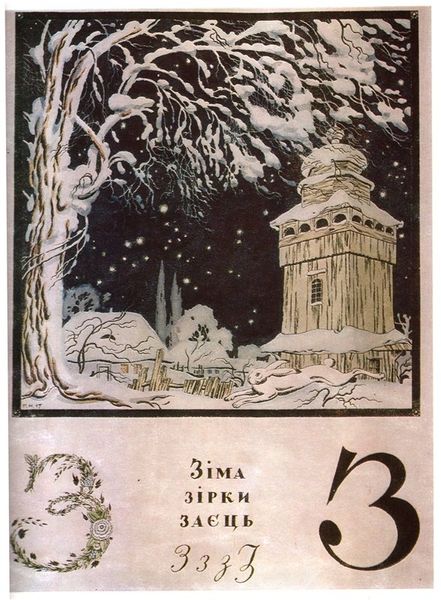
This is Heorhiy Narbut’s cover of the album, ‘Ukrainian Alphabet’, made in 1917. The design is really interesting, it’s like a stage set almost, a shallow space with lots happening in it. The pastel colours of the blocks with the letters and numbers contrast with the deep black silhouettes of the figures and trees behind. The surface is relatively flat, with a kind of overall evenness of tone, a bit like a poster. The blocks are like the basic building-blocks of language and visual expression, but they’re arranged in a way that feels unstable and a bit precarious, like a Jenga tower. Look at the black figure at the top, it looks like they’re about to topple the whole thing over. There’s a kind of fairytale quality to this image, it reminds me of the work of Paula Rego, maybe because of the slightly dark and unsettling imagery, or perhaps also because of the way it uses illustration to tell a story. Ultimately, the work is a reminder that art, like language, is always open to interpretation.
Comments
No comments
Be the first to comment and join the conversation on the ultimate creative platform.
More like this