photography, gelatin-silver-print
#
film photography
#
street-photography
#
photography
#
gelatin-silver-print
#
pop-art
#
cityscape
#
modernism
Dimensions: sheet: 25.2 x 20.2 cm (9 15/16 x 7 15/16 in.)
Copyright: National Gallery of Art: CC0 1.0
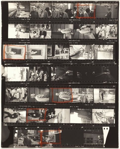
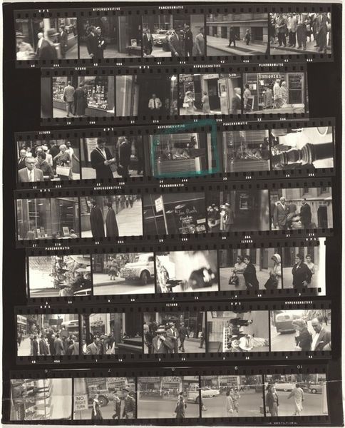
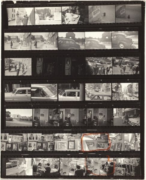
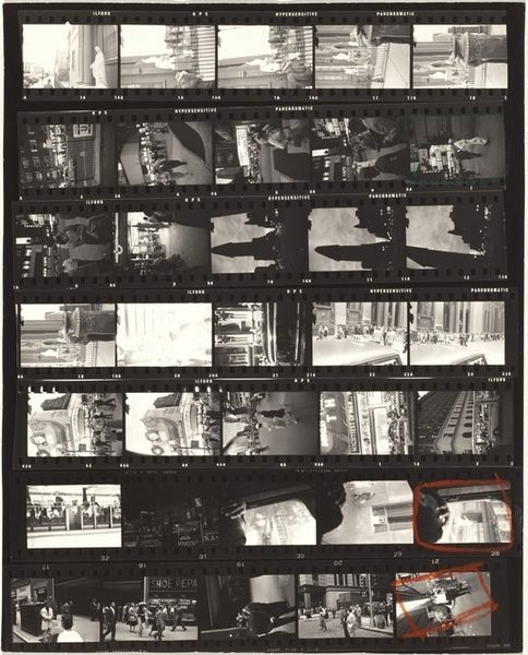
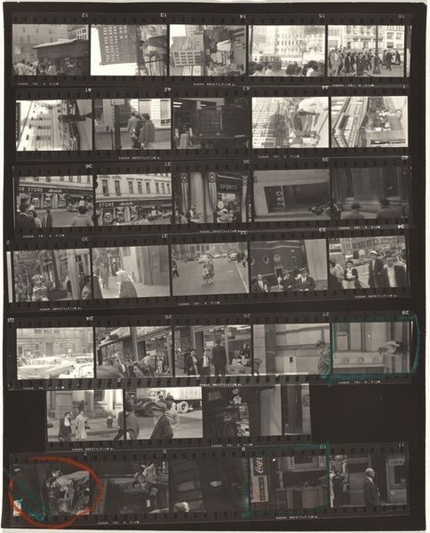
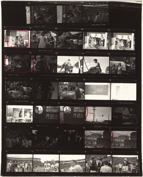
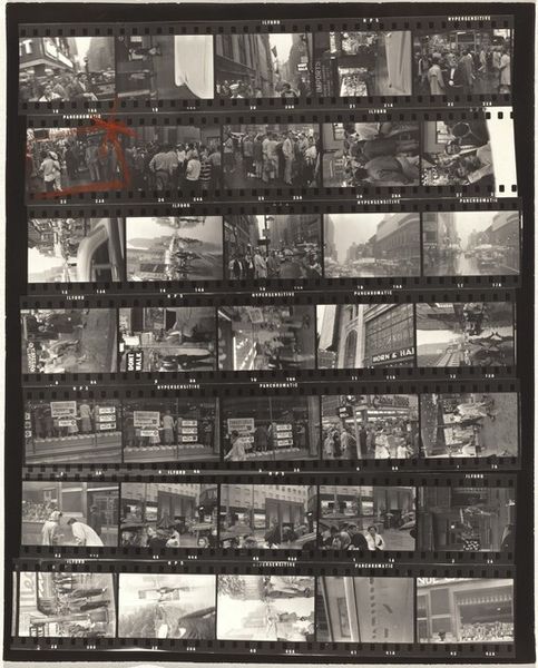
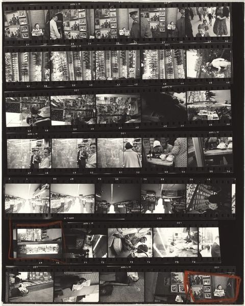
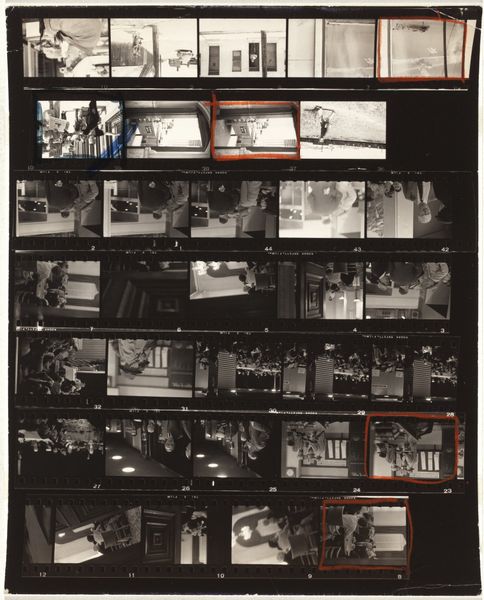
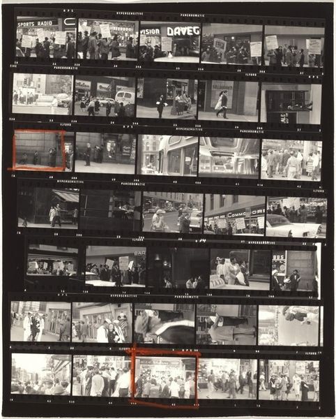
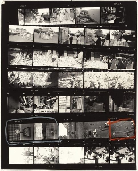
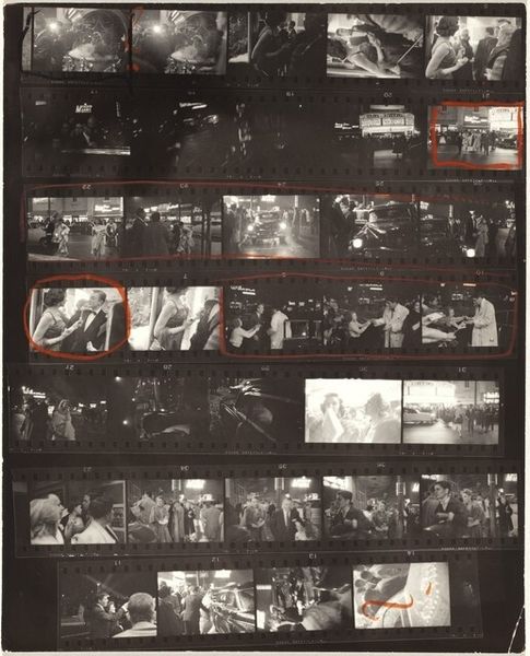
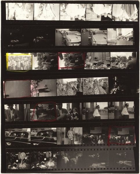
Curator: At first glance, it’s… a whisper of memories, a ghostly slide show flickering with mid-century Americana. Grainy, and somehow intimate, even though it’s documenting… commerce? Editor: Indeed. This gelatin-silver print, "Abercrombie & Fitch 2" by Robert Frank, dates from 1955 and showcases a contact sheet, offering us a raw, unedited view into Frank's photographic process. Curator: I love how he gives us all these fragmented scenes... like snippets of stories. Each tiny window into this opulent-looking store feels like a stage setting. Editor: The choice to present the entire contact sheet is fascinating. It challenges traditional notions of the "perfect" shot and highlights the often-overlooked labor and decision-making involved in photography. Considering the cultural context of 1950s America, the framing of Abercrombie & Fitch, then a symbol of elite sporting culture, opens conversations about wealth, privilege, and access. Curator: Totally. It's like he's peeking behind the polished façade, maybe hinting at the constructed nature of this "ideal" American lifestyle. And by not selecting one image, it leaves us wondering…what *is* the truth he’s chasing? Is there even one to be found in this sea of choices? Editor: The contact sheet becomes a narrative in itself. We're invited to consider which images resonate and why. Furthermore, Frank's focus on commercial spaces can be contextualized within debates around consumerism and social stratification. These images become tools to examine the relationship between commerce, identity, and social mobility. Curator: Right! It all boils down to seeing, really. I’m curious what the people of today and of the future might see in them. Like, if you look closely, you start noticing details… a hunting rifle display… then some blurred streetscapes outside the store. I wonder about Frank’s eye… I wonder how he thought he could weave all of this into some tapestry of contemporary social critique. Editor: Thinking about those nuances, and in closing, “Abercrombie & Fitch 2” is more than just a display of retail space, really—it becomes a lens to examine larger power dynamics. The multiple frames, a kind of raw, immediate archive, inviting us to ask how systems of privilege and representation truly function. Curator: Agreed. Frank seems to nudge us toward something deeper. To ask not just what we see, but what we *aren't* seeing, and who benefits from it all. That feels so... timely, even now.
Comments
No comments
Be the first to comment and join the conversation on the ultimate creative platform.
More like this