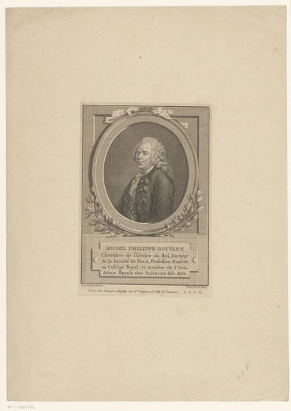
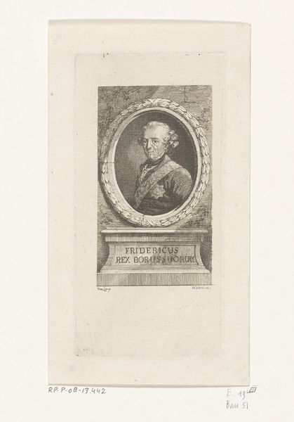
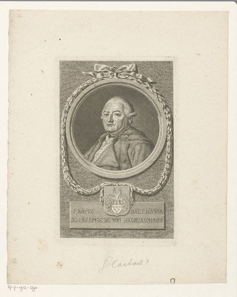
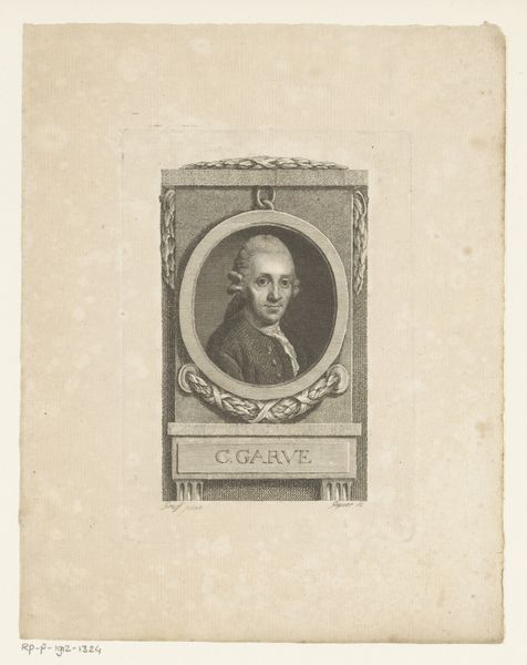
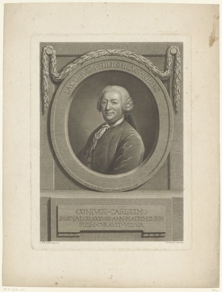
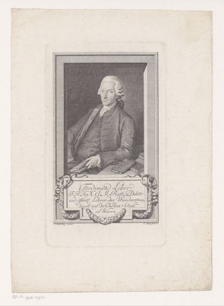
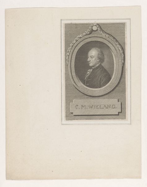
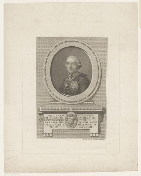
print, etching, engraving
#
portrait
#
neoclacissism
# print
#
etching
#
history-painting
#
engraving
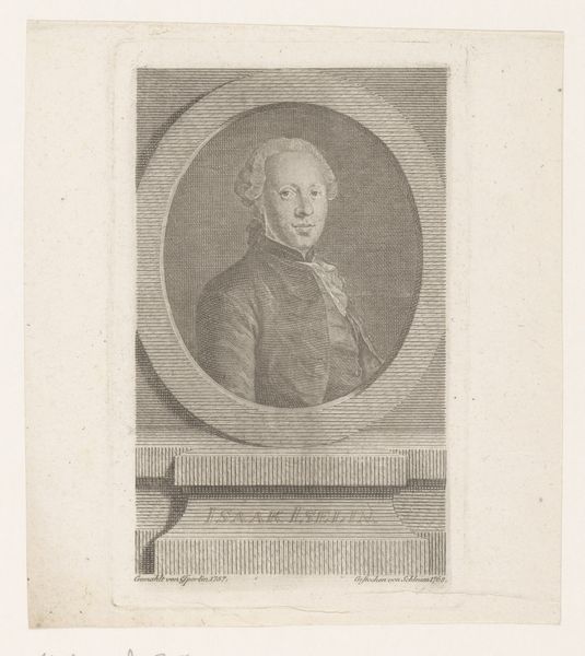
Dimensions: height 155 mm, width 96 mm
Copyright: Rijks Museum: Open Domain
Editor: This is Christian Gottlieb Geyser's "Portret van Justus Möser," made between 1754 and 1803, using etching and engraving techniques. I'm immediately struck by the balance and symmetry in the composition; the oval portrait seems carefully positioned. What catches your eye in terms of its formal qualities? Curator: The print’s effectiveness lies significantly in the contrasting textures achieved through etching and engraving. Note the delicate, almost ethereal quality of the face within the firm oval, against the grid texture achieved through the skillful convergence of parallel lines to depict form and shadow. The bow at the top softens the architectural rigidity suggested by the tablet bearing Möser's name. Editor: So it's not just about depicting the person, but about the relationship between the shapes and textures themselves? Curator: Precisely. Observe how Geyser uses line and tone to create depth and volume, leading the eye from the softly rendered face to the sharper details of the frame and inscription. This contrast highlights the subject's presence. Ask yourself, how would the impression change if these elements were rendered with uniform consistency? Editor: That's a good point. If the texture of his coat was more different from his face, it may detract attention away from it. I initially looked at it and thought it looked serious and stern because he isn't smiling. Curator: Indeed, it invites consideration of how visual cues work together to evoke specific feelings. Think of the formal frame almost as visual praise—raising the man up through design and execution. Editor: I never thought of that, so this print is really not only about Möser's image, but how Geyser made use of textures, tone, and depth. I will surely reflect on Geyser's other portraits in the collection.
Comments
No comments
Be the first to comment and join the conversation on the ultimate creative platform.
More like this