Curatorial notes
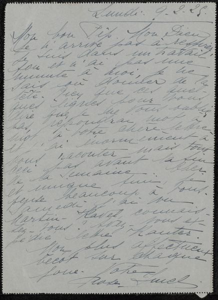
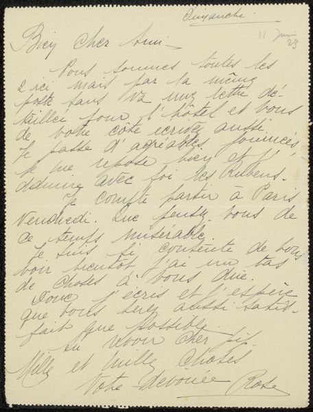
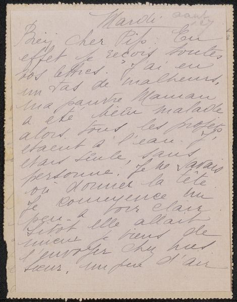
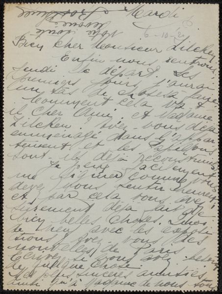
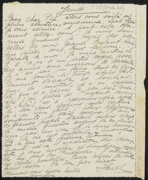
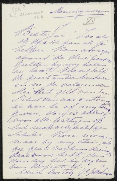
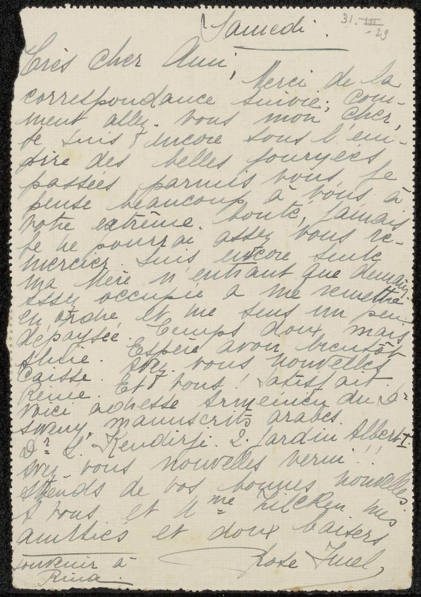
Editor: This is a letter entitled "Brief aan Philip Zilcken" by Rose Imel, sometime before 1923. It looks like ink on paper. It gives an intimate feeling. The flowy cursive almost resembles an abstract design in and of itself. What do you see in this piece, viewed through the lens of its intrinsic qualities? Curator: Precisely. Observe the balance between the density of the script and the open space of the paper, creating a textural contrast. Notice how the ascenders and descenders of the letters generate a rhythm across the page. It is fascinating to look beyond the words. Editor: That is a great way to think of it. It really does transform the writing into almost an art piece of its own. Does the consistency of the ink strokes indicate anything to you about the writing process itself? Curator: It seems very consistent in tone. This implies a focused execution. Further examination of the pressure and line thickness variation might provide insight into the speed and temperament. See how the shapes play with the edges of the format? Editor: I see how those longer letters appear trapped at the margins. Fascinating! I wouldn’t have considered the writing to be part of the structure, almost like a design choice itself. Curator: The integration of form and content here challenges the separation, doesn’t it? It underscores that writing, viewed aesthetically, shares creative DNA with abstract expression. Editor: I see that now. It is a very fresh perspective on a centuries-old approach. I'll consider this from now on. Thank you.