graphic-art, lithograph, print, etching, typography, engraving
#
graphic-art
#
baroque
#
lithograph
# print
#
etching
#
typography
#
history-painting
#
engraving
Dimensions: height 236 mm, width 187 mm
Copyright: Rijks Museum: Open Domain
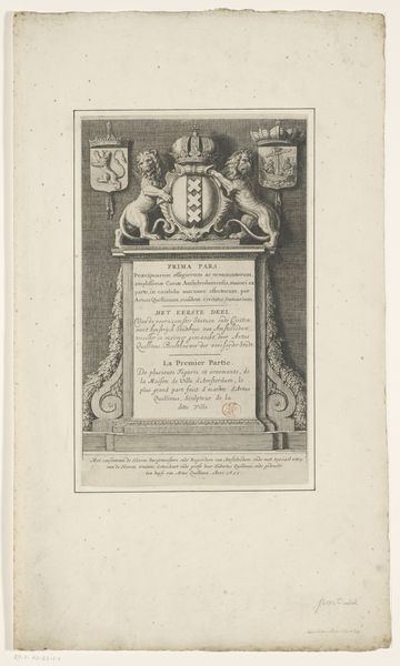
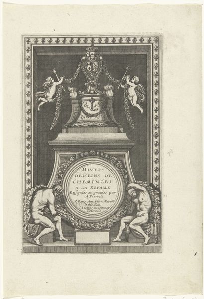
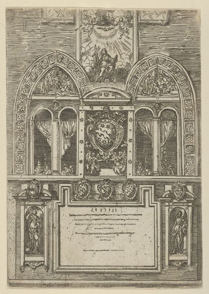
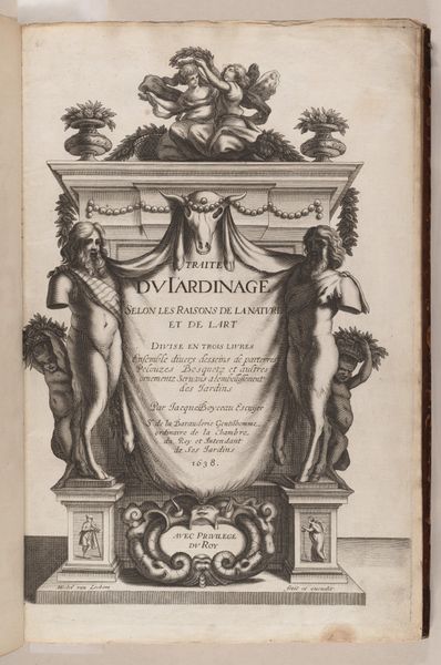
Jan van Oosterom created this title page for a Bible in 1721, using etching to make many identical copies. The image is pure graphic information, of course, but it still shows us the material world of the Dutch Republic. Consider the way the design echoes classical architecture, complete with spiraling columns and sculpted figures. But it is made with etched lines, a technology that allowed for mass production, and thus, the wide dissemination of religious texts. The columns are adorned with grape vines, a symbol of abundance and prosperity, reflecting the country’s economic strength at this time. The technique also allowed for precise detail. Look at the Amsterdam coat of arms. Or the way the pages of the Bible at the very top seem to flutter in the breeze. Through the labor-intensive work of etching, Oosterom created a visual statement that straddles both the sacred and the commercial. He reminds us that even the most spiritual endeavors are grounded in material reality.
Comments
No comments
Be the first to comment and join the conversation on the ultimate creative platform.
More like this