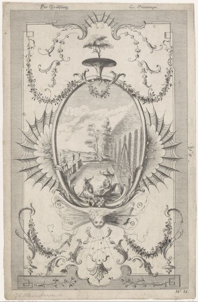
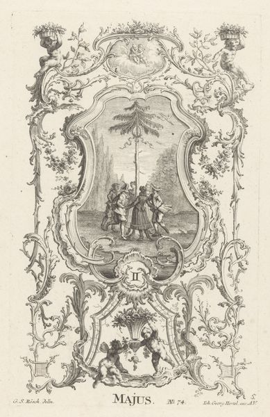
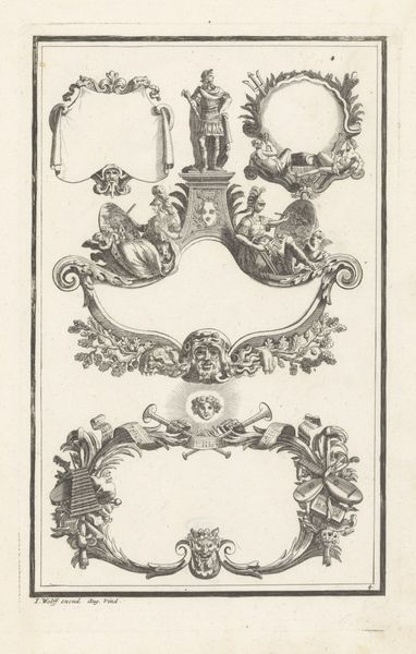
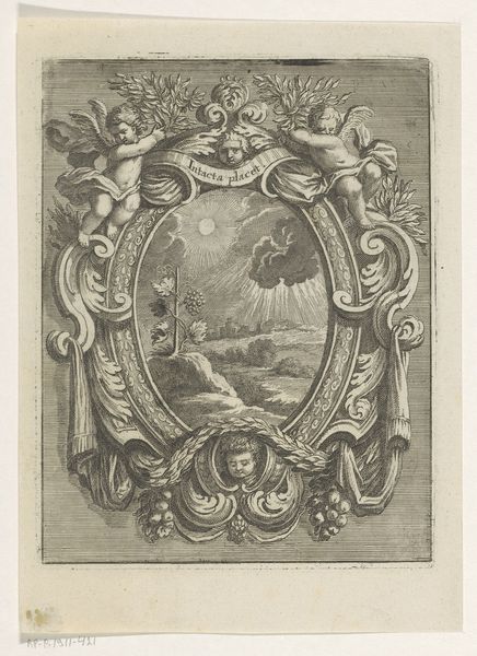
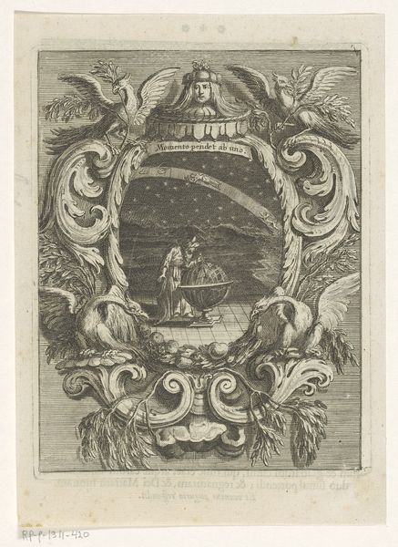
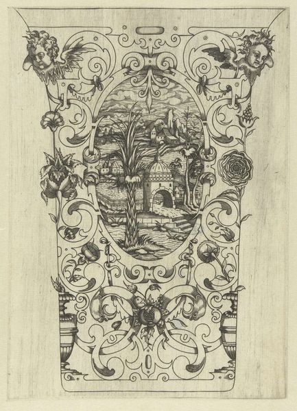
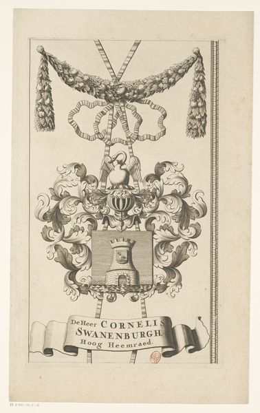
print, engraving
#
baroque
#
pen drawing
# print
#
landscape
#
figuration
#
line
#
engraving
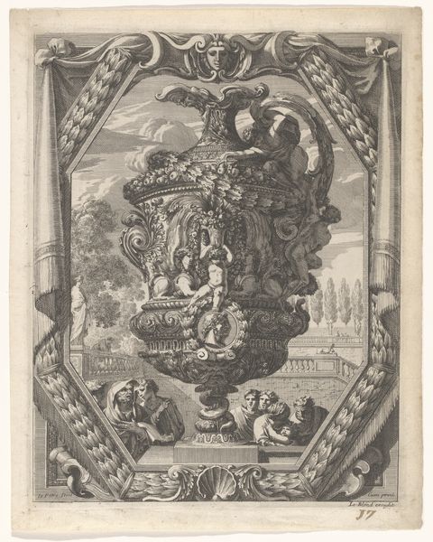
Dimensions: height 296 mm, width 186 mm
Copyright: Rijks Museum: Open Domain
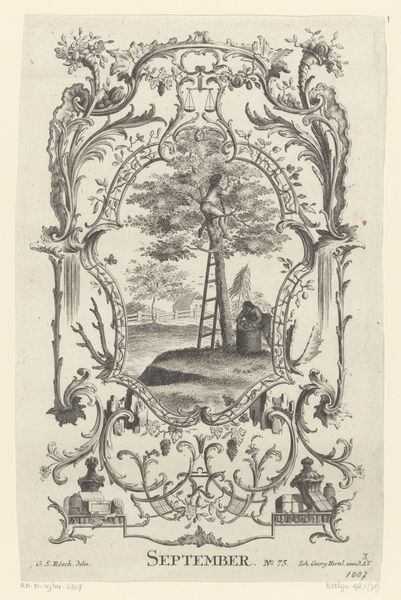
Editor: This print, "Augustus," from somewhere between 1705 and 1766, at the Rijksmuseum... The print’s got this intricate border framing a rural scene. It’s got that Old World kind of charm, but I'm also getting, I don't know, a formal stiffness from all the ornamentation? What catches your eye? Curator: The ornamentation *is* interesting, isn't it? It's bursting with classical references. Busts and flowing organic frills jostle around a rather idealized pastoral vignette. Almost like someone desperately trying to hold onto something "natural", whilst simultaneously smothering it with artifice. Does the rigidity somehow underline that longing, perhaps? And doesn't the contrast between the hard lines of the print and the soft scene within suggest a dialogue between "city" and "country," or even a conversation between order and chaos? Editor: I see what you mean! The busy border versus the quiet scene. The landscape scene feels more like a glimpse than a fully fleshed out artwork. Almost like the border is overshadowing it. Curator: A glimpse, yes! Almost as if the 'Augustus' month - signified I assume - is caught and momentarily framed *for* us. Like a little precious thing... Does that make it more intense for you? Does that suggest a transience, which makes the scene sadder perhaps, or more alive? Editor: Definitely more alive, maybe because it feels fleeting. Like it could disappear any second. And the border is frozen, permanent. I didn’t really notice that tension until now. Thanks for pointing it out! Curator: The beauty of art, isn't it? Layers upon layers of little tensions and resolutions. Something to think about, for both of us.
Comments
No comments
Be the first to comment and join the conversation on the ultimate creative platform.
More like this