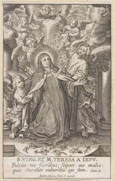
print, engraving
#
baroque
# print
#
figuration
#
history-painting
#
engraving
Dimensions: height 230 mm, width 184 mm
Copyright: Rijks Museum: Open Domain
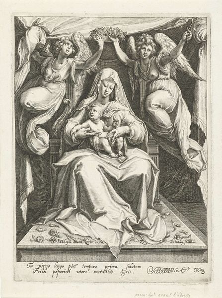
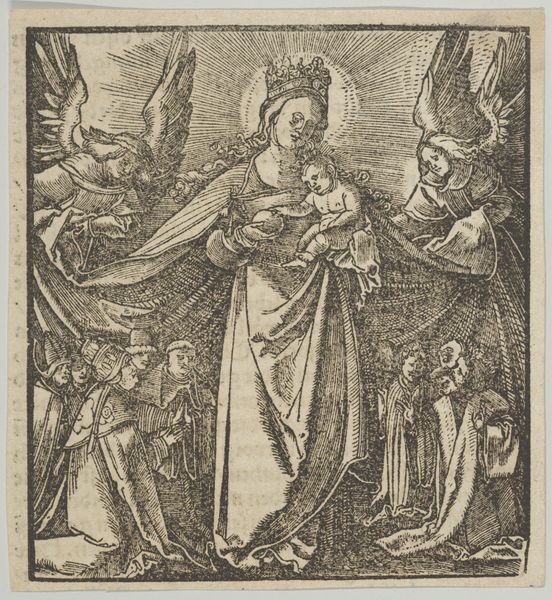
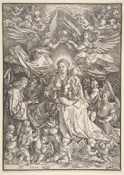
Curator: Here we have "Anna ten drieën," an engraving created between 1581 and 1612, attributed to Theodoor Galle after a design by Jan van der Straet. It’s currently housed in the Rijksmuseum. Editor: Wow, my first thought is "overflowing". Overflowing with figures, fabric, detail, meaning… it’s almost too much for the eye to take in all at once, you know? Curator: Indeed. It’s a common characteristic of the Baroque style, with its emphasis on dramatic intensity and complex compositions. Consider the symbolic weight embedded in the depiction of Saint Anne, Mary, and the Christ Child together—a potent image of familial and spiritual continuity. The other saints, like those flanking them, all allude to lineage. Editor: It’s like a visual family tree, with the angels adding a touch of divine endorsement, showering flowers of blessing from above! Are those Hebrew letters above the halo of Saint Anne? Curator: Yes, that's correct. The inscription employs Hebrew characters—a not uncommon inclusion in depictions of this subject—further emphasizing the divine lineage and Old Testament roots of Christian faith. Consider how the artist plays with layers of meaning, embedding the scene within a matrix of religious and cultural references. Editor: It also reads, to me, a little patriarchal… the composition itself funnels us toward Anne at the top. I'm aware of the significance and traditional symbolism of her presence, and the placement of other saint figures is all readable according to the common symbolism… But visually? Saint Anne is certainly running the show, up there. Curator: I see your point, though I feel that each character seems integral in that moment; after all, the work celebrates her and familial bonds. But to go further with what you are observing… This particular artistic interpretation allows viewers of the time to locate themselves within a structured worldview and understand relationships of intercession and access to the divine. Editor: Absolutely. And the texture! You can almost feel the weight of the fabrics through the intricate engraving. It's as if the artist is trying to capture every fold and shadow. But I keep coming back to that initial impression of being overwhelmed… Curator: Perhaps that feeling of being overwhelmed is precisely the point, isn’t it? The aim is to evoke a sense of awe and the abundance of grace. Editor: True. A lot to chew on! I hadn't considered that overwhelm itself might have been an intentional effect, rather than an aesthetic weakness, of such images. It seems Baroque wasn’t just a style, it was a sensibility—one aiming straight for the jugular, in a devotional kind of way.
Comments
No comments
Be the first to comment and join the conversation on the ultimate creative platform.
More like this