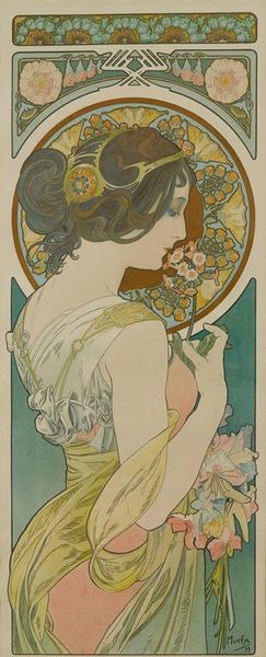
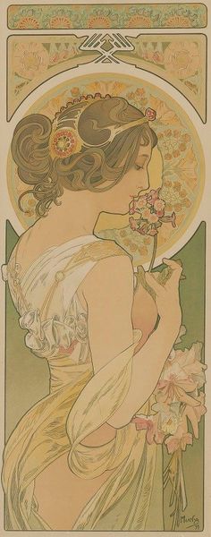
drawing, graphic-art, print, poster
#
portrait
#
drawing
#
graphic-art
#
art-nouveau
# print
#
men
#
symbolism
#
poster
Dimensions: Sheet: 20 11/16 × 13 1/2 in. (52.5 × 34.3 cm) Image: 19 13/16 × 13 1/16 in. (50.3 × 33.2 cm)
Copyright: Public Domain
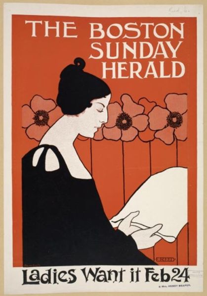
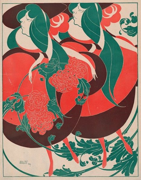
Curator: What a striking visual—I am immediately drawn to the figure's ethereal quality. The limited palette, dominated by a soft green, somehow amplifies the impact of those bold red poppies. Editor: You've intuited that well! We’re looking at a vintage poster advertising the "Tribune: Sunday" supplement. Although it's attributed to George Reiter Brill, its creation period spans between 1875 and 1917. Curator: Given that range, it places the piece firmly within the realm of shifting media landscapes. As a poster it employs striking Art Nouveau and Symbolist stylistic elements. Those fluid lines of the figure’s hair cascade downwards, counterpointed by the angularity of the type face. Editor: It’s intriguing to consider the newspaper insert of the day, competing for attention. It boasts of being the home of an installment of a love story by a Mrs. Burton Harrison and investigations into “How Gas is Made in Chicago,” and the city's “Lack of Public Markets." The design presents an idealized femininity that almost completely detaches it from these grittier social concerns. Curator: Precisely. Those flat, graphic qualities reduce the figure to a series of planes—evoking perhaps a distant echo of Japanese Ukiyo-e. The heavy outlines function semiotically, almost acting like a diagram; there is certainly an intention for instant legibility from a distance, I expect. The lack of naturalistic color contributes further to the flattening, and hints towards her symbolic purpose within the ad. Editor: Symbolism is key. The poppies—boldly red against that minty green—surely allude to both sleep and dreams and the sacrifice made during war time. A direct promotion of mass media entertainment using symbols. But this poster had to be compelling enough to catch the eye and lure someone in, perhaps away from another paper offering competing content, don't you think? Curator: Yes, it’s a fascinating snapshot into that era's modes of capturing a potential reader, using an alluring blend of textual news items juxtaposed with an aesthetically stylized femininity. Editor: Indeed; studying it, I gain an understanding about how these visuals functioned and interacted with an emerging print culture and an understanding of popular taste, or perhaps, how advertisers intended it.
Comments
No comments
Be the first to comment and join the conversation on the ultimate creative platform.
More like this