Copyright: Public domain US
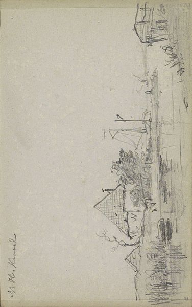
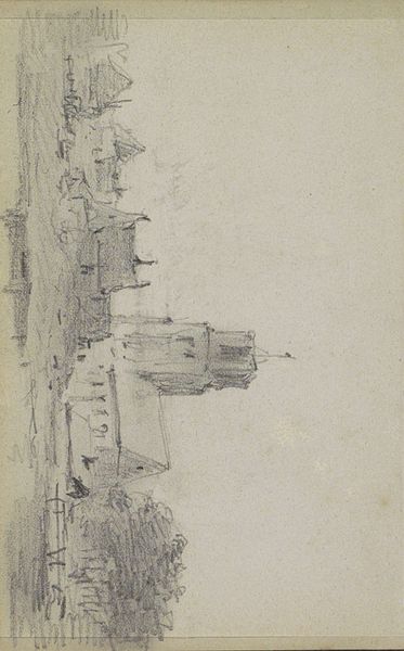
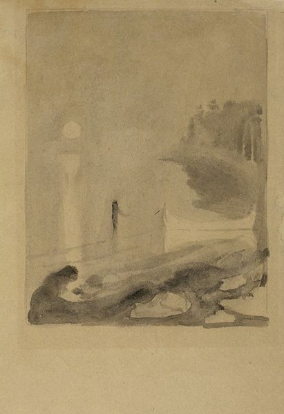
Curator: Oh, it's… melancholy. Look at that expanse of almost mournful gray-blue swallowing everything. Editor: Yes, this is Arthur Beecher Carles’ "Venetian Scene," a drawing created around 1905. Carles uses coloured pencil, as well as standard graphite pencil, to bring Venice to life—or perhaps, in your reading, something closer to a standstill? Curator: Standstill definitely. The colours, that watery almost oppressive sky… and then just a stab of the Italian flag there, drooped like someone gave up holding it. Though those structural buildings seem almost photographic by comparison, it almost feels like looking through someone’s old, half-remembered memory of travel. What do you make of it formally? Editor: The formal composition establishes a compelling tension between near and far. The foreground—largely open and seemingly empty—pushes the architectural elements into the background. It focuses on colour and form while relying on linear techniques to render details. That juxtaposition invites an extended look. The flag, serving almost as a punctuation mark, underscores a specific place, a mood and time, but again this contrasts to the vagueness in his color palette, which could mirror Venice as it is now as much as back then. Curator: It almost feels like Carles wanted the mood of Venice, not the Venice of postcards, the way memory smudges the sharp lines into pure emotion. But then, what a specific flag to plant in that hazy foreground. Editor: A fascinating observation. The presence of the flag infuses national identity—yet it doesn’t scream it. The composition’s tilt throws off perfect equilibrium, thus reflecting a touch of modernist alienation amid its representational faithfulness to Venice. It’s Carles grappling with what Italy *means* through the city as the ultimate symbol of what was and still is, from history to contemporary feeling. Curator: And what can coloured pencils, as medium, possibly offer? Do you feel, materially speaking, the image holds or compromises to an already intense moment of colouristic and structural conflict? Editor: The colored pencil, traditionally employed for detailed sketches, ironically becomes Carles' tool for capturing the sublime atmospheric qualities of Venice—that interplay is what gives the image its staying power. And for all this structural vagueness you identify, let us not ignore how, despite a loose appearance, that his line control when depicting the cityscape offers structure in itself to the work! The materials enhance his vision by mediating that emotion, capturing feeling within firm form. Curator: Absolutely! It's both structured and blurred. You leave me eager to think what this tension between memory and flag, sketchiness and solid form, does with ideas of cultural belonging! Editor: And I am happy to consider how our own feelings when witnessing Venetian scenes or emblems from national pride may echo Carles’ own rendering.
Comments
No comments
Be the first to comment and join the conversation on the ultimate creative platform.
More like this