About this artwork
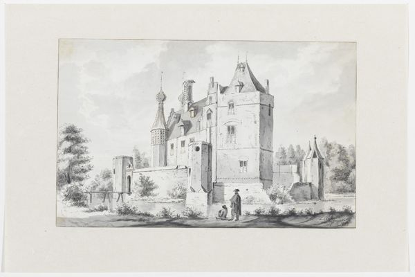
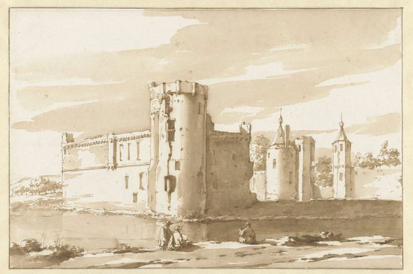
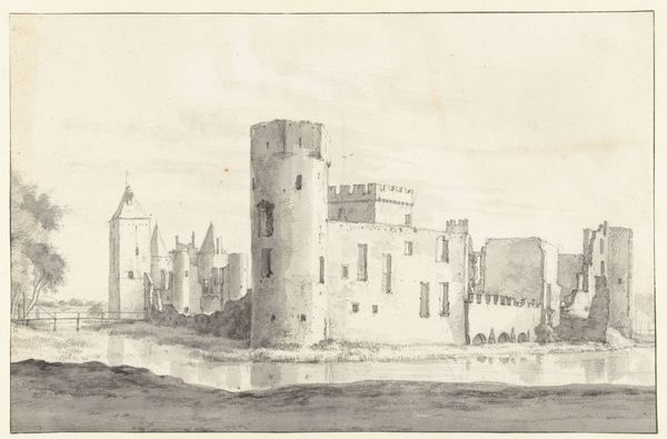
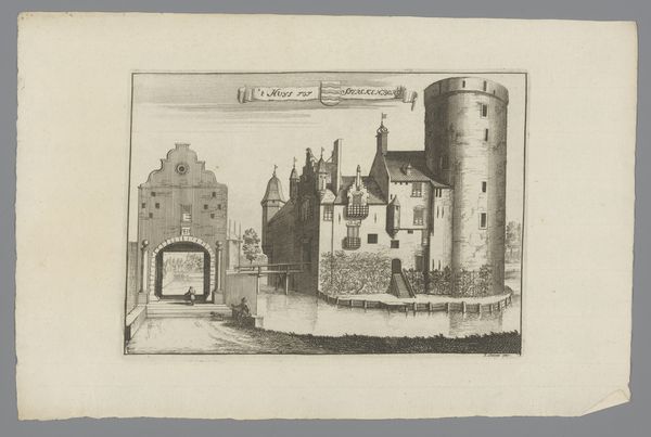
Editor: This is "Château du Hâ, Bordeaux," an etching and drawing in ink from sometime between 1638 and 1649. It feels very architectural and precise to me, but also a bit distant and detached. What jumps out at you when you look at it? Curator: I am immediately struck by the artist's handling of line. Note the controlled, almost scientific application of hatching to describe the varying textures of stone and earth. Do you observe how the contrast between the meticulous rendering of the château and the relative simplicity of the figures in the foreground establishes a certain visual hierarchy? Editor: I do. It's like the building is the real subject, and the people are just there to give it scale. Is the asymmetry important? The tower on the left feels very different from the rest of the composition. Curator: Indeed. The formal discordance contributes to a dynamic visual tension, preventing the image from becoming static or overly harmonious. One could even read the differences in structural rendering between the round tower and the gothic central structure, in concert with the use of empty space, as devices employed to call attention to the architectural complexities that convey status and power. Note how the lack of aerial perspective flattens the image, pushing the castle to the forefront and thus reinforcing its imposing presence. Editor: That's a fascinating way to look at it. I was so focused on the historical aspect, I almost missed the visual push and pull. So, you're suggesting that the artist might be using form to express meaning, rather than just representing the château accurately? Curator: Precisely. Form dictates content. The artwork's impact lies not in its subject, but in its carefully orchestrated elements and the relationships they engender. What new aspects do you perceive now? Editor: I now recognize how the formal properties create not only the composition but the viewing experience as well. The texture, the use of darks and lights, even the size--they all guide your eye, and lead to this viewing experience that would be much different if the formal qualities were different.
Château du Hâ, Bordeaux
1638 - 1649
Artwork details
- Medium
- drawing, etching
- Dimensions
- 208 mm (height) x 316 mm (width) (bladmaal)
- Location
- SMK - Statens Museum for Kunst
Tags
Comments
Share your thoughts
About this artwork
Editor: This is "Château du Hâ, Bordeaux," an etching and drawing in ink from sometime between 1638 and 1649. It feels very architectural and precise to me, but also a bit distant and detached. What jumps out at you when you look at it? Curator: I am immediately struck by the artist's handling of line. Note the controlled, almost scientific application of hatching to describe the varying textures of stone and earth. Do you observe how the contrast between the meticulous rendering of the château and the relative simplicity of the figures in the foreground establishes a certain visual hierarchy? Editor: I do. It's like the building is the real subject, and the people are just there to give it scale. Is the asymmetry important? The tower on the left feels very different from the rest of the composition. Curator: Indeed. The formal discordance contributes to a dynamic visual tension, preventing the image from becoming static or overly harmonious. One could even read the differences in structural rendering between the round tower and the gothic central structure, in concert with the use of empty space, as devices employed to call attention to the architectural complexities that convey status and power. Note how the lack of aerial perspective flattens the image, pushing the castle to the forefront and thus reinforcing its imposing presence. Editor: That's a fascinating way to look at it. I was so focused on the historical aspect, I almost missed the visual push and pull. So, you're suggesting that the artist might be using form to express meaning, rather than just representing the château accurately? Curator: Precisely. Form dictates content. The artwork's impact lies not in its subject, but in its carefully orchestrated elements and the relationships they engender. What new aspects do you perceive now? Editor: I now recognize how the formal properties create not only the composition but the viewing experience as well. The texture, the use of darks and lights, even the size--they all guide your eye, and lead to this viewing experience that would be much different if the formal qualities were different.
Comments
Share your thoughts