#
quirky illustration
#
childish illustration
#
cartoon like
#
cartoon sketch
#
personal sketchbook
#
sketch
#
limited contrast and shading
#
sketchbook drawing
#
cartoon style
#
sketchbook art
#
doodle art
Copyright: Fernand Leger,Fair Use
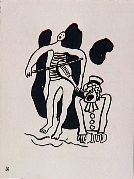
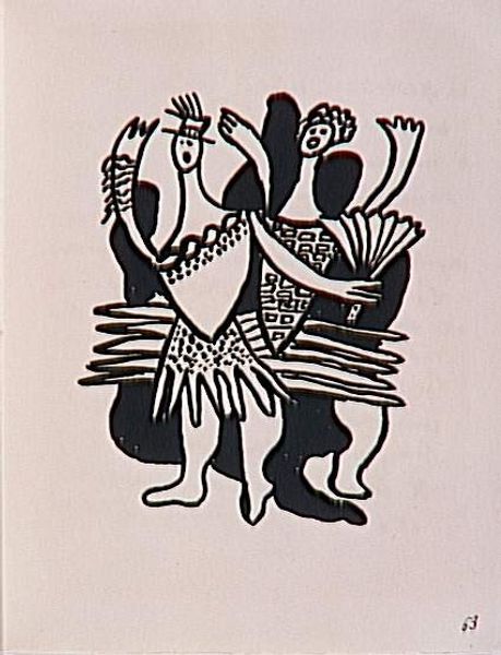
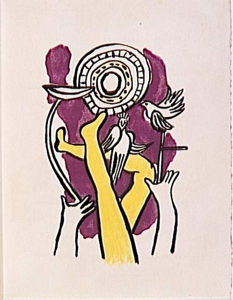
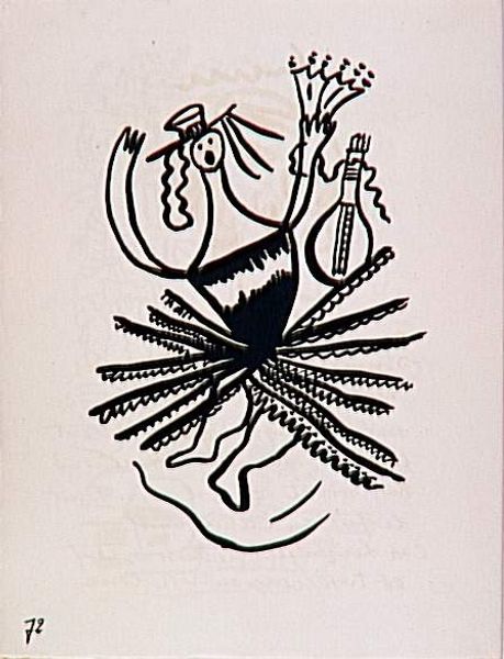
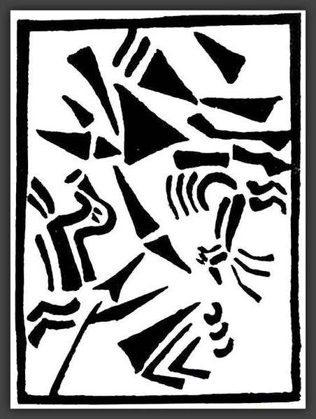
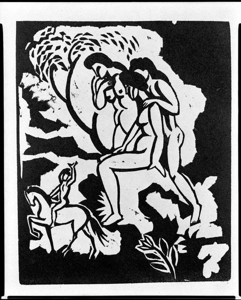
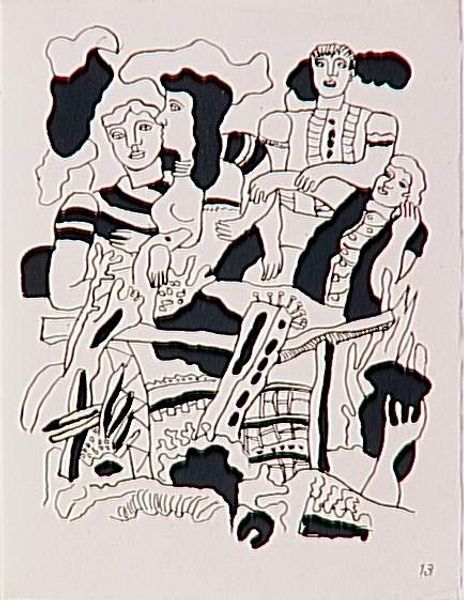
Fernand Léger made this ink drawing, "Circus," and well, it’s like a reminder that art can be found even in the most stripped-down forms. Léger’s use of simple black lines on a neutral background really puts the emphasis on shape and form. The contrast is stark, almost like a woodcut print, and you can sense the artist thinking about how each line defines a space. See how the lines create a sense of movement, almost like a wheel turning, drawing you into the heart of the circus? The lack of color makes you focus on the relationships between the shapes, the balance between the figures and the abstract numbers, the play of positive and negative space. This is not just an image; it’s a map of an idea. It reminds me of Joan Miró, who used a similar language of signs and symbols. And just like Miró, Léger shows us that art doesn’t have to be complicated to be profound, it just has to be felt.
Comments
No comments
Be the first to comment and join the conversation on the ultimate creative platform.
More like this