print, paper, photography, gelatin-silver-print
#
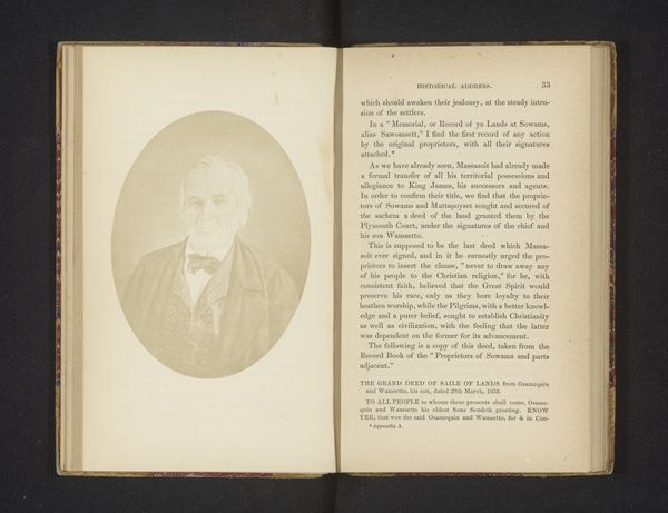
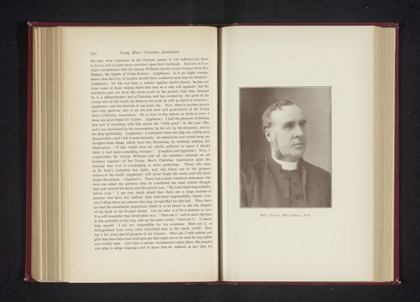
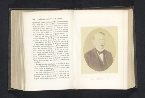
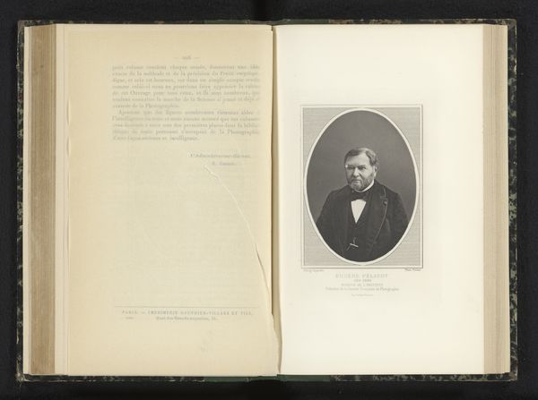
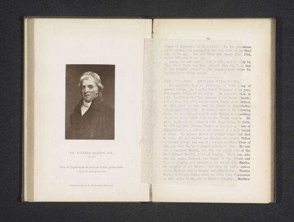
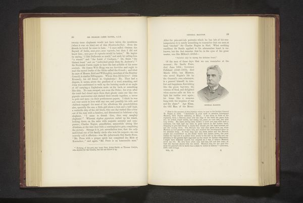
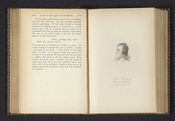
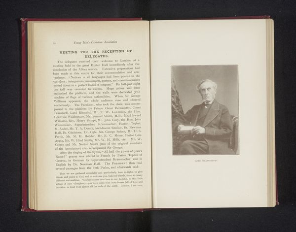
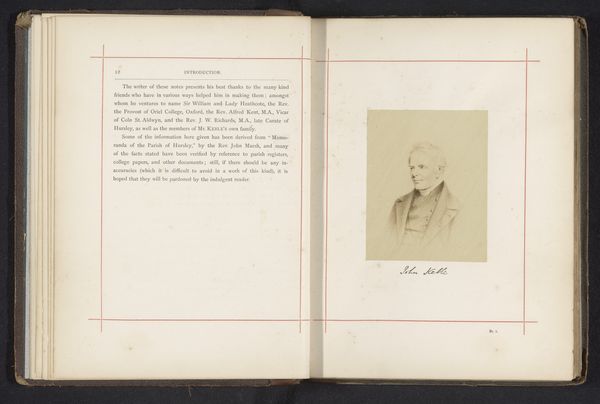
portrait
#
script typeface
#
aged paper
#
still-life-photography
#
paperlike
# print
#
paper
#
photography
#
gelatin-silver-print
#
thick font
#
handwritten font
#
letter paper
#
paper medium
#
thin font
#
historical font
#
small font
Dimensions: height 104 mm, width 75 mm
Copyright: Rijks Museum: Open Domain
Editor: Here we see a gelatin-silver print, dated between 1893 and 1895, titled "Vignette Portrait." The book and photograph, especially with the aged paper, gives me a solemn and almost antiquated feeling. What stands out to you about the composition? Curator: The stark juxtaposition of the portrait and the text presents a compelling formal problem. Consider the contrasting textures: the smooth photographic surface against the aged, fibrous paper. The typface also adds to the construction of the piece. How does the visual rhetoric of these elements—line, form, texture—create meaning? Editor: The differing fonts make it feel disconnected. Is that intentional, or a reflection of printing capabilities at the time? Curator: That is precisely the formal question we must interrogate! Are the choices aesthetic, technological, or both? Focus on how the framing of the subject—the vignette itself— isolates him. How does that inform our reading of the facing page and the content there? The arrangement and balance of the whole image directs how the eye moves. Editor: I hadn’t considered how the vignette emphasizes the individual on the right page versus the long printed form on the left page, almost calling us to decide which is of higher significance. Curator: Exactly. It also provokes thoughts about surface versus depth, image versus text. These opposing forces and their placement are worthy of contemplation, do you agree? Editor: Yes, it is quite revealing! Thanks, that gives me much to ponder. Curator: It’s in these relationships and contradictions that artworks often yield the richest insights.
Comments
No comments
Be the first to comment and join the conversation on the ultimate creative platform.
More like this