graphic-art, typography, poster
script typeface
graphic-art
script typography
paperlike
personal journal design
typography
thick font
publication mockup
handwritten font
classical type
thin font
poster
publication design
Dimensions: height 34 mm, width 99 mm, height 270 mm, width 205 mm
Copyright: Rijks Museum: Open Domain
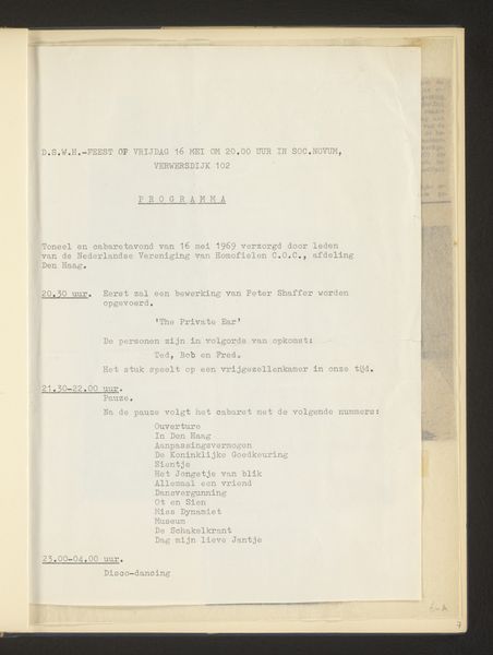
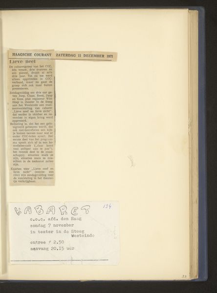
This page, titled "en toen ... 'Protest'," was made by COC sometime around 1970. The dates and locations underneath the title are like a tour schedule—a DIY listing of performances. What strikes me is its simplicity, and how the typewriter text takes center stage. Each letter is evenly pressed onto the page, a physical act that mirrors the process of protest itself—deliberate, insistent, and aimed at making an impression. The page is not overly designed or stylised, allowing the message to come through in an unfiltered way. I’m reminded of the work of Corita Kent, with her screen prints that combined text and image in similarly direct ways. Both artists share a belief in the power of accessible art as a vehicle for social change. This page isn't just an artwork; it's a historical document, a call to action. It’s art as conversation, as action, as life itself.
Comments
No comments
Be the first to comment and join the conversation on the ultimate creative platform.